TextInput
Controlled single-line text field in three fixed widths, with optional masking, error and
warning states. It is always controlled: type and value are required, and the value you
pass is the value it shows.


Use this when / not when
- Use for a plain text, email, telephone, number or password field inside a form.
- Not on its own when the field needs a label or a validation message — wrap it in
FieldContainer. - Not when the field needs an icon or a button inside the box — that is
InputBlock, which wraps this component. - Not for a search box:
SearchInputadds the clear button and the search affordances, and itsonChangegives you the string rather than the event.
Import
import {
  InputSize,
  InputType,
  TextInput,
} from "@onlyoffice/apps-ui-kit/components/text-input";
Also exported from the root barrel @onlyoffice/apps-ui-kit.
Needs ThemeProvider from @onlyoffice/apps-ui-kit/providers/theme above it in the tree;
its background, border and error colours all come from theme custom properties.
Stories
Default
An empty field with a placeholder, the shape most forms start from (placeholder); change any other prop live in the Controls panel below.
Sizes
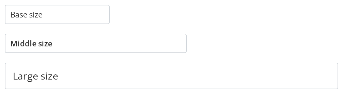
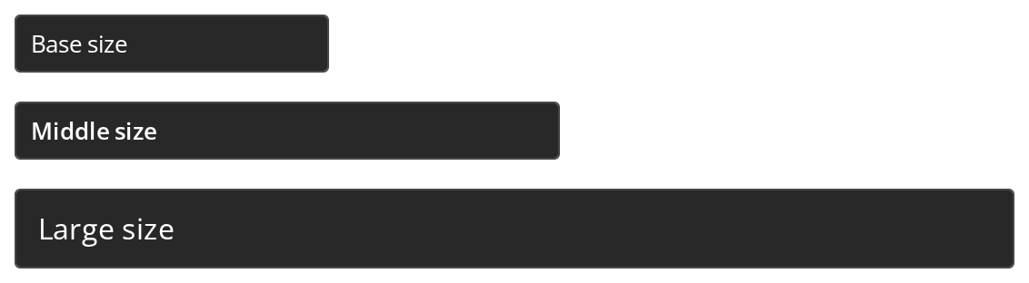
Pick the width by the room the form gives the field: 173px for a short value, 300px for most text, 550px for a long one (size); the middle size is also semibold, the large one uses a 16px font.
Types
Match type to the value so the browser supplies the right keyboard and value rules: password hides the characters, number rejects letters, email and tel bring up their own touch keyboards.


States
Every state the field can be in, side by side: a red border on hasError, an orange one on hasWarning, a grey box that ignores input on isDisabled, a field that blocks typing without changing its look on isReadOnly, and the bare text of withBorder={false} for inline use.


With Mask
Use a mask when the value has one fixed shape, such as a date or a phone number: the field inserts the separators as the user types and refuses characters that do not fit (mask). The date and phone fields show the whole pattern up front with underscores for the missing digits (guide); only the date field keeps the other digits in place when one is deleted (keepCharPositions). The third field passes a function instead of an array, so the pattern is chosen from the value as it is typed: a plain digit starts a four-digit extension, a leading + switches to the full number; without guide the mask grows with the value.


Scaled Inputs
Let the field fill its column instead of its size's fixed width, for form grids and side panels (scale); font size and padding still follow size.


Bold Text
Emphasize a value with isBold (600) or pass any fontWeight; the middle size is already 600, so isBold changes nothing there.


Auto Focused
Put the caret in the field the moment it appears, for a dialog or a panel whose first action is typing (isAutoFocussed); the field is focused when the story loads, so start typing without clicking.


Right To Left
The same fields under a right-to-left interface: the placeholder sits at the right edge and the caret of an empty field starts on the right; text typed in a right-to-left script runs right to left, Latin text still runs left to right (dir="auto"); the tel field keeps its placeholder left-to-right, so a phone number reads the same as in a left-to-right interface. The direction comes from the theme's interfaceDirection (the Direction toolbar); the wrapper also carries dir="rtl" for the rules that read the DOM direction.


Css Customization
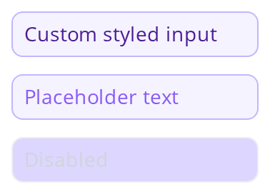
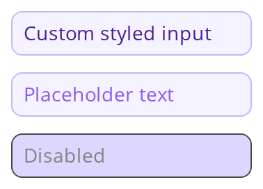
The first field sets the shared --text-input-* tokens on a wrapper -- the variables are listed under CSS variables on this page; hover and focus it to see the two border variables. The second carries --text-input-placeholder-color in its own style, the only place it works. The third is disabled: the theme takes over its text and border, and only the radius, the font size and --text-input-disabled-bg still apply.
Minimal example
type and value are both required, and the field is keyboard-reachable without anything
being said about tabIndex.
import { useState } from "react";
import {
  InputSize,
  InputType,
  TextInput,
} from "@onlyoffice/apps-ui-kit/components/text-input";

export function NameInput() {
  const [name, setName] = useState("");

  return (
    <TextInput
      scale
      tabIndex={0}
      type={InputType.text}
      size={InputSize.base}
      value={name}
      placeholder="Room name"
      onChange={(e) => setName(e.target.value)}
    />
  );
}
Props
Plus 299 more props inherited from React.AriaAttributes, React.DOMAttributes, React.HTMLAttributes and React.InputHTMLAttributes, forwarded to the element.
Enums
Recipes
Disabled and read-only
Two different things: isDisabled greys the field and takes it out of the form,
isReadOnly keeps it legible and selectable but not editable.
import {
  InputSize,
  InputType,
  TextInput,
} from "@onlyoffice/apps-ui-kit/components/text-input";

export function ReadOnlyField({ value }: { value: string }) {
  return (
    <TextInput
      scale
      tabIndex={0}
      isReadOnly
      type={InputType.text}
      size={InputSize.base}
      value={value}
      onChange={() => {}}
    />
  );
}
Error state
hasError only paints the field. The message belongs to
FieldContainer.
import { useState } from "react";
import {
  InputSize,
  InputType,
  TextInput,
} from "@onlyoffice/apps-ui-kit/components/text-input";

export function PortField() {
  const [port, setPort] = useState("");
  const hasError = port !== "" && Number.isNaN(Number(port));

  return (
    <TextInput
      scale
      tabIndex={0}
      type={InputType.number}
      size={InputSize.base}
      value={port}
      hasError={hasError}
      onChange={(e) => setPort(e.target.value)}
    />
  );
}
Masked input
A mask switches the implementation to react-text-mask. forwardedRef stops working here.
import { useState } from "react";
import {
  InputSize,
  InputType,
  TextInput,
} from "@onlyoffice/apps-ui-kit/components/text-input";

const phoneMask = [
  "+",
  /\d/,
  " ",
  "(",
  /\d/,
  /\d/,
  /\d/,
  ")",
  " ",
  /\d/,
  /\d/,
  /\d/,
  "-",
  /\d/,
  /\d/,
  /\d/,
  /\d/,
];

export function PhoneField() {
  const [phone, setPhone] = useState("");

  return (
    <TextInput
      tabIndex={0}
      type={InputType.tel}
      size={InputSize.base}
      value={phone}
      mask={phoneMask}
      onChange={(e) => setPhone(e.target.value)}
    />
  );
}
Behaviour the types don't state
tabIndexis left unset, so the field sits in the natural tab order. It used to default to-1, which took every field out of the tab order and made a form unfillable from the keyboard unless each one was giventabIndex={0}by hand. Those explicit zeroes are now redundant, and harmless; pass-1only where you mean the keyboard to skip a field.maxLengthdefaults to 255. Typing past it is dropped silently, which is a real limit for descriptions, keys and pasted tokens. Raise it where the field can legitimately be longer.placeholderdefaults to a single space, not to nothing.:placeholder-shownmatches on every field, so floating-label CSS built on that selector behaves as if a placeholder were always present.- The widths are fixed, not fluid:
base173px,middle300px,large550px.scaleis what makes the field fill its container; without it a field in a wide form stays 173px and looks broken.sizeitself never reaches the DOM — it is stripped before render and survives only asdata-size. - The component is memoised with a deep comparison (
React.memowithfast-deep-equal, not the default shallow compare). A prop object that is rebuilt each render with the same contents will not re-render it; an object mutated in place will not either. isBoldbeatsfontWeight. When both are set the weight is 600 andfontWeightis ignored.- The sizes differ in more than width.
middlerenders its text at weight 600 by default,largein a 16px font with taller padding;baseis 13px at weight 400. dirdefaults toauto, so each value picks its own text direction and mixed-script text reads correctly under either interface direction.forwardedRefis dropped whenmaskis set — the ref is attached to the plain<input>branch only.- The browser's own clear button for
type="search"is hidden by the stylesheet, in both WebKit and Firefox. hasErrorandhasWarninghold their colour through hover and focus. The border takes the error (red) or warning (orange) colour at rest, on hover and while focused, so the state never flickers back to the normal border. When both are set the warning colour wins, because its rules come later in the stylesheet.withBorder={false}removes the border outright, for a field set inline in text or a table cell. With it go the hover, focus, error and warning colours, which are all border colours, so a borderless field shows no validation state.
CSS variables
Set these on any ancestor; the stylesheet reads them through a fallback to the theme token.
Two states set their colours from the theme directly and ignore these overrides. Under
hasError or hasWarning the border comes from the theme's error or warning tokens, so
--text-input-border-color, -hover and -focus stop applying. A disabled field takes its
text, caret and border colours from the theme as well; only --text-input-radius,
--text-input-font-size and --text-input-disabled-bg still reach it.
The theme tokens below are declared on the <input> element itself, so a value set on an
ancestor never reaches it. Override them through the style prop only.
Accessibility
- Focusable by default, in the natural document order. Reach for
tabIndexonly to take a field out of that order, never to put it in. - The component renders no label and does not associate itself with one.
FieldContainerdoes not associate them either, so give the input anaria-label, or wrap it in a<label>of your own. hasErrorandhasWarningpaint the field throughdata-erroranddata-warningattributes only. Neither setsaria-invalid, so assistive technology is not told the field is wrong; set it yourself.isDisabledmaps to the nativedisabledattribute andisReadOnlytoreadonly, so both behave as expected for assistive technology.
Test ids
The element also carries data-size, and data-error, data-warning, data-scale,
data-without-border, data-keep-char-positions and data-guide, each set to "true"
only when the matching prop is on.
Related
FieldContainer— label, help tooltip and error message around this control.InputBlock— this input with an icon or button inside the box.SearchInput— search field whoseonChangereceives the string rather than the event.