Textarea
Multi-line text field that grows with its content, with optional line numbers, a copy button and a JSON mode. It is controlled: the value you pass is what it shows.


Use this when / not when
- Use for free text of more than one line: a description, a message, a pasted key or document.
- Not for a single line —
TextInputis sized and styled for that, and has the mask, prefix and password affordances this one does not. - Not to give the field a label, a help tooltip and an error message: wrap it in
FieldContainer, which is whathasErroris meant to pair with.
Import
import { Textarea } from "@onlyoffice/apps-ui-kit/components/textarea";
Also exported from the root barrel @onlyoffice/apps-ui-kit.
Needs ThemeProvider from @onlyoffice/apps-ui-kit/providers/theme above it in the tree, for
the surface, border and scrollbar colours.
Stories
Default
An empty field with a placeholder and a fixed height, the shape most forms start from (placeholder, heightTextArea); change any other prop live in the Controls panel below.
States
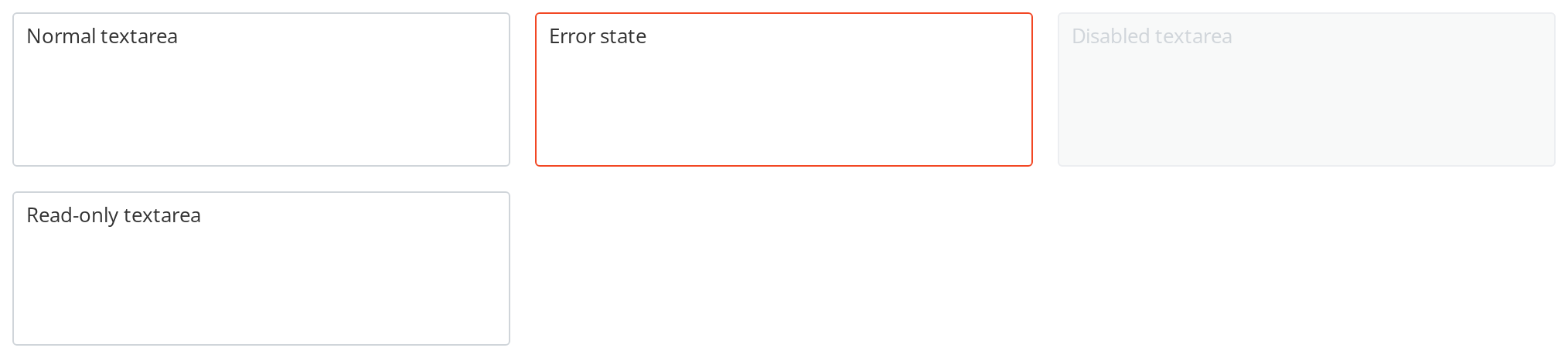
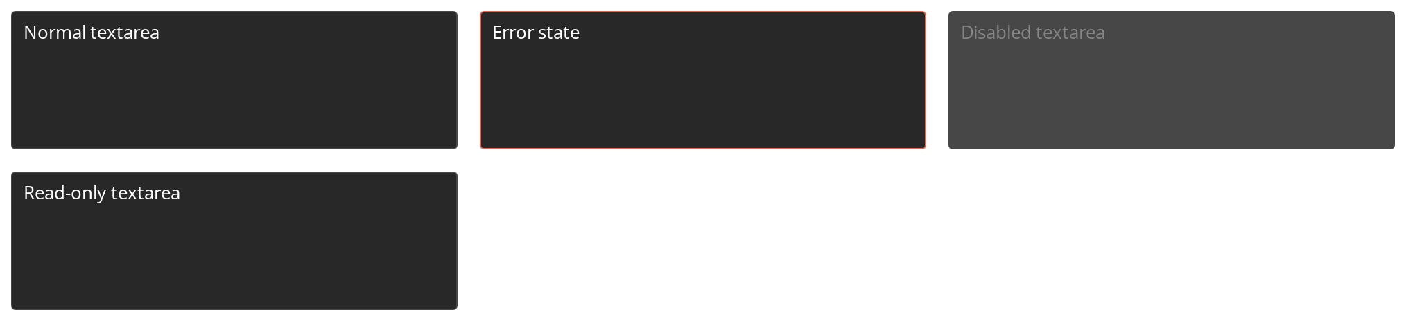
Four copies of the same field, one per state a form puts it in:
- Normal textarea — the plain field
- Error state — the red border a form shows after failed validation (
hasError) - Disabled textarea — greyed out and unfocusable (
isDisabled) - Read-only textarea — looks like the plain one but rejects typing (
isReadOnly)
With Copy
The copy button in the corner puts the whole text on the clipboard and confirms it with a toast (enableCopy, copyInfoText); clicking the frame or the button also selects all the text. The toast renders only where a Toast container is mounted, so the story mounts one.


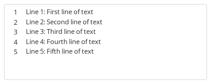
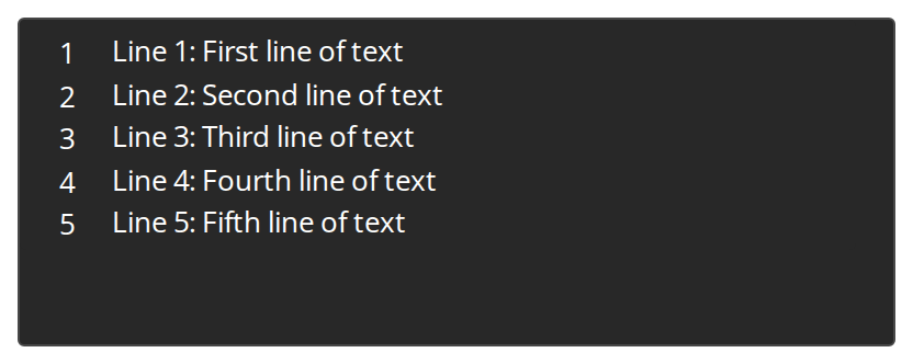
With Numeration
Line numbers beside the text for values read as code or configuration, so a reader can point to a line (hasNumeration).
JSON Field
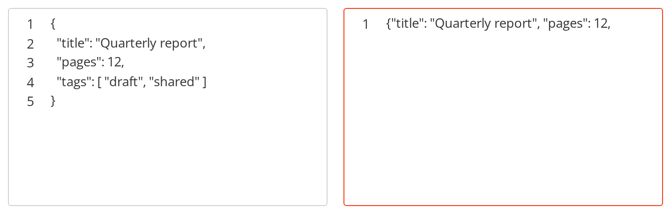
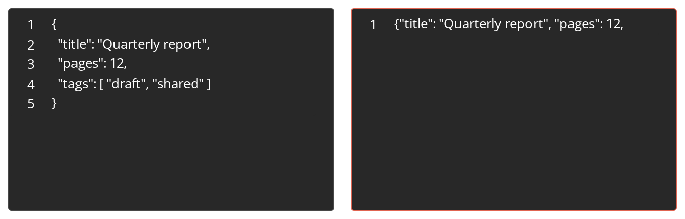
Two JSON fields, for values a reader edits as configuration:
- Left — a valid object, pretty-printed with line numbers (
isJSONField,hasNumeration) - Right — a truncated object, which keeps the red border until the text parses as JSON
Custom Heights
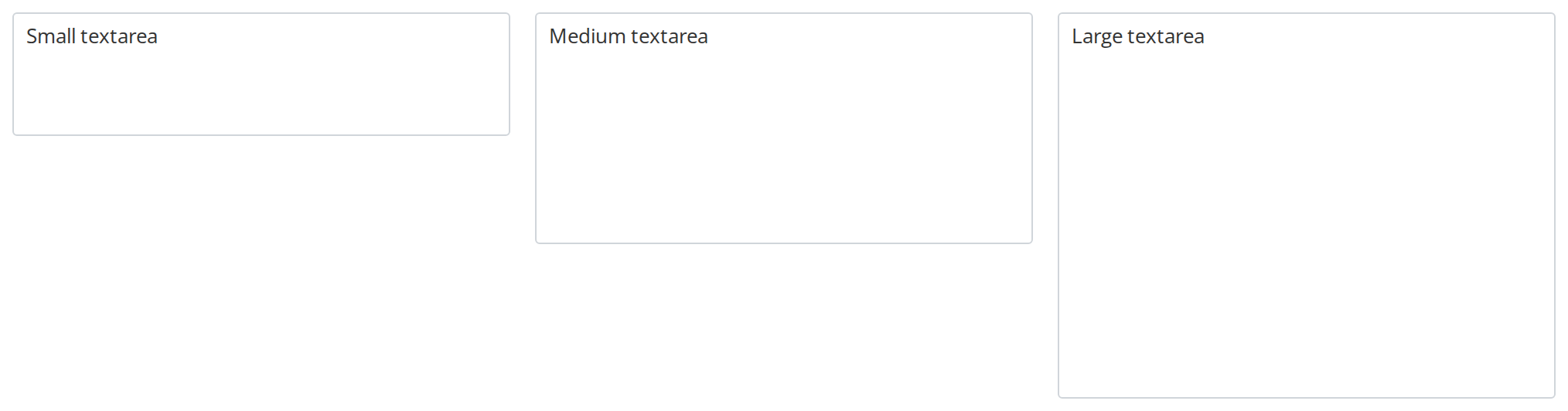
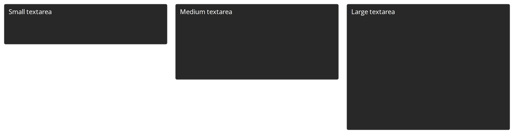
Three heights of the same field, to pick the one that fits the surrounding form (heightTextArea):
- Small textarea — 80px
- Medium textarea — 150px
- Large textarea — 250px
Grows With Content
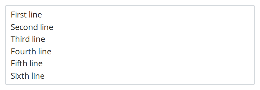
The frame is as tall as its text: add a line and it grows, delete one and it shrinks, never below the default height (isFullHeight).
Right To Left
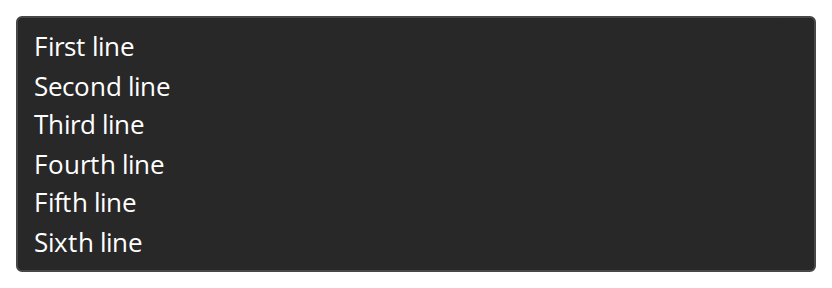
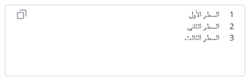
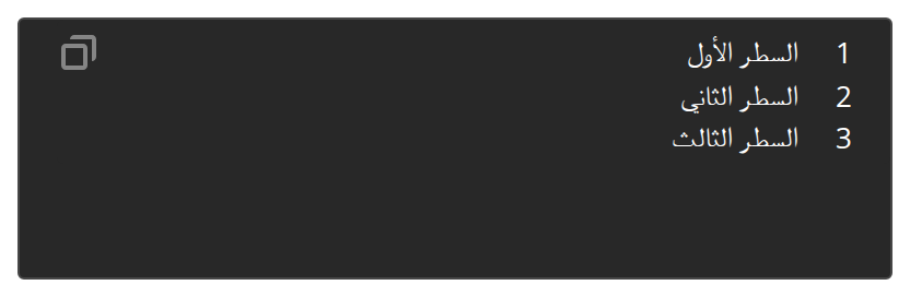
The same field under a right-to-left interface, mirroring the left-to-right layout: the line numbers move to the right edge, the copy button to the left one, and the text starts from the right. The direction comes from the theme's interfaceDirection (the Direction toolbar); the wrapper also carries dir="rtl" for the rules that read the DOM direction.
Css Customization
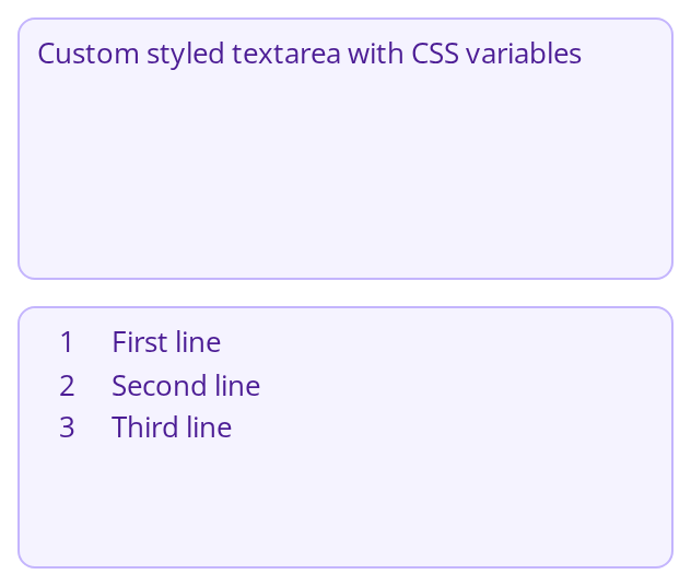
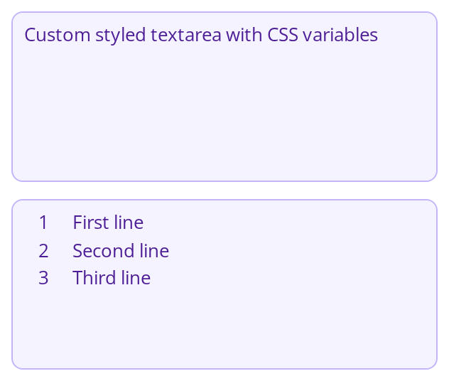
Nine of the variables set on one wrapper -- every one is listed under CSS variables on this page. The first field shows the shared --text-input-* tokens, the padding and the custom height; hover and focus it to see the two border variables. The second adds hasNumeration, the only state in which --textarea-numeration-text-color has anything to color.
Minimal example
import { useState } from "react";
import { Textarea } from "@onlyoffice/apps-ui-kit/components/textarea";

export function RoomDescription() {
  const [text, setText] = useState("");

  return (
    <Textarea
      value={text}
      aria-label="Room description"
      placeholder="What is this room for?"
      onChange={(e) => setText(e.target.value)}
    />
  );
}
Props
Recipes
Disabled and read-only
isDisabled greys the field and takes it out of the tab order; isReadOnly keeps it selectable
and focusable but refuses edits, and looks exactly like an editable field. For a value the user is meant to copy, read-only is the one you
want.
import { Textarea } from "@onlyoffice/apps-ui-kit/components/textarea";

export function ApiKeyField({ apiKey }: { apiKey: string }) {
  return (
    <Textarea
      value={apiKey}
      isReadOnly
      enableCopy
      copyInfoText="API key copied"
      tabIndex={0}
      onChange={() => {}}
    />
  );
}
Error
import { useState } from "react";
import { Textarea } from "@onlyoffice/apps-ui-kit/components/textarea";

export function CommentField() {
  const [text, setText] = useState("");
  const tooLong = text.length > 280;

  return (
    <Textarea
      value={text}
      hasError={tooLong}
      maxLength={400}
      tabIndex={0}
      onChange={(e) => setText(e.target.value)}
    />
  );
}
A JSON field with line numbers
import { useState } from "react";
import { Textarea } from "@onlyoffice/apps-ui-kit/components/textarea";

export function WebhookPayload() {
  const [payload, setPayload] = useState('{ "event": "file.created" }');

  return (
    <Textarea
      value={payload}
      isJSONField
      hasNumeration
      enableCopy
      heightScale
      tabIndex={0}
      onChange={(e) => setPayload(e.target.value)}
    />
  );
}
Behaviour the types don't state
- It has a maximum width but no width. The field caps at
--textarea-width(1200px) and otherwise takes whatever width the layout gives it — which, as a flex or grid item, is the width of its content, not of the free space. In a flex row it collapses to a sliver that is still focusable and still accepts text. Give itwidth: 100%— orflex: 1 1 autowithmin-width: 0where the parent is a flex container — throughwrapperClassName, which is the only prop that reaches the element carrying the max-width.styledoes not: it is spread onto the innerScrollbar, whose own rule is alreadywidth: 100% !important, so a width passed that way reads as though it had worked and changes nothing. isJSONFieldadds its own error state. In that mode the field is red whenever the value is empty or is not a JSON object or array —42and"text"parse and still count as invalid — whatever you pass ashasError.hasErrorstill applies on top of it, so a field holding valid JSON turns red when you pass it.- Three props are accepted and never read:
minHeight,fullHeightandpaddingLeftProp. The height they suggest comes fromheightTextArea,heightScaleandisFullHeightinstead. - The default
placeholderis a single space rather than an empty string, so:placeholder-shownmatches even when no placeholder was asked for. - A click on the field stops propagating, so a parent listening for clicks does not see it.
- The text direction is
auto: a value that starts with Arabic or Hebrew renders right to left regardless of the interface language.
CSS variables
Accessibility
- Renders a real
<textarea>, so it is announced as a multi-line field and supports the platform's own editing and selection. - Name it, one of three ways.
idlands on the<textarea>element itself, so aFieldContainergiven the same string aslabelForcaptions it exactly as it captions aTextInput— that is the one to reach for when the caption is on screen.aria-labelledbypoints at any other element that names it, andaria-labelcovers a field with no visible caption at all. The last two are declared as props because this type is closed and accepts no arbitrary DOM attributes. A field named by none of the three is announced as an unnamed edit box. aria-describedbycarries the error or hint. The component draws an error state in colour and nothing more, so the message itself has to be an element of yours that this prop points at.- The copy button is mouse-only. It is a
<div>with no tab stop and no accessible name; a keyboard user selects the text (withareaSelect, or by focusing the field) and copies it with the platform shortcut. - It is in the tab order by default.
tabIndexused to default to-1, which removed every multi-line field from keyboard navigation.
Test ids
Related
TextInput— single line, with masking and fixed widths.FieldContainer— the label, help tooltip and error message around it.InputBlock— a single-line field with an icon or a button inside it.