ContextMenuButton
Icon that opens a menu of actions, built afresh from a callback each time it is clicked. The
callback is what the menu shows — the data prop is read once and then forgotten.


Use this when / not when
- Use for the "more" button of a row, a card or a toolbar, where the actions depend on what is selected at the moment of the click.
- Not for a right-click menu on a region — that is
ContextMenu, which this one opens forRowin itstogglemode. - Not for choosing a value:
ComboBox. - Not for a menu you control yourself —
DropDownanchored to anIconButtonof your own is less indirect.
Import
import {
  ContextMenuButton,
  ContextMenuButtonDisplayType,
} from "@onlyoffice/apps-ui-kit/components/context-menu-button";
Also exported from the root barrel @onlyoffice/apps-ui-kit.
Needs ThemeProvider from @onlyoffice/apps-ui-kit/providers/theme for the icon and menu
colours, and TranslationProvider from @onlyoffice/apps-ui-kit/providers/translation because
the items are DropDownItems.
Stories
Default
The row-level "more" button: click the dots to open the menu and click again or outside it to close it. Change any other prop live in the Controls panel below.
Disabled
Use it when the actions do not apply to the current item: the icon greys out and a click opens nothing (isDisabled).
With Icon Border
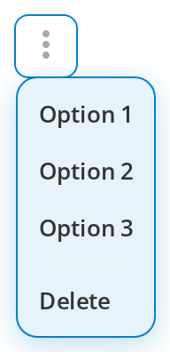
Gives the icon a larger, boxed click target (displayIconBorder): the dots sit in a rounded 32px square. The default theme draws no line around it; set --cmb-border to add one, as the CSS customization story does.


Custom Colors
Matches the icon to the surface it sits on: each button has its own colour, and hovering it shows its hover colour (color, hoverColor). Click any to open its menu.

Css Customization
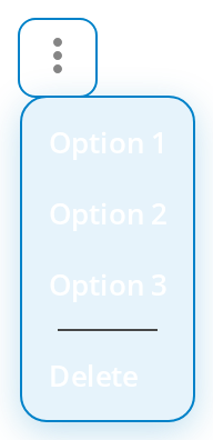
Every overridable variable set on one wrapper -- the variables are listed under CSS variables on this page. The example opens the menu in a bordered box (displayIconBorder), so every variable is on screen at once; hover the dots to see --cmb-hover-border. The menu is kept inline (usePortal={false}): in a portal it leaves the wrapper, so set the --dropdown-* variables on document.body instead.
Minimal example
getData is what the menu is built from, and the component calls it without checking — a
button without one throws on the first click.
import { ContextMenuButton } from "@onlyoffice/apps-ui-kit/components/context-menu-button";

export function RowActions({
  onRename,
  onDelete,
}: {
  onRename: () => void;
  onDelete: () => void;
}) {
  return (
    <ContextMenuButton
      title="Actions"
      getData={() => [
        { key: "rename", label: "Rename", onClick: onRename },
        { key: "delete", label: "Delete", onClick: onDelete },
      ]}
    />
  );
}
Props
Enums
Recipes
Open and close, controlled
opened opens the menu when it changes, and onClose reports a close the component performed
itself after a click outside.
import { useState } from "react";
import { ContextMenuButton } from "@onlyoffice/apps-ui-kit/components/context-menu-button";

export function ControlledActions({ onRename }: { onRename: () => void }) {
  const [open, setOpen] = useState(false);

  return (
    <ContextMenuButton
      opened={open}
      onClose={() => setOpen(false)}
      onClick={() => setOpen(true)}
      getData={() => [{ key: "rename", label: "Rename", onClick: onRename }]}
    />
  );
}
Disabled
import { ContextMenuButton } from "@onlyoffice/apps-ui-kit/components/context-menu-button";

export function MaybeActions({ canEdit }: { canEdit: boolean }) {
  return (
    <ContextMenuButton
      isDisabled={!canEdit}
      title="Actions"
      displayIconBorder
      getData={() => [{ key: "rename", label: "Rename", onClick: () => {} }]}
    />
  );
}
Behaviour the types don't state
datais read once. It seeds the internal state on the first render and is never looked at again, so a menu whose items change has to supply them throughgetData, which is called on every click.- It re-renders only for four props. The component is memoised with a comparison that looks
at
opened,displayType,isDisabledandgetDataalone — a newtitle,color,iconNameor handler does nothing until one of those four changes. Pass a stablegetDatathat closes over fresh values, or key the component. onMouseOverandonMouseOutare wired to the wrong events. They are handed to the icon as itsonMouseDownandonMouseUp, and thatonMouseUpitself only fires for the middle and right buttons — seeIconButton.displayType="auto"isdropdown. The function that would choose by width returnsdropdownunconditionally.toggleis the one that differs: no menu is rendered at all andonClickis left to open one, which is howRowuses it.- The menu gets a backdrop only on a tablet or a phone, and a transparent one at that; on a
desktop a click outside is caught by
clickandmousedownlisteners instead. - The icon is the kit's vertical dots unless
iconNamegives a URL, which is fetched at runtime. columnCountandasideHeaderare declared and never read.
CSS variables
All five apply only with displayIconBorder. The theme's value for --cmb-border is a colour
with no width or style, so by default the box draws no line at all, and --cmb-hover-border
shows nothing until --cmb-border supplies a style, as in 1px solid.
The menu is a DropDown and reads its own --dropdown-* variables.
By default it is portalled to document.body, outside the wrapper, so set them there, or pass
usePortal={false} to keep the menu inside the element that sets them. The icon colour is set
inline by the icon itself; change it with color, hoverColor and clickColor, not with a
variable.
Accessibility
- The icon is an
IconButton: a<div>with no role, no tab stop and no Enter or Space activation, so the menu cannot be opened from the keyboard; a keyboard route to the same actions has to come from the host. - The wrapper and the icon both carry
aria-disabledwhileisDisabled, but there is noaria-haspopuporaria-expanded, and the menu is not linked to the button. - The items are
role="option"rows in arole="listbox", which is not what a menu of actions is. titlerenders the kit's hover tooltip, not an accessible name.
Test ids
| Element | data-testid |
|---|---|
| The wrapper | context-menu-button, overridable with testId |
| An item | the item's dataTestId, otherwise <key>_item |
Related
ContextMenu— the right-click menu, whichtogglemode leaves you to open.DropDown— the menu this renders, and its own props.IconButton— the icon, and the props passed through to it.