FloatingButton
Round corner badge that shows the progress of a background operation and opens its panel. It is the disc that appears in the bottom corner of the portal while files are uploading.


Use this when / not when
- Use for one long operation running in the background — an upload, a conversion, a bulk move — that the user should be able to watch and come back to.
- Not for the progress of a single row;
LoadingButtonis the 16px version that sits inline. - Not for a determinate bar inside a panel —
ProgressBaris that. - Not for a primary action floating over the content: this one is a status badge, and its colour is fixed to the accent.
Import
import { FloatingButton } from "@onlyoffice/apps-ui-kit/components/floating-button";
Also exported from the root barrel @onlyoffice/apps-ui-kit.
Needs ThemeProvider from @onlyoffice/apps-ui-kit/providers/theme, and specifically its
colour scheme: the circle's background is the accent colour, and without one it has no
background at all unless you pass color.
Stories
Default
An upload that has just started, with no progress value yet, so the ring spins; change any other prop live in the Controls panel below.

With Progress
Floating button showing upload progress at 45%. The circular progress indicator fills as the percentage increases.


With Alert
A red exclamation mark on the circle's upper edge, for an operation that needs the user's attention, such as one that finished with errors (alert).


Completed
A finished operation: the ring fades out, the circle pulses once and a green tick stays on its upper edge (completed).


Stopped
Floating button in stopped state. Shows the minus status icon when the user aborts a running operation, instead of the success checkmark.


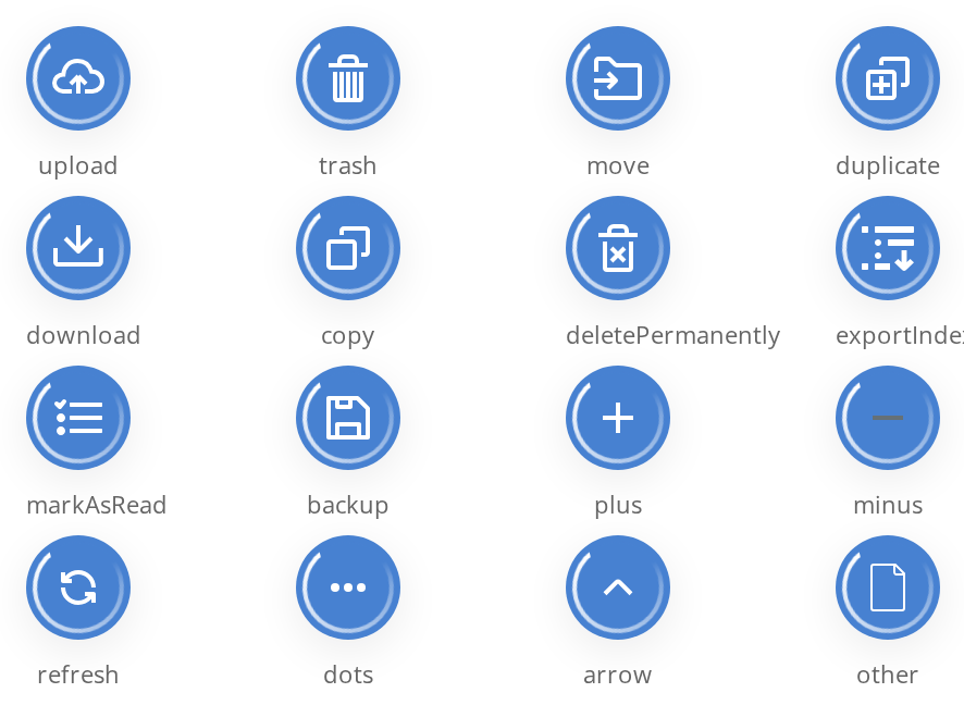
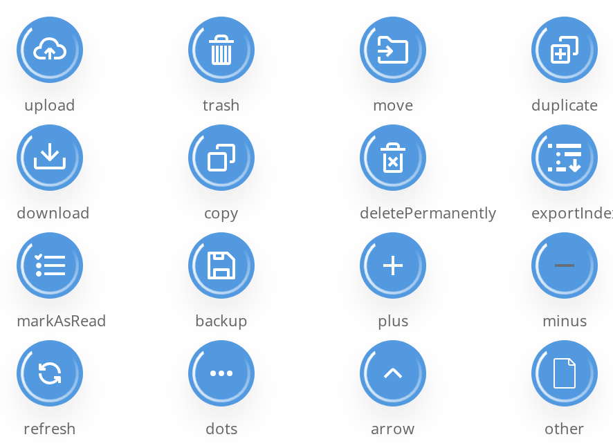
Icon Variants
Floating buttons with different icon variants. Shows the available built-in icons for common operations.
Without Progress
The bare circle with no ring, for an operation whose progress is not worth showing, or a badge that only opens a panel (withoutProgress).


Without Status Badge
A finished move with no tick on the circle: the ring still fades out, but the badge on the upper edge is hidden whatever the state props say (withoutStatus).


Custom Color
The circle, the ring and the accent parts of the icon in a colour of your own instead of the accent colour, for example one per kind of operation (color).


Custom Icon Image
An image of your own in the middle, 20px wide, for an operation none of the built-in icons fits (iconUrl).


Css Customization
Two buttons under one wrapper that sets the background, the shadow and the icon colour -- the variables are listed under CSS variables on this page.
- Upload — the background and the shadow; its icon is one of the accent icons (upload, trash, deletePermanently, other), whose shapes are painted in the background colour, so the icon colour does not reach it
- Move — the icon colour, on an icon that is not an accent one


Minimal example
The component positions itself against the nearest positioned ancestor — see "Behaviour the types don't state".
import { FloatingButton } from "@onlyoffice/apps-ui-kit/components/floating-button";

export function UploadBadge({
  percent,
  onOpen,
}: {
  percent: number;
  onOpen: () => void;
}) {
  return (
    <div style={{ position: "relative", height: 200 }}>
      <FloatingButton icon="upload" percent={percent} onClick={onOpen} />
    </div>
  );
}
Props
Added by the wrapper the folder exports
The index module exports a wrapped component, so these are accepted on top of the props above.
icon is a key of FloatingButtonIcons, which is exported beside the component:
upload, trash, move, duplicate, plus, minus, refresh, exportIndex, dots,
arrow, deletePermanently, download, copy, markAsRead, other, backup.
Recipes
Finished
completed fades the ring out, plays a one-off brightening of the circle and turns the badge
into a tick.
import { FloatingButton } from "@onlyoffice/apps-ui-kit/components/floating-button";

export function UploadDone({ onOpen }: { onOpen: () => void }) {
  return (
    <div style={{ position: "relative", height: 200 }}>
      <FloatingButton icon="upload" completed onClick={onOpen} />
    </div>
  );
}
Failed or aborted
alert draws the warning triangle and stopped the "aborted" mark, which wins over both
alert and completed.
import { FloatingButton } from "@onlyoffice/apps-ui-kit/components/floating-button";

export function UploadFailed({ onOpen }: { onOpen: () => void }) {
  return (
    <div style={{ position: "relative", height: 200 }}>
      <FloatingButton icon="upload" alert completed onClick={onOpen} />
    </div>
  );
}
Cancellable
showCancelButton adds a cross beside the circle, which calls clearUploadedFilesHistory. It
only appears on hover unless showCloseIcon keeps it out.
import { FloatingButton } from "@onlyoffice/apps-ui-kit/components/floating-button";

export function CancellableUpload({
  percent,
  onOpen,
  onCancel,
}: {
  percent: number;
  onOpen: () => void;
  onCancel: () => void;
}) {
  return (
    <div style={{ position: "relative", height: 200 }}>
      <FloatingButton
        icon="upload"
        percent={percent}
        onClick={onOpen}
        showCancelButton
        clearUploadedFilesHistory={onCancel}
      />
    </div>
  );
}
Behaviour the types don't state
- The component positions itself. From the desktop breakpoint up its wrapper is
position: absolute, 100×70, pinned to the bottom trailing corner of the nearest positioned ancestor, atz-index: 300; the circle inside it isz-index: 500. Give it aposition: relativeparent, or it will pin itself to something further up the page. - The background is
!importantand comes from the theme's colour scheme. Without a colour scheme — and withoutcolor— the declaration resolves to nothing and the circle is drawn transparent, icon and ring floating on the page. percentdoes not complete the operation. The finished look is controlled bycompletedalone;percent={100}keeps the ring and the running look until you pass it.- Without
percentthe ring spins. The indeterminate animation is the default, and apercentabove 0 replaces it with an arc of that share. withoutProgressremoves the ring, not the animation — the circle is drawn on its own, andpercentthen has nothing to show.- The cancel cross lives outside the circle, 77px from the trailing edge and 33px from the
bottom of the wrapper, and fades in on hover. On a device with no hover it is invisible
unless
showCloseIconis set. Its handler isclearUploadedFilesHistory, notonClick. showCancelButtonandshowCloseIconare two different switches. The first decides whether the cross exists; the second whether it is visible without hovering.- The status badge has a fixed precedence:
stopped, thenalert, thencompleted.withoutStatussuppresses all three. iconUrlis rendered as a plain<img width={20}>withalt="icon", so it is not recoloured by the theme the way the built-in icons are.id,classNameandstylego on the circle, not on the wrapper that carries the position — soclassNamecannot be used to move the button.- The circle is 48px, the ring 38px and the icon box 38px. There is no size prop, and
--floating-button-button-sizeonly resizes the clickable disc — see "CSS variables".
CSS variables
Set them on any ancestor.
The accent icons are upload, trash, deletePermanently and other: their shapes are painted
in the circle's colour, so --floating-button-icon does not reach them.
--floating-button-button-size resizes nothing but the clickable disc — the ring, the icon box
and the status badge are laid out in a fixed 48px box in its top corner, so any other value puts
them out of line with it.
color writes the first of these inline, so it wins over an ancestor's value.
Accessibility
- The circle is a
<div>with a click handler. It carriesdata-role="button"— an attribute, not therole— so assistive technology sees a plain element, and there is notabIndexor key handler to reach it with. aria-labelis set to the icon's name followed by the word "button" ("upload button"), in English regardless of the interface language, and cannot be overridden.- The progress is conveyed only by the ring: no
role="progressbar", noaria-valuenow, so the percentage is invisible to a screen reader. - An
iconUrlimage is announced by itsalt, which is always"icon". - The cancel cross is an SVG with a click handler and no name of its own. Anything cancellable needs a real control elsewhere as well.
Test ids
None of them can be overridden by a prop.
Related
LoadingButton— the same idea at 16px, inline in a row.ProgressBar— the linear form of the same number.OperationsProgressButton— the portal's panel this badge opens.