LinkWithDropdown
Dashed link that opens a menu under itself. It is the inline "change this" affordance of the portal — a value written as text that turns out to be a choice.


Use this when / not when
- Use for a short value inside a sentence or a toolbar that the user can change: a role, a period, a sort order.
- Not for a button that opens a menu —
ContextMenuButtonis the icon-triggered one, andComboBoxis the real select. - Not for a link that navigates;
Linkis that, and this one renders an<a>with nohref. - Not for a menu anchored to something you already render — use
DropDowndirectly.
Import
import { LinkWithDropdown } from "@onlyoffice/apps-ui-kit/components/link-with-dropdown";
Also exported from the root barrel @onlyoffice/apps-ui-kit.
Needs ThemeProvider from @onlyoffice/apps-ui-kit/providers/theme; the link and the menu take
their colours from it.
Stories
Default
The link with a three-item menu; click it to open the menu, pick an entry to see its onClick in the Actions panel, and change any other prop live in the Controls panel below.
With Expander
Link with an expander arrow icon that indicates the presence of a dropdown menu.


Custom Styling
Link with custom font size, weight, and color for styled appearance.

Disabled
Use it while the options do not apply yet: clicking no longer opens the menu and the cursor stays an arrow (isDisabled). In the light theme the text keeps the default grey, so the state is not visible until the link is clicked.


Semi Transparent
Link with reduced opacity for a subtle, secondary appearance.


With Custom Width
Link with a manually set dropdown width for controlling the menu size.


Text Overflow
Use it where a label can be longer than its place: the text stops at 200px with an ellipsis and the chevron stays beside it (isTextOverflow).


Open Menu
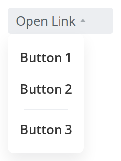
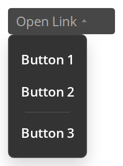
The menu shown on first render (isOpen): the link keeps its highlighted background and the chevron points up while the menu is open. Clicking outside or picking an entry closes it.
Css Customization
The variables are listed under CSS variables on this page. The first link shows the text, background, radius and padding variables; hover it or open its menu to see the hover pair. The second, with isDisabled, is there for --link-with-dropdown-disabled-color.

Minimal example
The link opens and closes itself; data is a list of
DropDownItem props.
import { LinkWithDropdown } from "@onlyoffice/apps-ui-kit/components/link-with-dropdown";

export function SortLink({ onSort }: { onSort: (by: string) => void }) {
  return (
    <LinkWithDropdown
      withExpander
      data={[
        { key: "name", label: "Name", onClick: () => onSort("name") },
        { key: "date", label: "Last modified", onClick: () => onSort("date") },
        { key: "size", label: "Size", onClick: () => onSort("size") },
      ]}
    >
      Sort by
    </LinkWithDropdown>
  );
}
Props
The entries of data are ContextMenuModels — see
ContextMenu for the shape. Only key and label are
required.
Recipes
Open / close (controlled)
isOpen is copied into the component's own state whenever it changes, and the component keeps
toggling that state on its own. Hold the value yourself if you need to open the menu from
elsewhere — and expect the two to drift once the user closes it by clicking outside.
import { useState } from "react";
import { LinkWithDropdown } from "@onlyoffice/apps-ui-kit/components/link-with-dropdown";

export function RoleLink({ role }: { role: string }) {
  const [open, setOpen] = useState(false);

  return (
    <div>
      <button type="button" onClick={() => setOpen((v) => !v)}>
        Toggle from outside
      </button>
      <LinkWithDropdown
        isOpen={open}
        withExpander
        data={[
          { key: "viewer", label: "Viewer" },
          { key: "editor", label: "Editor" },
        ]}
      >
        {role}
      </LinkWithDropdown>
    </div>
  );
}
Disabled / read-only
isDisabled greys the text and stops the click, so the menu can no longer be opened; the
cursor stays an arrow instead of turning into a pointer.
import { LinkWithDropdown } from "@onlyoffice/apps-ui-kit/components/link-with-dropdown";

export function FixedRole({ role }: { role: string }) {
  return (
    <LinkWithDropdown isDisabled data={[]}>
      {role}
    </LinkWithDropdown>
  );
}
Behaviour the types don't state
- An entry's
onClickis found by matching itskeyagainst a DOM attribute, so the key has to be a string: a numerickeyis read back as text, the lookup misses, and the menu closes without calling anything. - The menu closes on any entry click, before the entry's own handler runs.
isOpenis a seed, not a source of truth. It is applied through an effect on change, so re-passing the sametrueafter the user closed the menu does not reopen it.window.orientationis read while the component is being created, so it throws when rendered on a server. Render it on the client only.hasScrollonly does anything on a phone. Elsewhere it is ignored; on a phone the menu is given a fixed height — 250px upright, 100px in landscape — and its own scrollbar.- Unknown props are spread onto both the
<a>and the menu. Anything the component does not destructure reaches two elements, and reaches the DOM, where React reports it in the console. - The trigger is an
<a>with nohref, wrapped in two<span>s, and the outer one is what carriesid,styleand the click target.classNameis applied to the outer span, to the<a>and to the expander wrapper — all three. isTextOverflowcaps the text at 200px (--link-dropdown-max-width) and truncates it; without it the text is never shortened.- The link brings its own padding of
4px 8pxand isdisplay: inline-block, so it sits slightly wider than the text it replaces. isHoveredis declared and never read; the hover state comes from CSS.
CSS variables
Set them on any ancestor.
--link-with-dropdown-color also paints the chevron that withExpander draws, and the chevron
keeps it on hover and while the menu is open, when the text switches to
--link-with-dropdown-hover-color. The background, radius and padding belong to the link's
outer box, so --link-with-dropdown-bg shows only while the link is closed and not hovered.
color overrides the first of these as an inline style, so it wins over any of them.
Accessibility
- The trigger carries
role="button",aria-haspopup,aria-expandedandaria-disabled, which is more than most of this kit — but it has notabIndexand no key handler, so it cannot be focused or opened from the keyboard. - The menu is a
DropDownand inherits its behaviour, including the outside-click close and the lack of focus trapping. titleis a plaintitleattribute: a mouse tooltip, not an accessible name.- Where the choice matters,
ComboBoxis the component with real select semantics.
Test ids
The component sets data-test-id="link-dropdown", with dashes — not data-testid — so
Testing Library's getByTestId does not find it. Query it as
[data-test-id="link-dropdown"], or pass an id.
| Element | Attribute |
|---|---|
| The link | data-test-id="link-dropdown" |
| A menu entry | data-testid="link_with_drop_down_<key>" |
Related
DropDown— the menu this opens.DropDownItem— what each entry ofdatabecomes.Link— the plain link, without a menu.