EmptyView
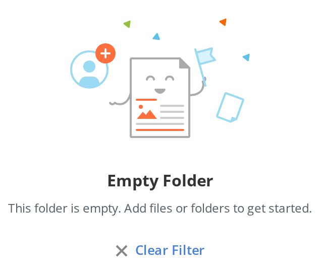
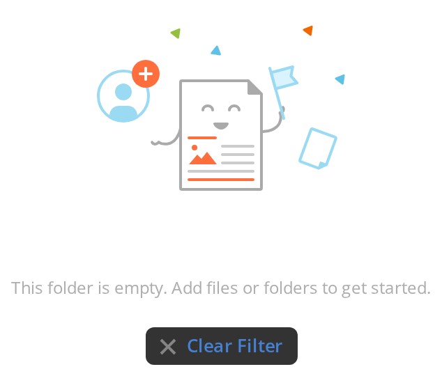
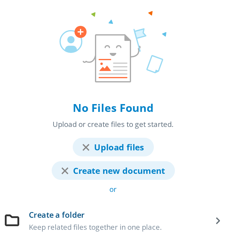
Centred empty state with an icon, a title, a description and a list of things the user can do next. It places itself, so it goes straight into the region it fills.
Use this when / not when
- Use when a list, a room or a panel has nothing in it and the user can act on that: create something, invite someone, change a filter.
- Not when the emptiness is the result of an error —
ErrorContaineris the one with the error framing. - Not when content is on its way: a skeleton such as
RectangleSkeletonsays "wait", while this one says "there is nothing". - Not for the portal's own empty screens, which carry their own imagery and layout: that is
EmptyScreenContainer.
Import
import { EmptyView } from "@onlyoffice/apps-ui-kit/components/empty-view";
Also exported from the root barrel @onlyoffice/apps-ui-kit.
Needs ThemeProvider from @onlyoffice/apps-ui-kit/providers/theme above it in the tree for
the title, description and item colours.
Stories
Default
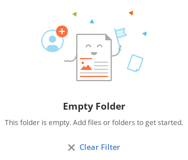
The common case: an illustration, a title and a description, with one link that takes the user somewhere they can act. Change the texts live in the Controls panel below.
No Options
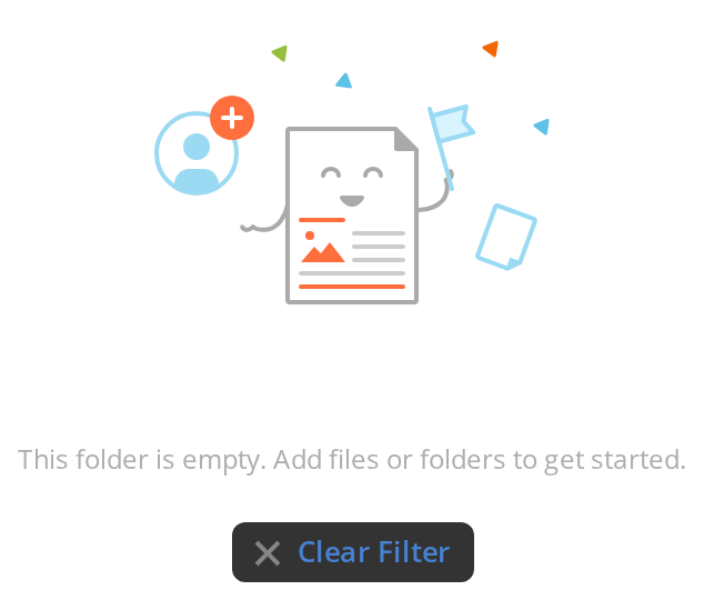
For an empty state the user cannot act on, such as a search with no results: only the illustration, the title and the description (options={null}).


With Multiple Options
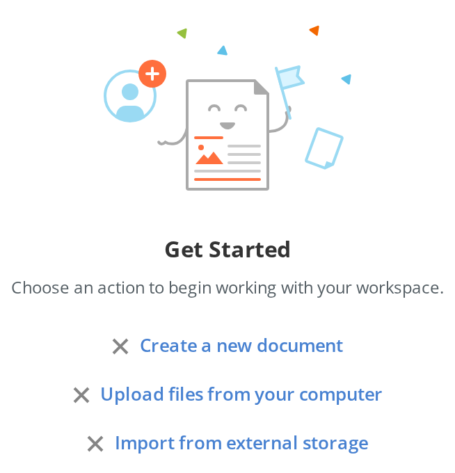
When several next steps are equally likely, offer each as a link; they stack under the description in the order given.
Suggestion Cards
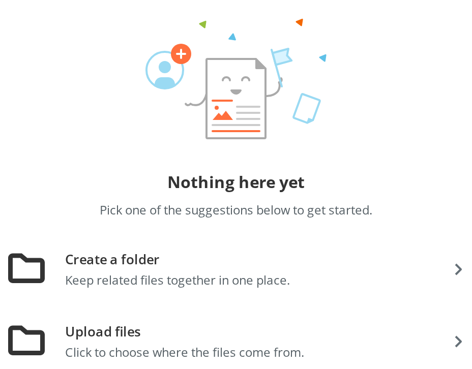
Cards give each next step a title and a line of explanation, for when a link alone would not say enough:
- Create a folder — a plain card; clicking it runs its
onClick - Upload files — click it to open a menu of choices instead (
model) - A third card, Browse templates, is
disabledand therefore not rendered at all
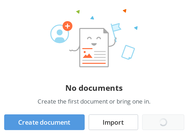
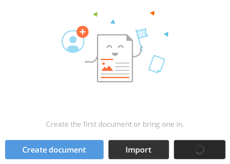
With Buttons
Buttons suit a step that starts work right here rather than going somewhere; they line up in a row and wrap when there is no room:
- Create document — primary, which is what a button option is unless told otherwise
- Import — secondary (
primary: false) - Sync — secondary, with a loader while its work runs (
isLoading)
Text Actions With Separator
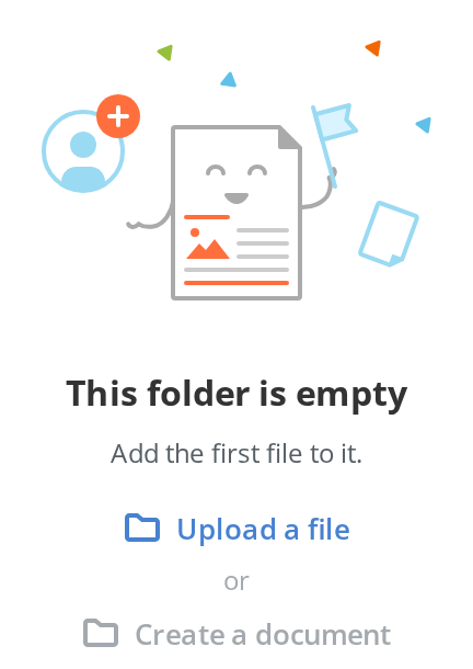
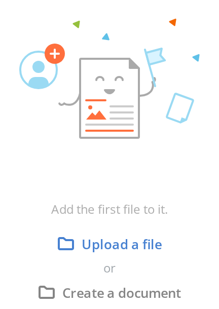
Text actions are the lightest option, for two alternatives joined by a word:
- Upload a file — an accented icon-and-text action (
type: "action") - or — a separator line of text between the two (
type: "separator") - Create a document — the same action in grey, for the less likely choice (
className: "secondary")
With Extra Content
When the empty state needs something the option types do not cover — a hint, a form, a picture — it goes between the description and the options (extraContent).
Right To Left
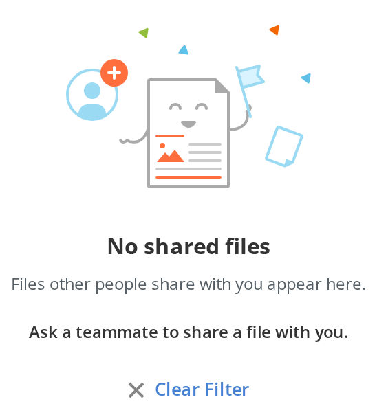
The same empty state under a right-to-left interface: in the suggestion card the icon moves to the right edge, the text aligns right, and the arrow moves to the left edge and points left. The direction comes from the theme's interfaceDirection (the Direction toolbar); the wrapper also carries dir="rtl" for the rules that read the DOM direction.
Css Customization
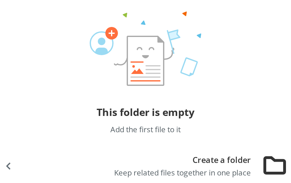
Every overridable variable set on one wrapper -- the variables are listed under CSS variables on this page. The instance holds two links, a separator and a suggestion card. Hover a link and the card to see the hover backgrounds.
Minimal example
options is required; pass null for an empty state with nothing to do.
import { EmptyView } from "@onlyoffice/apps-ui-kit/components/empty-view";

export function NoRooms({ onCreate }: { onCreate: () => void }) {
  return (
    <EmptyView
      icon={
        <svg viewBox="0 0 96 96" width="96" height="96" aria-hidden="true">
          <rect
            x="8"
            y="8"
            width="80"
            height="80"
            rx="8"
            fill="none"
            stroke="currentColor"
          />
        </svg>
      }
      title="No rooms yet"
      description="Rooms are where you collaborate on files with other people."
      options={[
        {
          key: "create",
          type: "button",
          title: "Create a room",
          onClick: onCreate,
        },
      ]}
    />
  );
}
Props
Recipes
A list of suggestions with a separator
import { EmptyView } from "@onlyoffice/apps-ui-kit/components/empty-view";

const ICON = (
  <svg viewBox="0 0 24 24" width="24" height="24" aria-hidden="true">
    <circle cx="12" cy="12" r="10" fill="none" stroke="currentColor" />
  </svg>
);

export function EmptyFolder({
  onUpload,
  onCreateFile,
}: {
  onUpload: () => void;
  onCreateFile: () => void;
}) {
  return (
    <EmptyView
      icon={ICON}
      title="This folder is empty"
      description="Add the first file to it."
      options={[
        {
          key: "upload",
          type: "action",
          title: "Upload a file",
          icon: ICON,
          onClick: onUpload,
        },
        { key: "or", type: "separator", text: "or" },
        {
          key: "create",
          type: "action",
          title: "Create a document",
          icon: ICON,
          onClick: onCreateFile,
        },
      ]}
    />
  );
}
Behaviour the types don't state
- It positions itself. The wrapper is
margin-inline: auto,width: 100%, capped at--empty-view-width(480px), with--empty-view-padding-topof 61px — 40px on mobile — and an 18px gap between its parts. Put it directly in the region it fills; a wrapper of your own that centres it again will fight it. - Option types are told apart by shape, not only by
type. An option with atofield is a link whatever else it carries;button,separatorandactionare matched ontype; anything else falls through to an item. A link option therefore cannot also be a button. - A link option without
LinkRoutersilently stops navigating. It renders as an action link with the same icon and text, and thetoyou passed is ignored. Pass your router'sLinkcomponent, or use anactionoption with anonClick. isNext: truehas the same effect on purpose, for a link that should run a handler rather than navigate.- An item with a
modelopens that context menu on click and does not call itsonClick. - An item with
disabled: trueis not rendered at all — there is no greyed-out state. - A
buttonoption isprimaryunless you say otherwise, and is alwaysButtonSize.small. extraContentrenders between the header and the options, outside the body element, so it does not take the body's gap.
CSS variables
--empty-view-link-accent loses to --accent-main: wherever the host page defines that
token, it colours the link options instead. An action option has no variable of its own —
its colour is --accent-main, or a fixed blue without it. The pressed backgrounds of links and
items have no override either.
Accessibility
- The title renders as an
<h3>and the description as a<p>; the wrapper has no landmark role, so place it inside your own region. - An item is a
<div>withrole="button",tabIndex={0}and anaria-labelof itstitle, so it is in the Tab order and announced by its title — but it has no key handler, so Enter and Space do not activate it. - An
actionoption is a<div>withrole="button"andtabIndex={0}, named by its own text; it has no key handler either, so Enter and Space do not activate it. - A
buttonoption is a native<button>, activated by Enter and Space. A link option is whatever yourLinkRouterrenders; without one (or withisNext) it is an<a>with nohref, which has no role and is not in the Tab order. - The icon you pass is rendered as given; mark it
aria-hiddenunless it carries meaning the title does not.
Test ids
Neither can be overridden by a prop.
Related
EmptyScreenContainer— the portal's own empty screens.ErrorContainer— when the emptiness is a failure.RectangleSkeleton— when the content is still loading.