Scrollbar
Scrolling region with the kit's own thin tracks, which fade out when nothing is happening. It
is what Aside and DropDown put their
content in.
Use this when / not when
- Use for a region of your own that scrolls and should look like the rest of the portal: a panel's body, a long list, a dialog's content.
- Not for the page itself. The component needs a parent with a height, and the browser's own scrollbar is the right one for the document.
- Not around a virtualised list of your own —
InfiniteLoaderbrings its own, and nesting two scrolling regions makes both awkward. - Not to hide a scrollbar.
noScrollYstops the content scrolling; it does not hide an overflow.
Import
import { Scrollbar } from "@onlyoffice/apps-ui-kit/components/scrollbar";
Also exported from the root barrel @onlyoffice/apps-ui-kit.
Needs ThemeProvider from @onlyoffice/apps-ui-kit/providers/theme for the thumb's colours,
which differ between the light and the dark theme.
Stories
Default
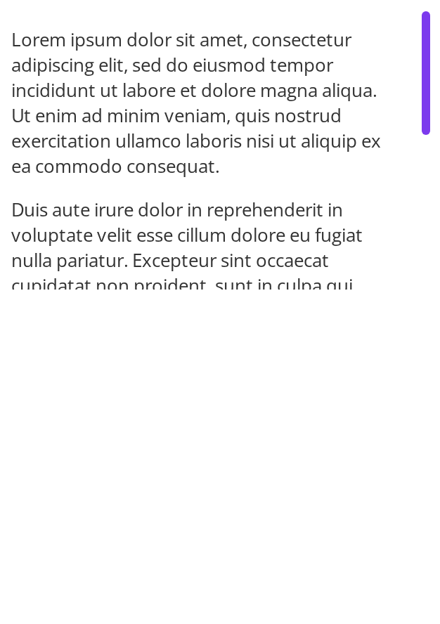
Tall content in a fixed-size box, with auto-hide turned off so the vertical track stays on screen (autoHide={false}); change any other prop live in the Controls panel below.
With Auto Hide
The default behaviour, for content where a permanent track would distract: the track stays hidden until you scroll or move the pointer over the content, then fades out three seconds later (autoHide).
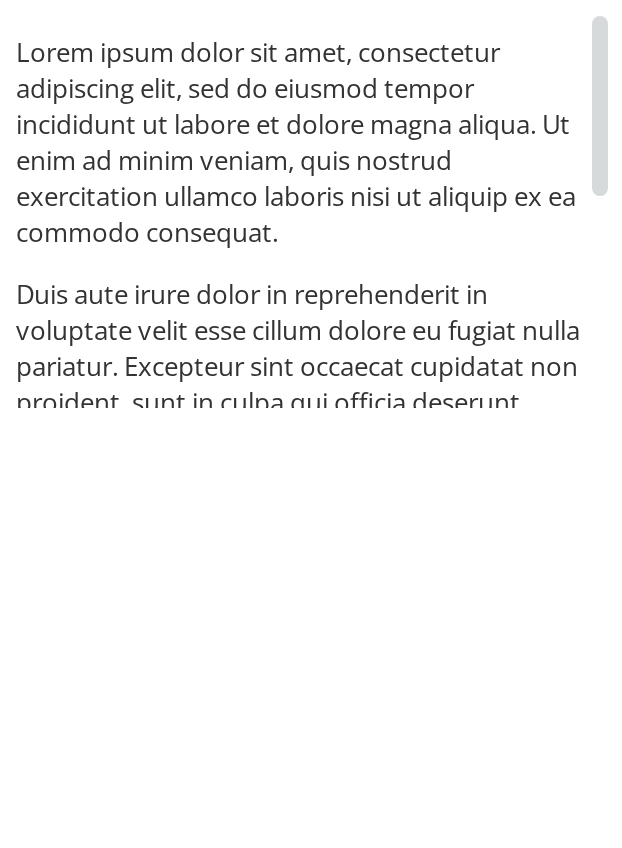
With Fixed Size
The thumb stays at its wider 8px thickness on desktop instead of widening only while the pointer is over the track, so it is easier to find and grab (fixedSize).
With Horizontal Scroll
Content that overflows sideways gets a horizontal track along the bottom edge, drawn the same way as the vertical one.


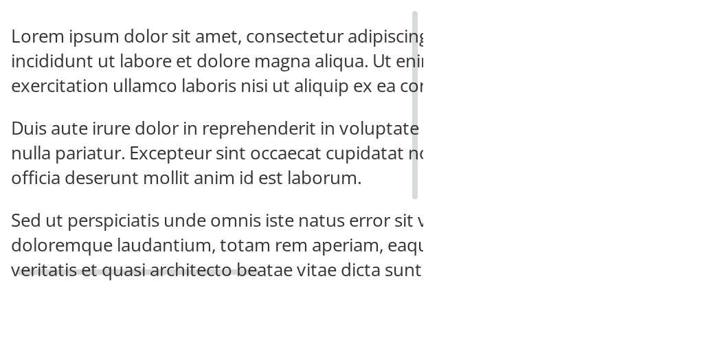
With Both Scrollbars
Content taller and wider than the box shows both tracks, each shortened by 16px so they do not overlap in the corner.
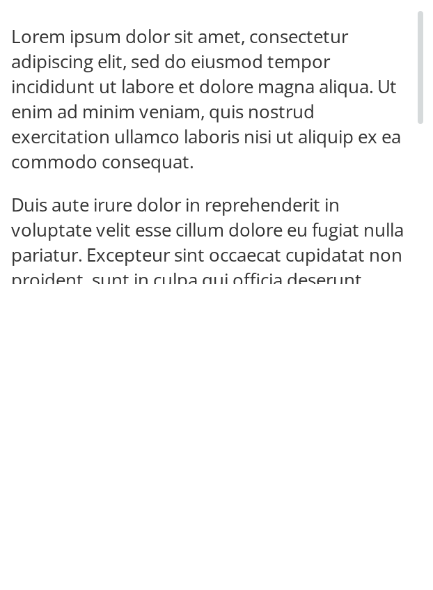
With Padding After Last Item
Scrollbar with additional padding after the last item, providing extra space at the bottom of scrollable content.
With Padding Inline End
Scrollbar with inline-end padding, adding space on the right (or left in RTL) side of the scroll body.
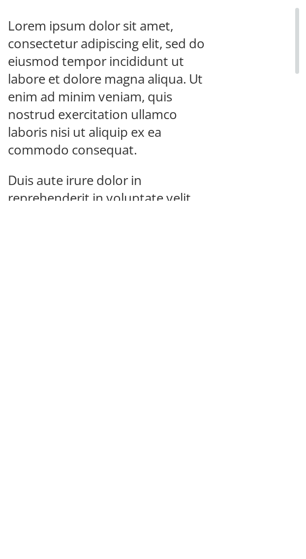
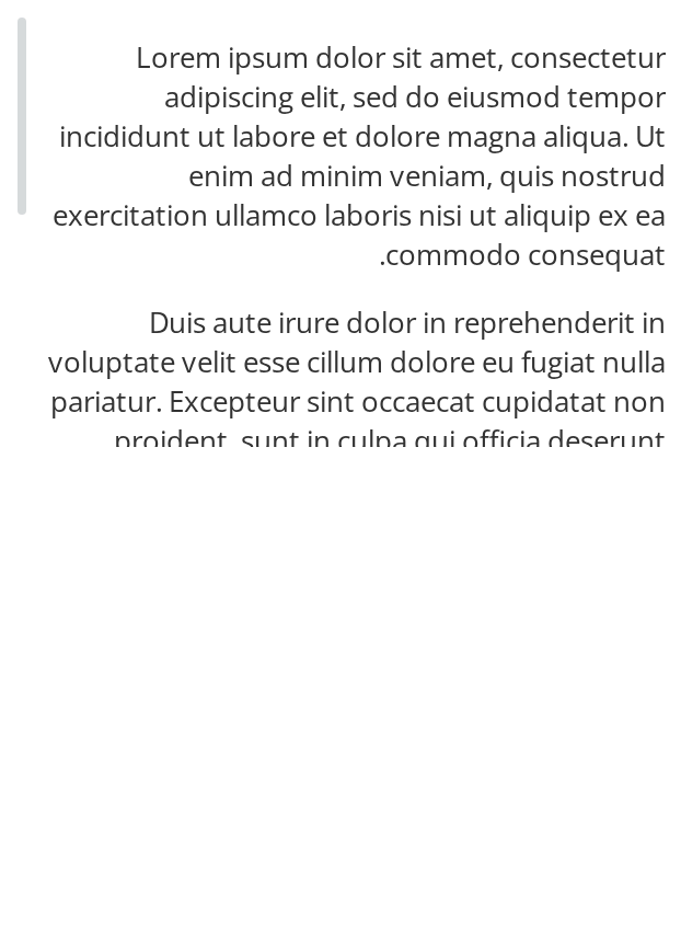
Right To Left
The same box under a right-to-left interface: the vertical track moves to the left edge, the text aligns to the right and the content's inline-end padding moves to the left with the track. The direction comes from the theme's interfaceDirection (the Direction toolbar); the wrapper also carries dir="rtl" for the text itself.
Css Customization
The variables are listed under CSS variables on this page. The example sets the thumb colours (hover and drag the thumb to see the other two), a 6px thumb, a 2px track padding and 32px of space before the track.
Minimal example
The scrolling element takes the height of its parent, so the parent is where the height goes.
import { Scrollbar } from "@onlyoffice/apps-ui-kit/components/scrollbar";

export function MemberList({ names }: { names: string[] }) {
  return (
    <div style={{ height: 320 }}>
      <Scrollbar>
        {names.map((name) => (
          <p key={name} style={{ margin: "8px 16px" }}>
            {name}
          </p>
        ))}
      </Scrollbar>
    </div>
  );
}
Props
Recipes
A region the keyboard can scroll
tabIndex is -1 by default, which keeps the region out of the tab order and so out of reach of
the arrow keys. Pass 0 when the content is long enough to matter.
import { Scrollbar } from "@onlyoffice/apps-ui-kit/components/scrollbar";

export function TermsOfUse({ text }: { text: string }) {
  return (
    <div style={{ height: 240 }}>
      <Scrollbar tabIndex={0} autoHide={false}>
        <p style={{ margin: 16 }}>{text}</p>
      </Scrollbar>
    </div>
  );
}
Growing with its content instead of filling its parent
import { Scrollbar } from "@onlyoffice/apps-ui-kit/components/scrollbar";

export function ShortList({ names }: { names: string[] }) {
  return (
    <Scrollbar translateContentSizeYToHolder style={{ maxHeight: 200 }}>
      {names.map((name) => (
        <p key={name} style={{ margin: "8px 16px" }}>
          {name}
        </p>
      ))}
    </Scrollbar>
  );
}
Behaviour the types don't state
- It needs a parent with a height. The scrolling element fills its parent, so a
Scrollbarin a box of automatic height has nothing to scroll.translateContentSizeYToHolderis the way round it, together with amax-height. - The tracks are hidden until something happens. With
autoHide— the default — they appear on a scroll or a pointer move and fade three seconds later.autoHide={false}keeps them, which is kinder for a region a user has to read. - The markup is three nested elements:
.scroll-wrapper, then.scroller, then.scroll-body. Other parts of the kit find the scrolling element by exactly that path — theInfiniteLoaderlooks for#sectionScroll .scroll-wrapper > .scroller— so give the outer element an id rather than restructuring the inside. paddingAfterLastItemandpaddingInlineEndare written as custom properties in an effect, and only when they are truthy: clearing either one leaves the last value in place.contentRefis filled in by the ref setter rather than forwarded, so it is available after mount, not during render.rtlfollows the interface direction when you leave it out; in a right-to-left interface the vertical track moves to the left edge.- The thumb thickens on desktop. From 1024px up it widens from 4px to 8px while the pointer
is over its track or the thumb is pressed.
fixedSizekeeps it at 8px there all the time; below 1024px both stay at--scrollbar-thumb-size. - The scrollbar is the vendored
react-scrollbars-custom, configured by the kit;refgives you its instance, withscrollTop,scrollToand the element handles.
CSS variables
The track itself is transparent, so --scrollbar-radius shows only where it clips a thumb that
reaches the track's corner — with --scrollbar-track-padding: 0.
Accessibility
- The scrolling element's
tabIndexis -1, so a keyboard user cannot focus the region and cannot scroll it with the arrow keys. PasstabIndex={0}for any region with content worth reading, and give it anaria-labelthrough the wrapper. - Nothing here announces that the region scrolls; the tracks are decoration, drawn with
<div>s. autoHidehides the only visual cue that there is more below. Turn it off when that cue matters.
Test ids
| Element | data-testid |
|---|---|
| The outermost element | scrollbar |
| The scrolling element | scroller |
| The content element | scroll-body |
None of them can be overridden by a prop.
Related
Aside— wraps its children in one of these unless told not to.DropDown— uses one for a list with amaxHeight.InfiniteLoader— the virtualised list, which looks for this component's inner elements by class.