SelectionArea
Rubber-band selection: a dragged rectangle that reports which items it covers, frame by frame. It renders one fixed, invisible box and does all its work through document listeners and class names you give it.
Use this when / not when
- Use over a listing whose items you can label with classes and a
valueattribute, when dragging across them should select them. - It does nothing without an element whose id is the literal
sectionScroll. Every mouse-down outside one is ignored.Sectionrenders that element as its body scroller, so inside one this is already satisfied; anywhere else, give the scrolling element that id yourself or the component is inert. - Not for selecting one item — that is the checkbox on
TilesorRows. - Not for dragging items somewhere —
DragAndDropis the drop target. - It holds no selection.
onMovehands you the full covered and uncovered sets on every frame; keeping and applying them is yours. - It is pointer-only. There is no keyboard equivalent and no focus handling of any kind.
Import
import { SelectionArea } from "@onlyoffice/apps-ui-kit/components/selection-area";
Also exported from the root barrel @onlyoffice/apps-ui-kit.
Needs ThemeProvider above it in the tree for the rectangle's border colour, and for the writing
direction — in a right-to-left interface the tile column index is mirrored, which it learns from
the provider's direction context.
Stories
Default
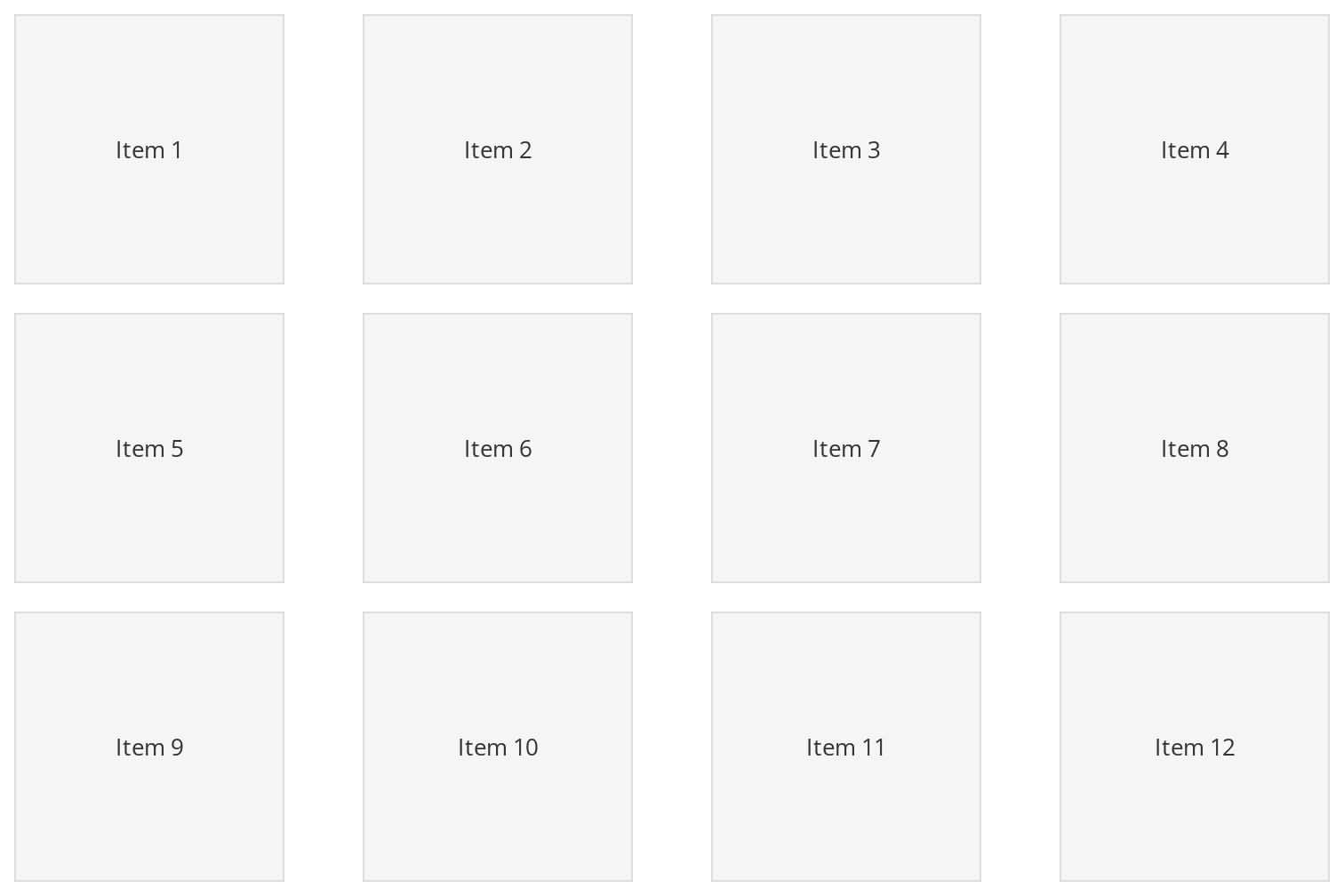
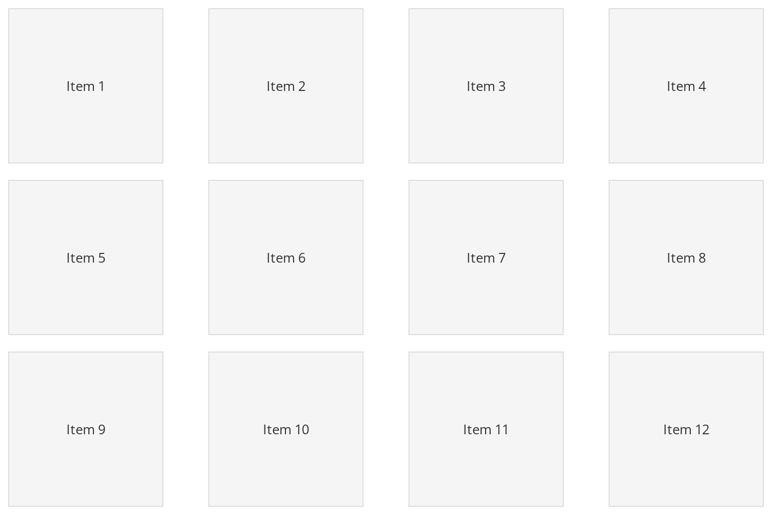
A grid of tiles, the layout the rectangle's column and row arithmetic is built for. Click and drag across the items to select them; a covered tile turns blue. Change any other prop live in the Controls panel below.
Row View
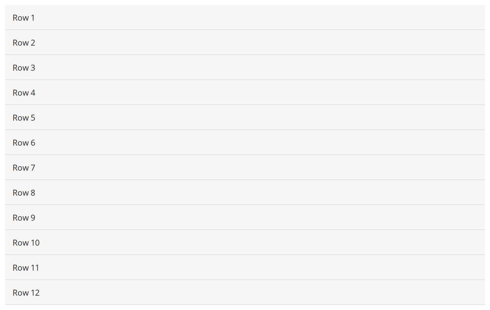
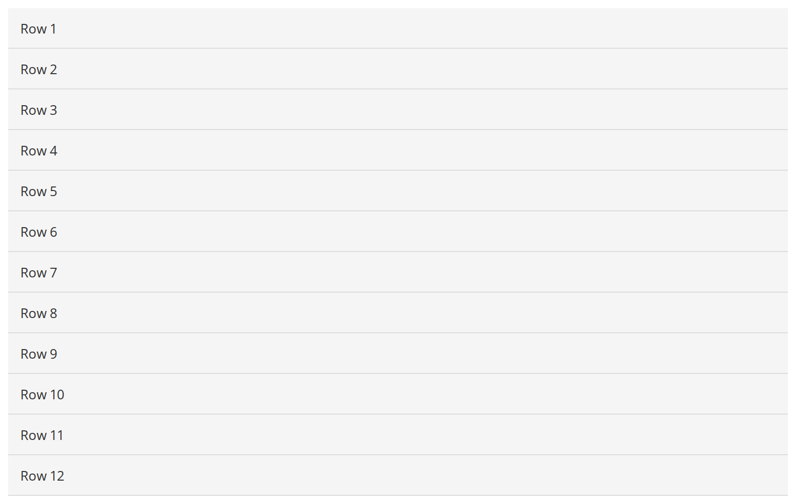
A list of equal-height rows, where only the rectangle's vertical extent decides what is covered: drag down from any row and every row it crosses turns blue, however far to the side the pointer goes (viewAs). Each row keeps its value on a child, found by itemClass.
Right To Left
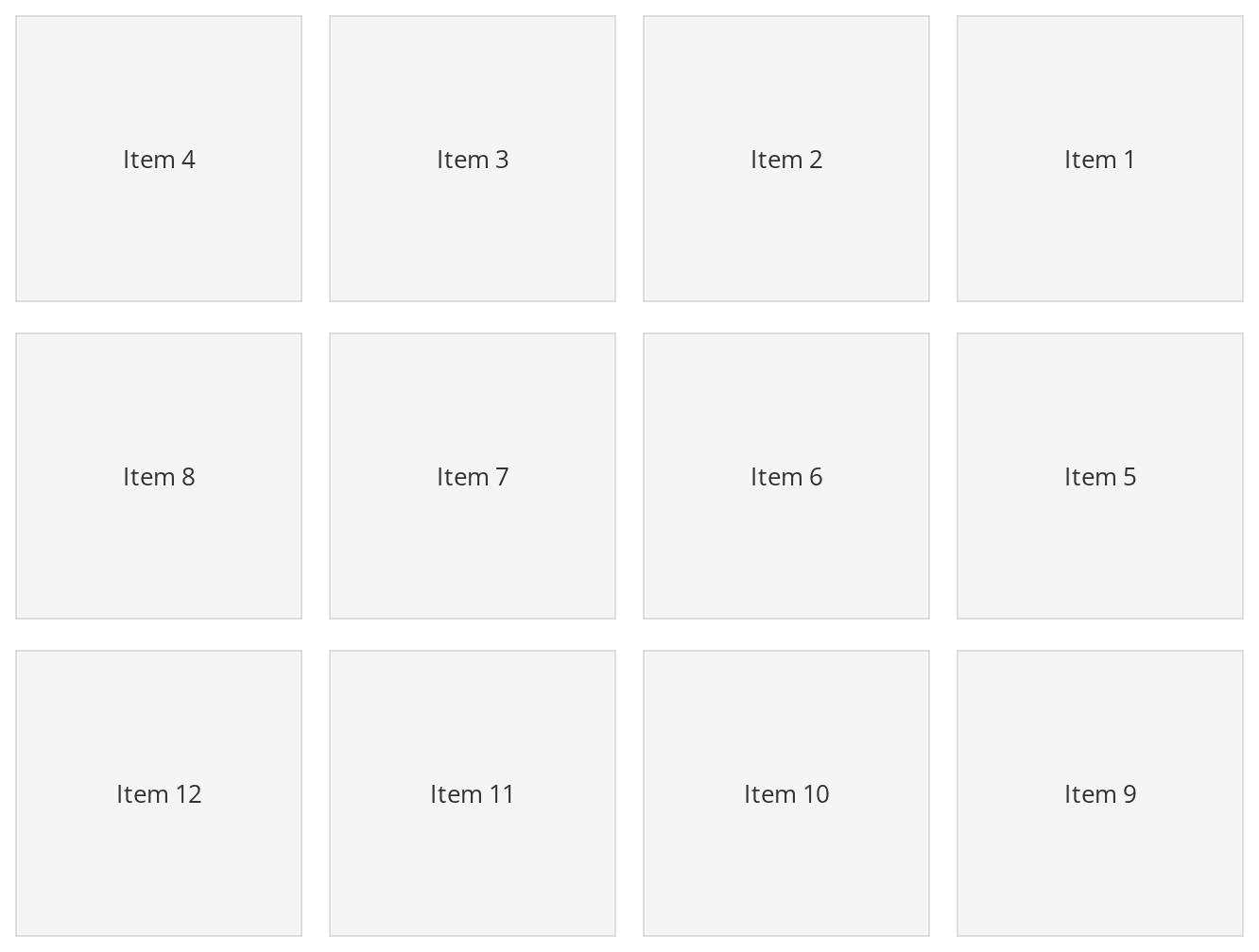
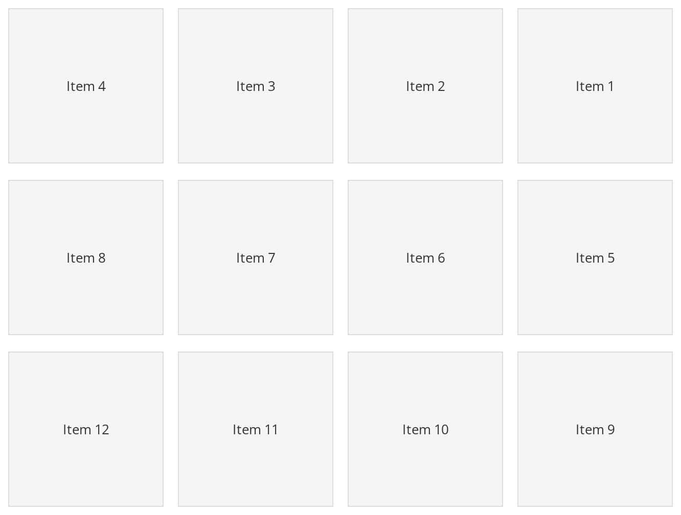
The tile grid in a right-to-left layout: the first tile sits in the top right corner, and a drag across the right-hand column selects the first tile of each row. The wrapper carries dir="rtl" for the grid; the component mirrors its column order from the theme's interfaceDirection (the Direction toolbar).
Css Customization
All three variables set on one wrapper -- the variables are listed under CSS variables on this page. Drag across the tiles to see the fill and the border.
Minimal example
import { useState } from "react";

import { SelectionArea } from "@onlyoffice/apps-ui-kit/components/selection-area";

const files = ["Report.docx", "Notes.txt", "Budget.xlsx"];

export function SelectableList() {
  const [selected, setSelected] = useState<string[]>([]);

  return (
    <div id="sectionScroll" className="files-scroll">
      <SelectionArea
        viewAs="row"
        containerClass="files-scroll"
        scrollClass="files-scroll"
        itemsContainerClass="files-list"
        selectableClass="file-row"
        itemClass="file-row-value"
        onMove={({ added }) =>
          setSelected(
            added.map((node) => node.textContent ?? "").filter(Boolean),
          )
        }
      />
      <div className="files-list">
        {files.map((name, index) => (
          <div key={name} className="file-row">
            <div className="file-row-value" data-value={`file_${index}`}>
              {name}
            </div>
          </div>
        ))}
      </div>
      <p>{selected.length} selected</p>
    </div>
  );
}
Props
Recipes
Labelling the items
Each selectable element needs a value attribute shaped type_…_index: the first
_-separated part names the group, the last is the item's position within the listing. In row
view the attribute is looked for on the descendant carrying itemClass; in tile view on the
selectable element itself.
import { SelectionArea } from "@onlyoffice/apps-ui-kit/components/selection-area";

const rooms = ["Marketing", "Design", "Legal"];

export function LabelledTiles() {
  return (
    <div id="sectionScroll" className="tiles-scroll">
      <SelectionArea
        viewAs="tile"
        containerClass="tiles-scroll"
        scrollClass="tiles-scroll"
        itemsContainerClass="tiles-grid"
        selectableClass="room-tile"
        itemClass="room-tile"
        countTilesInRow={3}
        folderHeaderHeight={0}
        defaultHeaderHeight={0}
        arrayTypes={[{ type: "room", itemHeight: 180, rowGap: 16 }]}
        isRooms
        onMove={({ added }) => console.info(added.length)}
      />
      <div className="tiles-grid">
        {rooms.map((room, index) => (
          <div key={room} className="room-tile" data-value={`room_${index}`}>
            {room}
          </div>
        ))}
      </div>
    </div>
  );
}
Applying the result
added and removed together cover every selectable element on each frame, so the simplest
correct handler replaces the whole selection rather than merging.
import { useCallback, useState } from "react";

import { SelectionArea } from "@onlyoffice/apps-ui-kit/components/selection-area";

export function ControlledSelection({ ids }: { ids: string[] }) {
  const [selected, setSelected] = useState<Set<string>>(new Set());

  const onMove = useCallback(({ added }: { added: Element[] }) => {
    const next = new Set<string>();
    for (const node of added) {
      const value = node.getAttribute("data-value");
      if (value) next.add(value);
    }
    setSelected(next);
  }, []);

  return (
    <div id="sectionScroll" className="scroll">
      <SelectionArea
        viewAs="row"
        containerClass="scroll"
        scrollClass="scroll"
        itemsContainerClass="list"
        selectableClass="row"
        itemClass="row-value"
        onMove={onMove}
      />
      <div className="list">
        {ids.map((id, index) => (
          <div key={id} className="row">
            <div className="row-value" data-value={`item_${index}`}>
              {id}
              {selected.has(`item_${index}`) ? " ✓" : ""}
            </div>
          </div>
        ))}
      </div>
    </div>
  );
}
Behaviour the types don't state
- The literal id
sectionScrollis a hard requirement. A mouse-down whose target is not inside an element with that id is ignored outright.Sectionputs it on its body scroller, but only whilewithBodyScrollis set and the layout is not the phone one — so a section that does not scroll its own body leaves this component inert as well. - Six more literal class names cancel a selection before it starts:
not-selectable,tile-selected,table-row-selected,row-selected,table-container_row-checkboxanditem-file-name. A mouse-down inside any of them does nothing. - Positions are computed, not measured. The first selectable element is measured once at the
start of each drag, and every other item's rectangle is derived from its index, that height and
the gaps in
arrayTypes. A listing whose items differ in height selects the wrong ones. addedandremovedare not deltas. On each animation frame every selectable element is classified afresh:addedis everything the rectangle covers now,removedeverything it does not.clearnever arrives. The one call that would set it is guarded by a comparison of the pointer's position with itself, which is always zero — the flag inTOnMoveis unreachable.- The drag starts after 10px. Below that threshold the rectangle stays hidden and no
onMovefires, so a plain click never reports anything. - Only the left button starts a selection. A press with any other button is dropped straight
after
onMouseDownhas been called. onMouseDownfires for every button and every target, because it is called before the left-button check and before the class-name checks.- In tile view three optional props are treated as required.
countTilesInRow,folderHeaderHeightanddefaultHeaderHeightare asserted to exist; leaving them out makes the computed positionsNaNand nothing is ever covered. - It listens on the document for as long as it is mounted, adding
mousemove,mouseupand ascrolllistener on the scrolling element for the duration of a drag, plus ablurlistener on the window that cancels it. - The rectangle is
position: fixedatz-index: 1000and is painted over everything; it is moved by writing inline styles, not by React.
CSS variables
Accessibility
- There is no keyboard equivalent. Range selection here is a mouse gesture and nothing else; provide checkboxes or a Shift-click path on the items themselves so that a keyboard user can select more than one.
- The rectangle is a decorative
<div>with no role and no label, and nothing announces how many items are covered. Put the count in a live region of your own if it matters. - Because it works from a document-level
mousedown, it competes with anything else that starts on the same event; the class names above are the only way to opt an element out.
Test ids
It is not settable. The element also carries the stable class selection-area.
Related
Tiles— the tile listing this is normally dragged over.Rows— the same for the list view.DragAndDrop— for dragging files in, rather than selecting.