FilterInput


Works only inside an ONLYOFFICE Apps portal: it needs the portal's API client, stores and translations, and is not part of the public API.
The bar above a file listing: search, a filter panel, a sort menu, a view switch and the chips for what is in force. It holds no filter state of its own — you tell it what is selected through two getters and it tells you what changed.
Use this when / not when
- This is portal-internal. Its filter groups, its contacts pages and its room grouping row are DocSpace's; the type even names the pages it can be on.
- Use it above a listing that already has a filter model of the shape the panel expects.
- Not for a plain search box —
SearchInputis that, and this renders one inside itself. - Not for the chips alone —
SelectedItemis the chip. - Every getter must be stable. They are effect dependencies, and one recreated on each render either re-runs a request or loops; see the behaviour notes.
- It renders no selector. The step where the panel picks a person or a room is yours, through
renderSelector.
Import
import FilterInput from "@onlyoffice/apps-ui-kit/components/filter";
It is a default export, so the name is yours to choose; FilterInput is also exported by name
and reaches the root barrel @onlyoffice/apps-ui-kit through it.
Needs ThemeProvider above it in the tree for its colours, and TranslationProvider for the
labels it does not take as props — "Clear all", "All rooms", "Create group" and the group
management tooltip render as empty strings without one.
Stories
Default
The bar as a desktop listing shows it: the search box, the filter button, the sort button and the button that switches to the other view. Change any prop live in the Controls panel below.


Document Types
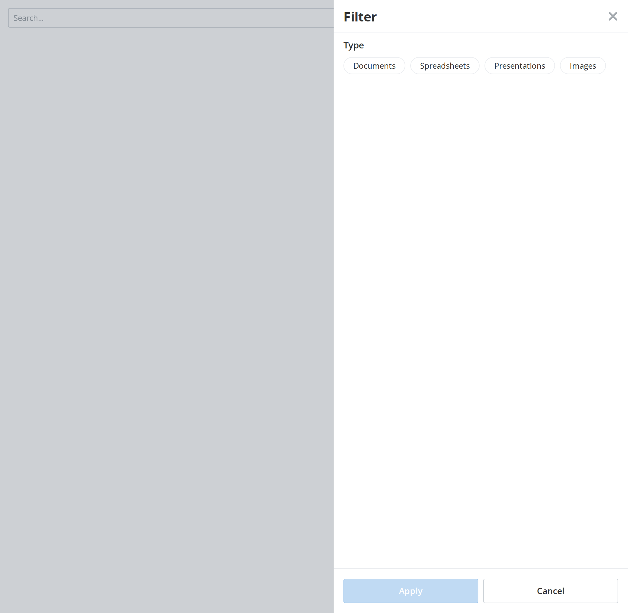
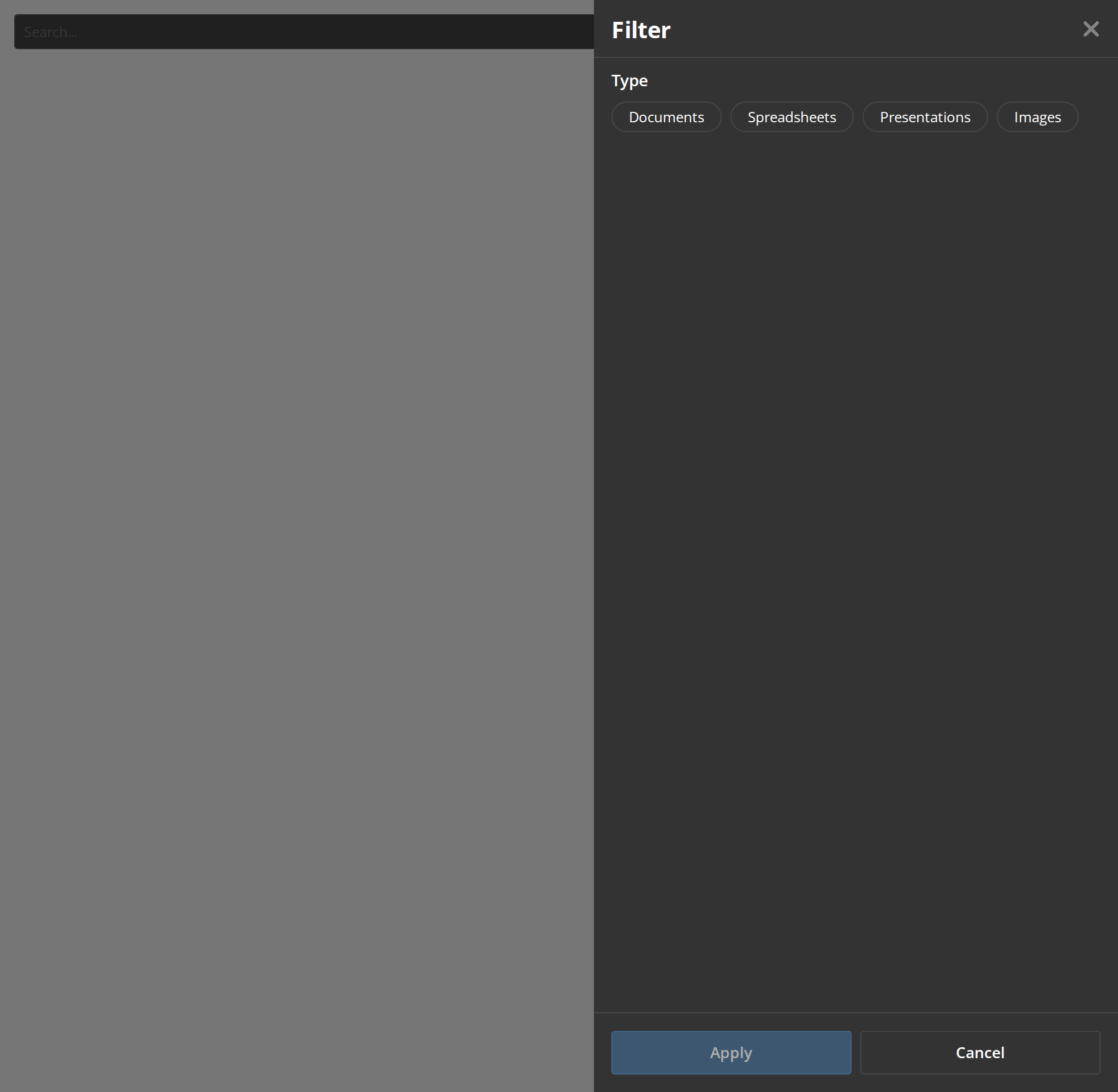
The filter panel with one group of options, opened for you when the story loads. Pick a type and press Apply to see the selection reach onFilter in the Actions panel.
With Selected Filters
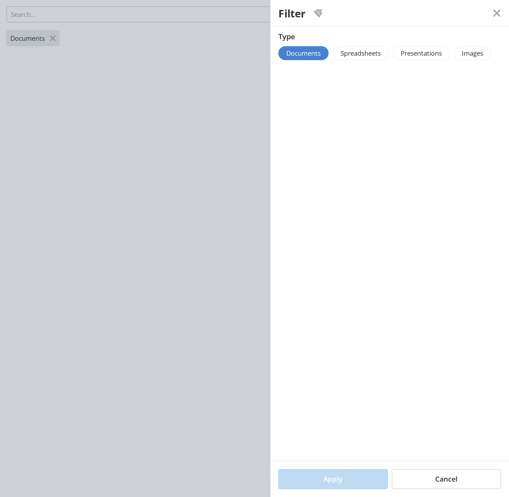
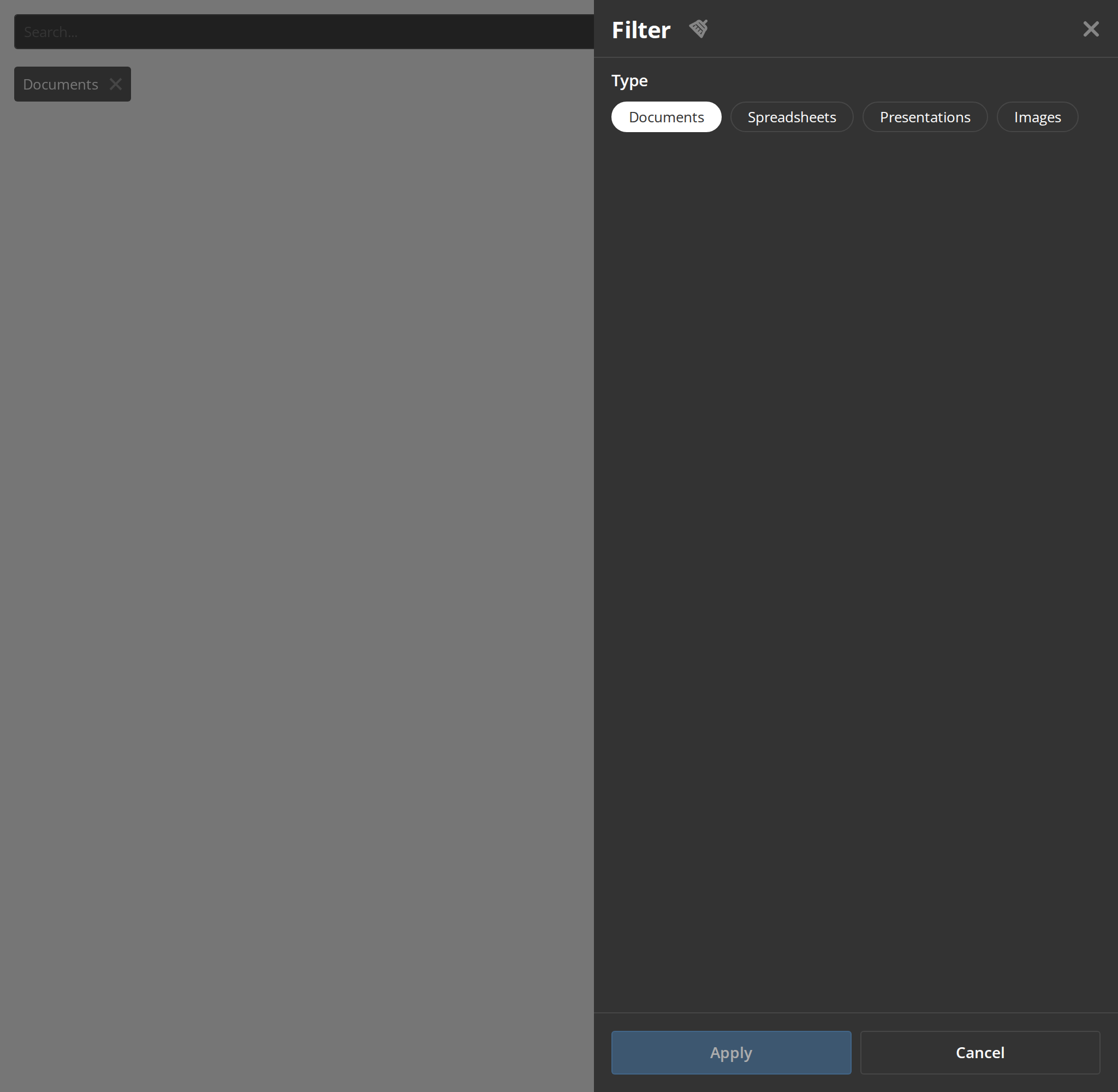
A filter already in force when the bar mounts: its chip is under the search box and its option is highlighted in the panel, opened for you when the story loads (initSelectedFilterData). Apply stays disabled until the selection changes.
Multiple Filter Groups
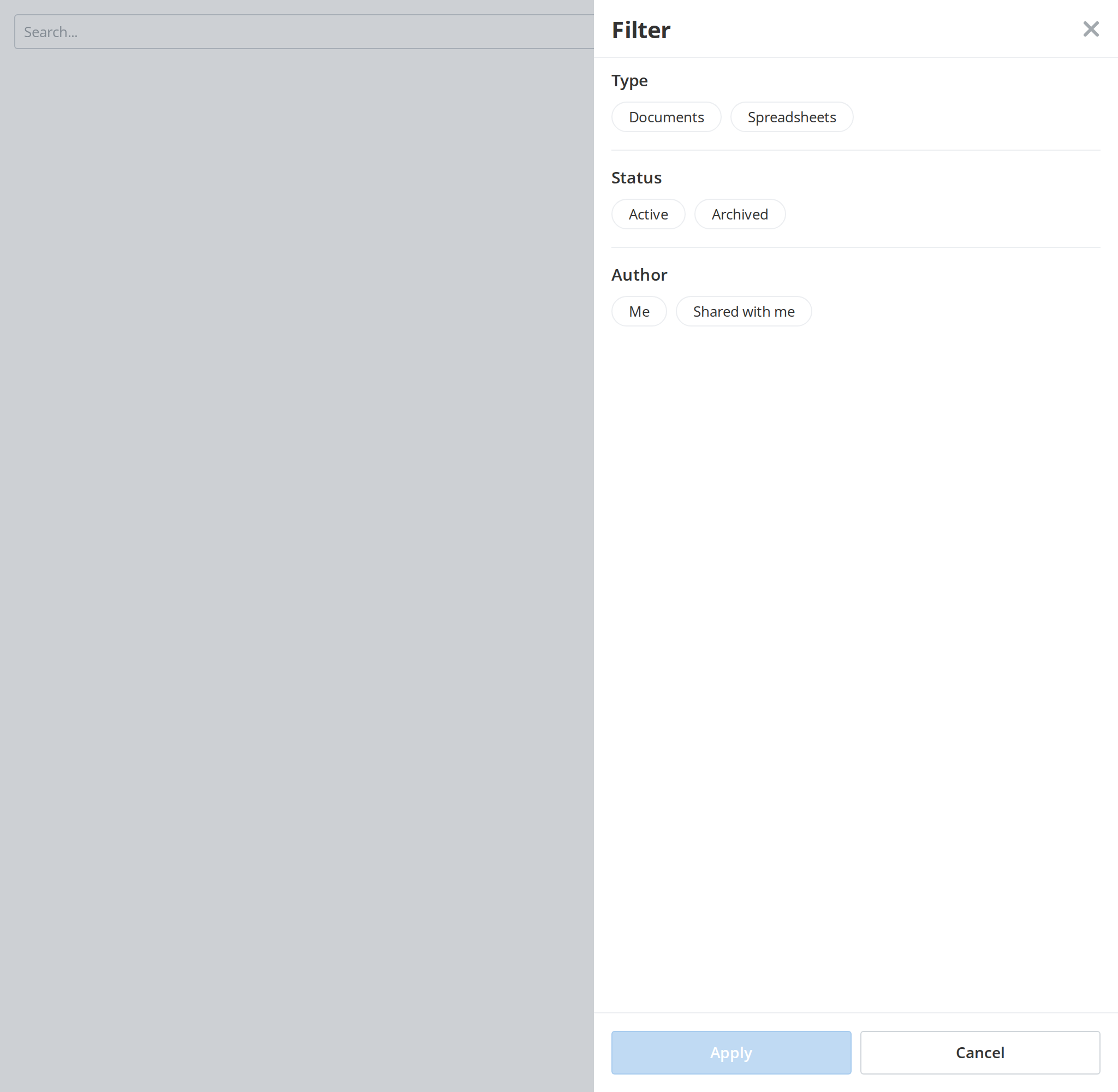
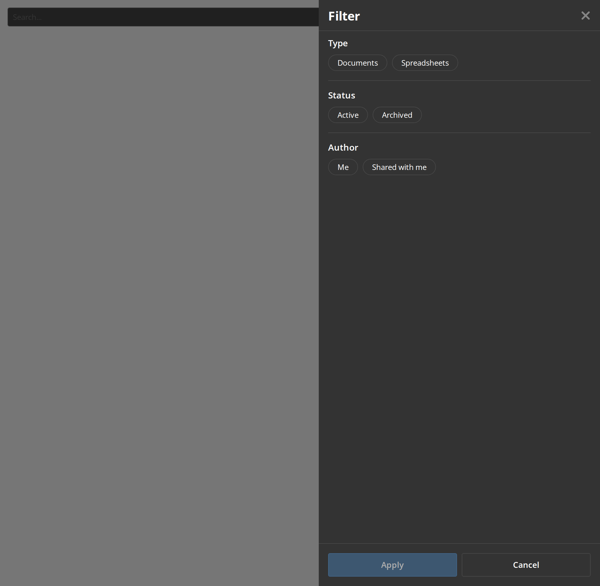
Several groups in one panel, each under its heading and divided by a line, so a listing can be narrowed by type, status and author at once. The panel opens for you when the story loads; one option can be picked per group.
Rooms Filter
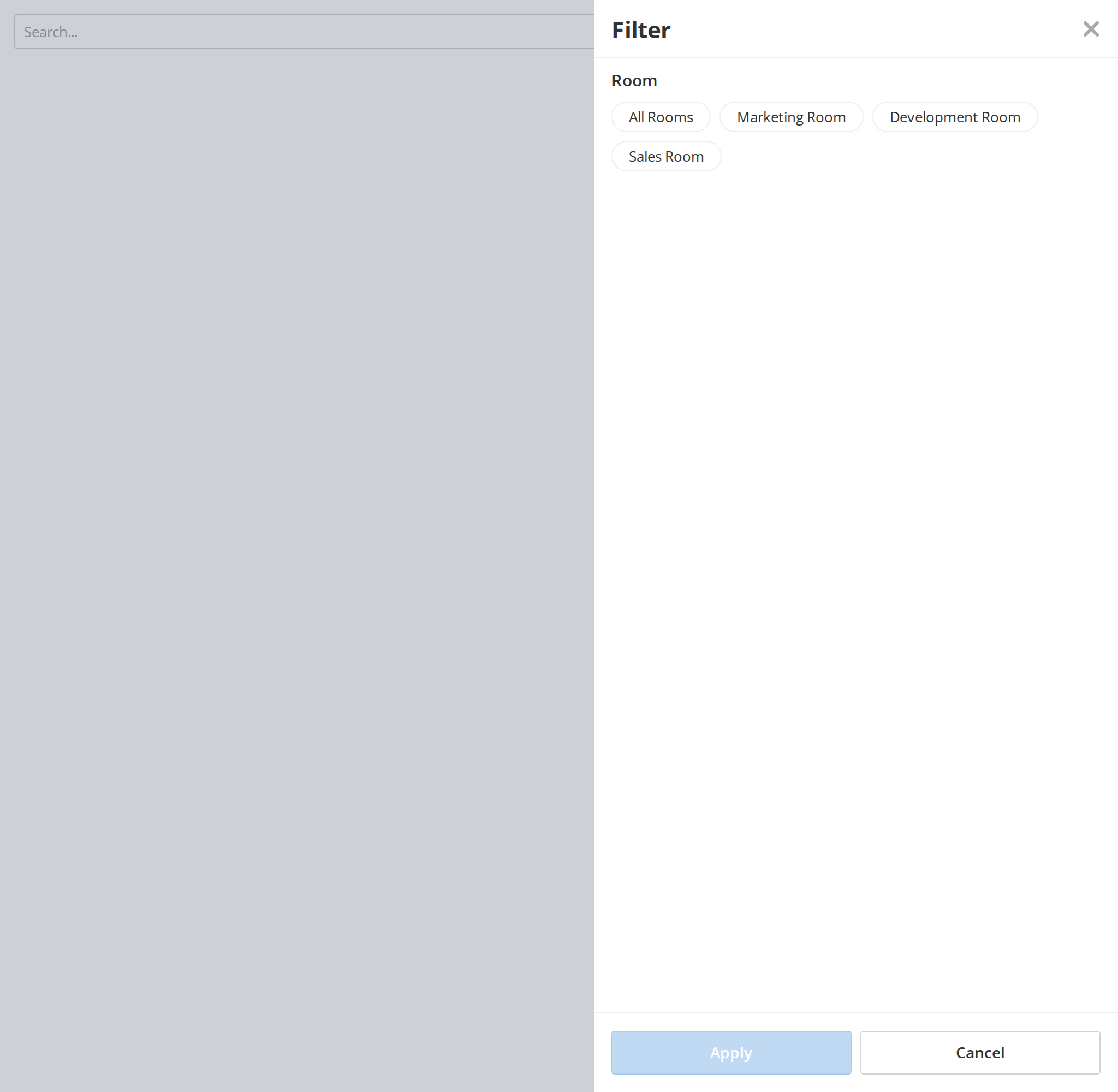
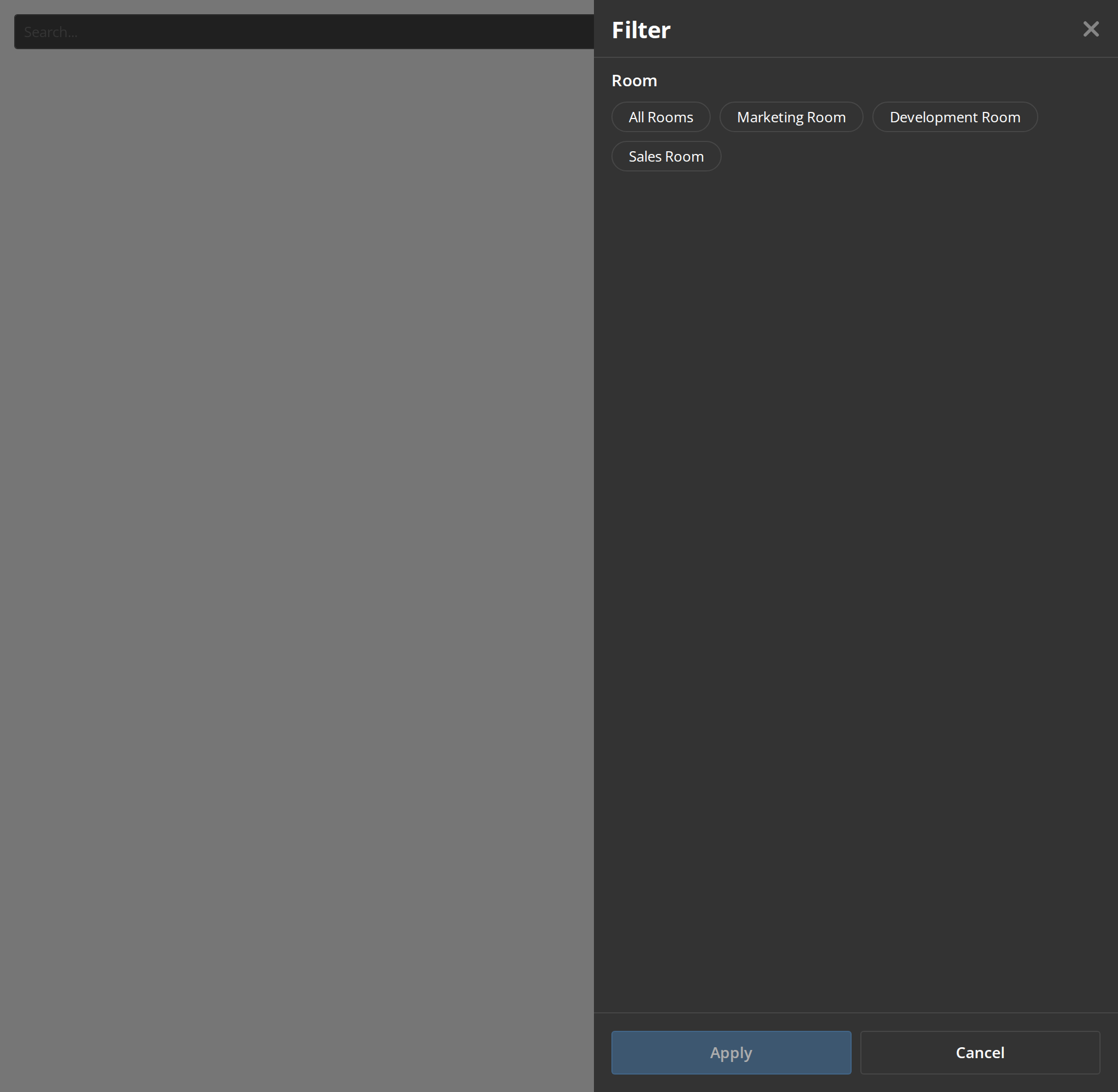
The panel of a listing of rooms: it shows a loading skeleton for half a second before the options appear, and passes the rooms flag on to renderSelector (isRooms). The panel opens for you when the story loads.
Disabled Filter
The bar while the listing is being reordered, when searching, filtering and sorting would fight the new order: the search box is disabled and the filter button is gone (isIndexEditingMode), and so are the sort button and the view switch (isIndexing).


View Selector Default
The view switch the sort menu holds on smaller screens: one button per view, the current one filled. Click the other icon to switch views.


View Selector Disabled
The view switch greyed out while switching views is not possible; clicks on its icons do nothing (isDisabled).

View Selector Filter Mode
The single button the bar shows on a desktop: it carries the icon of the view you would switch to, not the current one, and turns into the other icon when clicked (isFilter).


With Filter Chips
The filters in force as chips under the bar, so the reader sees what narrows the listing and can drop any of it in one click. Click a chip to remove it (removeSelectedItem); the "Clear all" link appears once more than one chip is shown (clearAll).


Panel Option Kinds
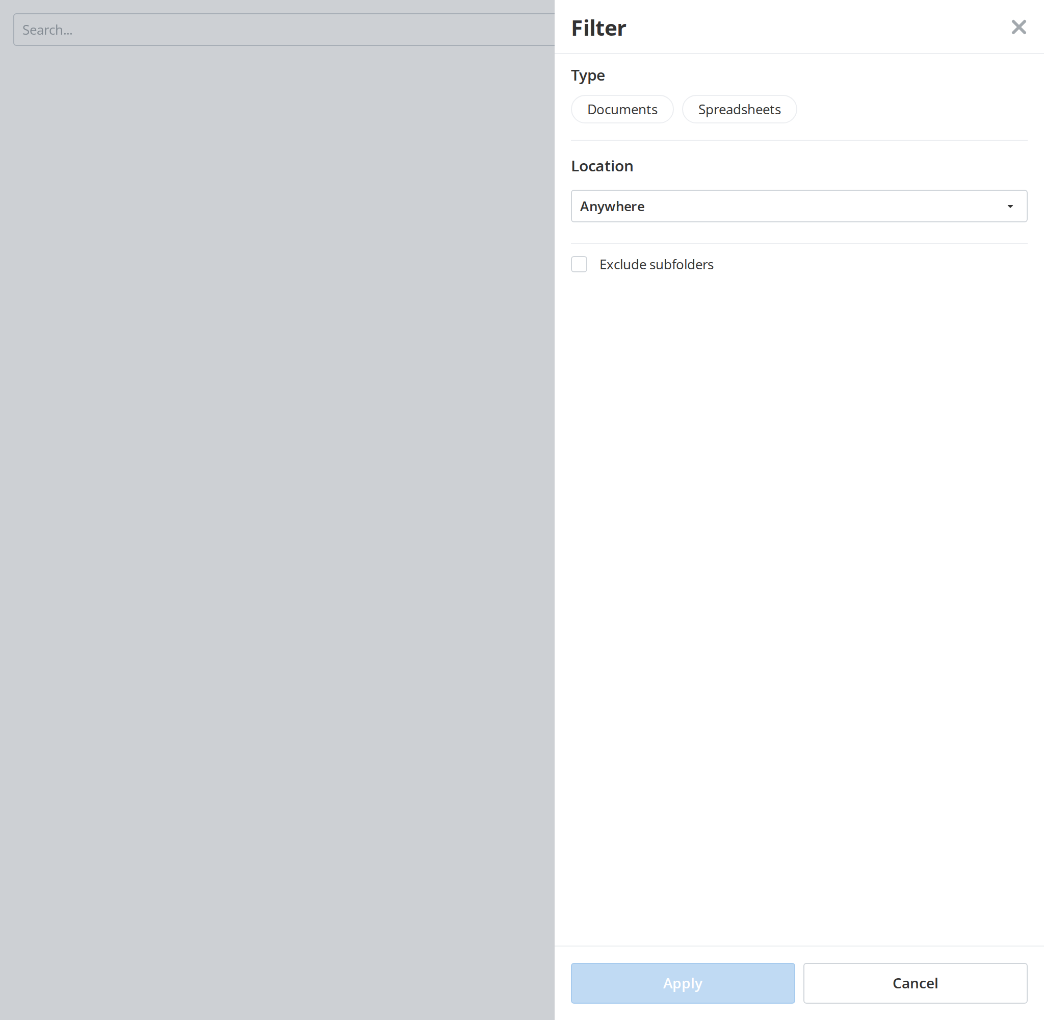
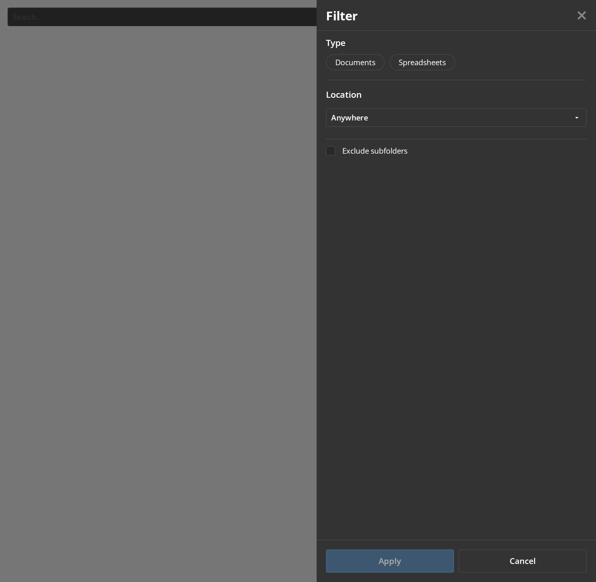
The kinds of option a group can hold besides tags, for filters that are not a choice among a few words. The panel opens for you when the story loads:
- Documents, Spreadsheets — tags, one of which can be picked
- Anywhere — a drop-down list of values (
withOptionswithoptions) - Exclude subfolders — a checkbox, in a group without a heading (
isCheckbox,withoutHeader)
Sort Menu On Tablet
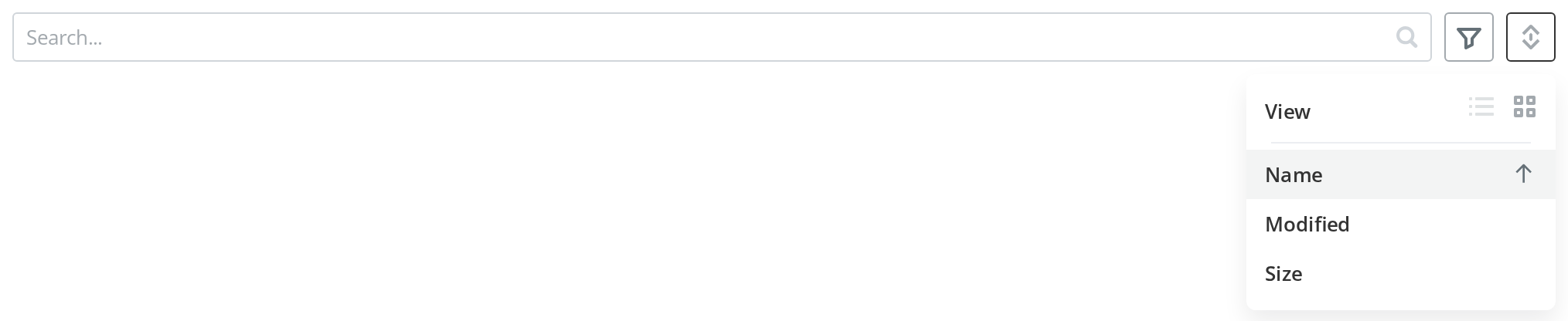
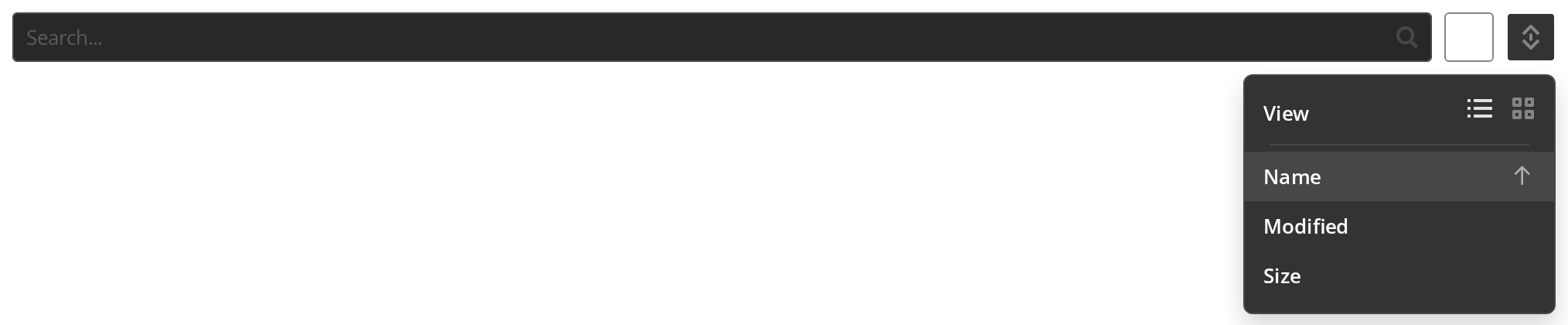
The sort menu on a device narrower than a desktop, opened for you when the story loads: the view switch has left the bar and heads the menu, above the sort fields (currentDeviceType). The current field carries an arrow for its direction; pick it again to reverse it (onSort).
With Grouping Row
A row of group chips under the bar, for a listing its host has sorted into groups: "All rooms" first, the chosen group highlighted (currentGroupId), and the groups that do not fit behind the "..." button. Click a chip to choose it (onFilterByGroup); the button at the end of the row opens the host's group management (setEditRoomGroupsDialogVisible).


With Main Button
A main button inside the search box, for a listing that has no room for one of its own beside the bar (showMainButton, mainButtonProps).


Right To Left
The bar in a right-to-left interface: the search box starts at the right edge, the filter, sort and view buttons line up at the left, and the chips and the "Clear all" link run from right to left.


Css Customization
The variables of the bar set on one wrapper -- the variables are listed under CSS variables on this page. Hover the filter and view buttons, and open the sort menu, to see the hover and menu values. The sort menu's view icons appear only below the desktop layout, so set those two with currentDeviceType in the Controls panel; the panel's variables apply only on :root or body, because it renders in a portal.


Minimal example
import { useCallback, useState } from "react";

import FilterInput from "@onlyoffice/apps-ui-kit/components/filter";
import { DeviceType } from "@onlyoffice/apps-ui-kit/enums";

export function ListingFilter() {
  const [search, setSearch] = useState("");
  const [clearSearch, setClearSearch] = useState(false);

  const getSelectedInputValue = useCallback(() => search, [search]);
  const getSelectedFilterData = useCallback(() => [], []);
  const getViewSettingsData = useCallback(() => [], []);
  const getFilterData = useCallback(async () => [], []);
  const getSortData = useCallback(() => [], []);
  const getSelectedSortData = useCallback(
    () => ({ sortDirection: "asc" as const, sortId: "AZ" as const }),
    [],
  );

  return (
    <FilterInput
      placeholder="Search"
      onSearch={setSearch}
      onClearFilter={() => setSearch("")}
      clearSearch={clearSearch}
      setClearSearch={setClearSearch}
      getSelectedInputValue={getSelectedInputValue}
      getSelectedFilterData={getSelectedFilterData}
      getViewSettingsData={getViewSettingsData}
      getFilterData={getFilterData}
      getSortData={getSortData}
      getSelectedSortData={getSelectedSortData}
      onFilter={() => {}}
      onSort={() => {}}
      onSortButtonClick={() => {}}
      onChangeViewAs={() => {}}
      removeSelectedItem={() => {}}
      clearAll={() => {}}
      view="files"
      viewAs="row"
      viewSelectorVisible={false}
      filterHeader="Filter"
      selectorLabel="Select"
      filterTitle="Filter"
      sortByTitle="Sort by"
      userId="1"
      currentDeviceType={DeviceType.desktop}
      isIndexing={false}
      isIndexEditingMode={false}
      isRecentFolder={false}
      isRooms={false}
      isContactsPage={false}
      isContactsPeoplePage={false}
      isContactsGroupsPage={false}
      isContactsInsideGroupPage={false}
      isContactsGuestsPage={false}
    />
  );
}
Props
Recipes
Clearing the search box from outside
There is no value prop. To empty the field, raise clearSearch: the component clears it, calls
onClearFilter and then calls setClearSearch(false) itself, so the flag is a pulse rather than a
state you hold at true.
import { useCallback, useState } from "react";

import FilterInput from "@onlyoffice/apps-ui-kit/components/filter";
import { Button } from "@onlyoffice/apps-ui-kit/components/button";
import { DeviceType } from "@onlyoffice/apps-ui-kit/enums";

export function ResettableFilter() {
  const [search, setSearch] = useState("");
  const [clearSearch, setClearSearch] = useState(false);

  const getSelectedInputValue = useCallback(() => search, [search]);
  const empty = useCallback(() => [], []);
  const emptyAsync = useCallback(async () => [], []);
  const getSelectedSortData = useCallback(
    () => ({ sortDirection: "asc" as const, sortId: "AZ" as const }),
    [],
  );

  return (
    <div>
      <FilterInput
        placeholder="Search"
        onSearch={setSearch}
        onClearFilter={() => setSearch("")}
        clearSearch={clearSearch}
        setClearSearch={setClearSearch}
        getSelectedInputValue={getSelectedInputValue}
        getSelectedFilterData={empty}
        getViewSettingsData={empty}
        getFilterData={emptyAsync}
        getSortData={empty}
        getSelectedSortData={getSelectedSortData}
        onFilter={() => {}}
        onSort={() => {}}
        onSortButtonClick={() => {}}
        onChangeViewAs={() => {}}
        removeSelectedItem={() => {}}
        clearAll={() => setSearch("")}
        view="files"
        viewAs="row"
        viewSelectorVisible={false}
        filterHeader="Filter"
        selectorLabel="Select"
        filterTitle="Filter"
        sortByTitle="Sort by"
        userId="1"
        currentDeviceType={DeviceType.desktop}
        isIndexing={false}
        isIndexEditingMode={false}
        isRecentFolder={false}
        isRooms={false}
        isContactsPage={false}
        isContactsPeoplePage={false}
        isContactsGroupsPage={false}
        isContactsInsideGroupPage={false}
        isContactsGuestsPage={false}
      />
      <Button label="Reset" onClick={() => setClearSearch(true)} />
    </div>
  );
}
The chips under the bar
The chips come from getSelectedFilterData, not from a prop. Removing one calls
removeSelectedItem — and the component has already dropped the chip from its own list by then, so
your model has to catch up rather than confirm.
import { useCallback, useState } from "react";

import FilterInput from "@onlyoffice/apps-ui-kit/components/filter";
import type { TItem } from "@onlyoffice/apps-ui-kit/components/filter";
import { DeviceType, FilterGroups } from "@onlyoffice/apps-ui-kit/enums";

export function FilterWithChips() {
  const [items, setItems] = useState<TItem[]>([
    { key: "docx", label: "Documents", group: FilterGroups.filterType },
  ]);

  const getSelectedFilterData = useCallback(() => items, [items]);
  const empty = useCallback(() => [], []);
  const emptyAsync = useCallback(async () => [], []);
  const getSelectedSortData = useCallback(
    () => ({ sortDirection: "asc" as const, sortId: "AZ" as const }),
    [],
  );

  return (
    <FilterInput
      placeholder="Search"
      onSearch={() => {}}
      onClearFilter={() => {}}
      clearSearch={false}
      setClearSearch={() => {}}
      getSelectedInputValue={useCallback(() => "", [])}
      getSelectedFilterData={getSelectedFilterData}
      getViewSettingsData={empty}
      getFilterData={emptyAsync}
      getSortData={empty}
      getSelectedSortData={getSelectedSortData}
      onFilter={() => {}}
      onSort={() => {}}
      onSortButtonClick={() => {}}
      onChangeViewAs={() => {}}
      removeSelectedItem={({ key }) =>
        setItems((rest) => rest.filter((item) => item.key !== key))
      }
      clearAll={() => setItems([])}
      view="files"
      viewAs="row"
      viewSelectorVisible={false}
      filterHeader="Filter"
      selectorLabel="Select"
      filterTitle="Filter"
      sortByTitle="Sort by"
      userId="1"
      currentDeviceType={DeviceType.desktop}
      isIndexing={false}
      isIndexEditingMode={false}
      isRecentFolder={false}
      isRooms={false}
      isContactsPage={false}
      isContactsPeoplePage={false}
      isContactsGroupsPage={false}
      isContactsInsideGroupPage={false}
      isContactsGuestsPage={false}
    />
  );
}
Behaviour the types don't state
- Every getter is an effect dependency, and an unstable one is a bug.
getViewSettingsDatais called during render and again in an effect keyed on the function itself, which then sets state — pass an inline arrow and the component re-renders without end.getSelectedFilterDatare-fetches on every new identity, andgetSelectedInputValuefocuses the search box each time it is read. Wrap all of them inuseCallback. - The search box has no value prop. What it shows comes from
getSelectedInputValue, what you get back is the string, and clearing it is theclearSearchpulse described above. - The filter panel works on a copy. It opens as a side panel of grouped options — tags,
checkboxes, toggles, drop-down lists and selector steps — and the whole selection reaches
onFilteronly when Apply is pressed; closing it discards the changes. The one exception is the clear icon in the panel's header, which callsonFilter([])at once when filters were in force. - The sort menu marks the current field with an arrow pointing in the current direction; picking that field again reverses the direction, and picking another keeps it.
- The sort button disappears whenever
isIndexing,isFlowsPageorisRecentFolderis set, and the filter button wheneverisIndexEditingModeorisFlowsPageis;isIndexEditingModealso disables the search box. - The view selector is in two places. On a desktop it is a single button beside the sort
button that offers the view you are not in; below that breakpoint it is rendered inside the sort menu instead, and
viewSelectorVisiblegoverns both. viewAs="table"is quietly treated as"row"by the sort menu and the view selector.- The room grouping row needs four things at once:
withRoomGroups,organizeRoomsGrouping, a resolvedgetAllRoomGroups, andisFilterOrSearchActiveunset. Only groups whoseiconis an object survive — a string ornullicon drops the group — and the icon is an SVG source turned into a data URL. - That row measures itself in a hidden copy. Every chip is rendered twice, once off-screen, and the visible row appears only once those measurements are in; the overflow spills into a menu.
- Removing a chip is optimistic. The component filters its own list first and calls
removeSelectedItemafterwards, so a failed removal leaves the bar and your model disagreeing until the next read. - "Clear all" needs two labelled chips. The link appears only when more than one selected item carries a label.
- It assigns
window.onscrollwhen the search box is focused on an iOS tablet, replacing any handler already there with a no-op. renderSelectoris not optional in practice. Any filter group that picks a person or a room opens a step this package cannot fill.- The bar is a full-width flex column: a 32px row of controls with an 8px margin under it, then the chips, then the grouping row.
CSS variables
The two sort-menu view icons are coloured by position, not by which view they are: the rules
assume the row view comes first in getViewSettingsData, so a different order swaps the colours.
The filter panel is a ModalDialog rendered in a portal on
<body>, outside any wrapper you put round the bar, so --filter-tag-*, --filter-separator,
--filter-bg and --filter-width take effect only when set on :root or body. The search box,
the chips and the buttons inside the bar read their own components' variables —
SearchInput, SelectedItem,
IconButton and Button.
Accessibility
- The buttons are
<div>s with anonClick. The filter button, the sort button, the view switch, the chips and the overflow control have no role, notabindexand no key handler, so none of them can be reached or operated from the keyboard. - The only labels the controls carry are the native
titleattributes fromfilterTitleandsortByTitle; the panel's heading comes fromfilterHeader, and nothing translates any of them. - The filter panel is a
ModalDialog:role="dialog"witharia-modal, closed by Escape. The bar passes it noaria-label, so it is announced unnamed. - The hidden measurement copy of the grouping row is
aria-hidden, so it is not read twice. - The search box is the kit's
SearchInputand is the one part of the bar a keyboard user can use — but it takes focus by itself whenever the value getter changes. - Nothing announces that the listing has been filtered or sorted; the chips are the only report, and they are not a live region.
Test ids
None of them are settable.
Related
Section— the layout whose filter slot this belongs in.SearchInput— the search box it renders, on its own.SelectedItem— the chip it renders for each filter in force.