NavMenu
Sidebar navigation: groups of items, each with an optional sub-menu, a badge and a collapsed rail form. It owns which section is expanded and nothing else — what is active, and what a click does, come from you.
Use this when / not when
- Use for the left-hand navigation of an application: a handful of groups, each a short list of destinations, some of them with children.
- Not for a menu that pops open —
DropDownandContextMenuare the floating ones. - Not for the portal's own sidebar chrome —
Articleis the panel with the header, the resize handle and the mobile behaviour; this is the list that goes inside it. - There is no router. Give it
LinkRouterand each entry withlinkDatabecomes your link component; without it every entry is a<button>andlinkDatais ignored. - A section header is never a link. An item with
childrenis always rendered as a button, whateverlinkDatasays.
Import
import { NavMenu } from "@onlyoffice/apps-ui-kit/components/nav-menu";
Also exported from the root barrel @onlyoffice/apps-ui-kit, together with two icon components
this folder re-exports — ArticleHideMenuIcon and CatalogSettingsPaymentIcon.
Needs ThemeProvider above it in the tree for every colour it paints. In the collapsed form the
labels become tooltips through the kit's shared tooltip, which needs <RootTooltip /> from
Tooltip mounted once near the root of the application — without it a
collapsed rail has no labels at all.
Stories
Default
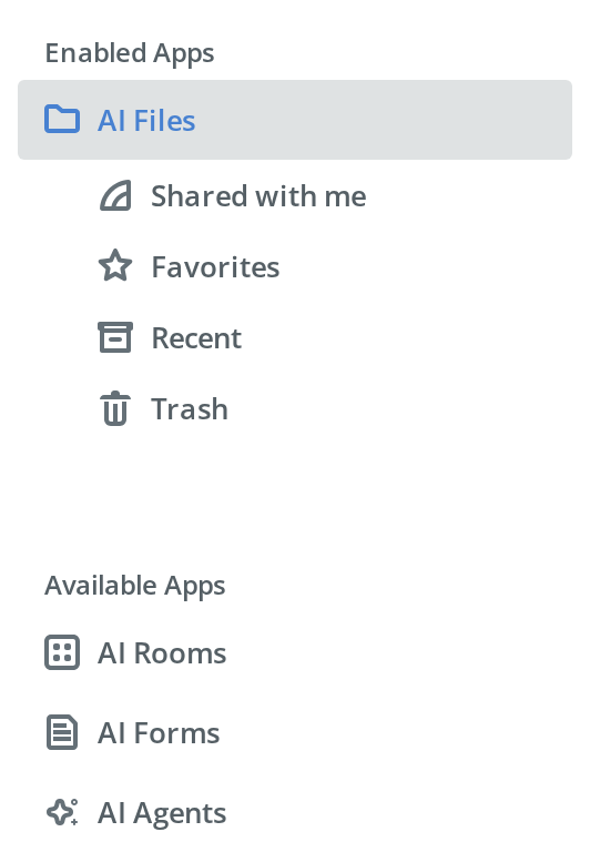
The starting point: two captioned groups, the first section open and active. Change the active entry, collapse the menu to a rail or try any other prop live in the Controls panel below.
No Sub Items
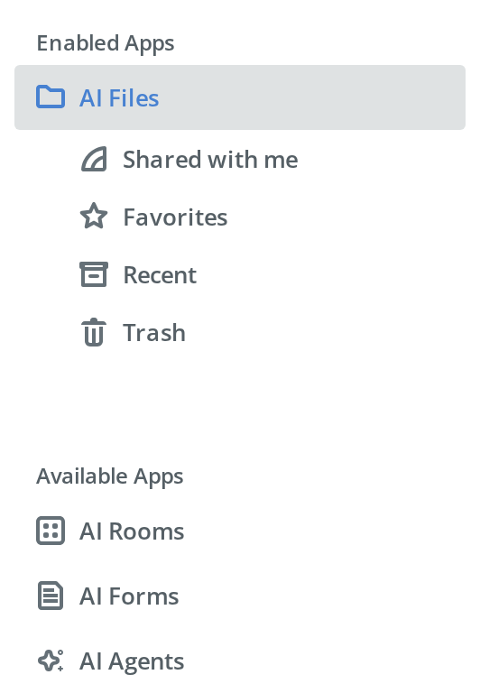
For a short menu of plain destinations: one group whose items have no sub-menus, so each entry is a single row with its icon and label.


Controlled Active
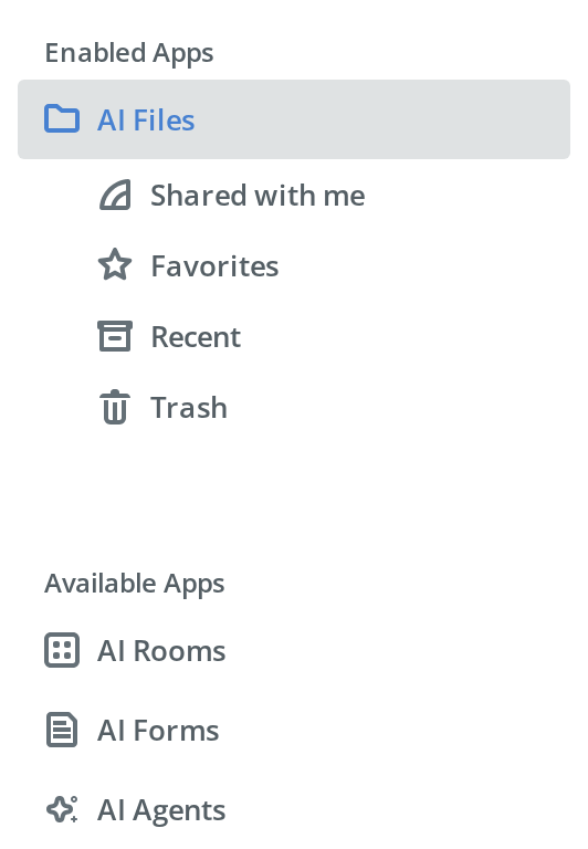
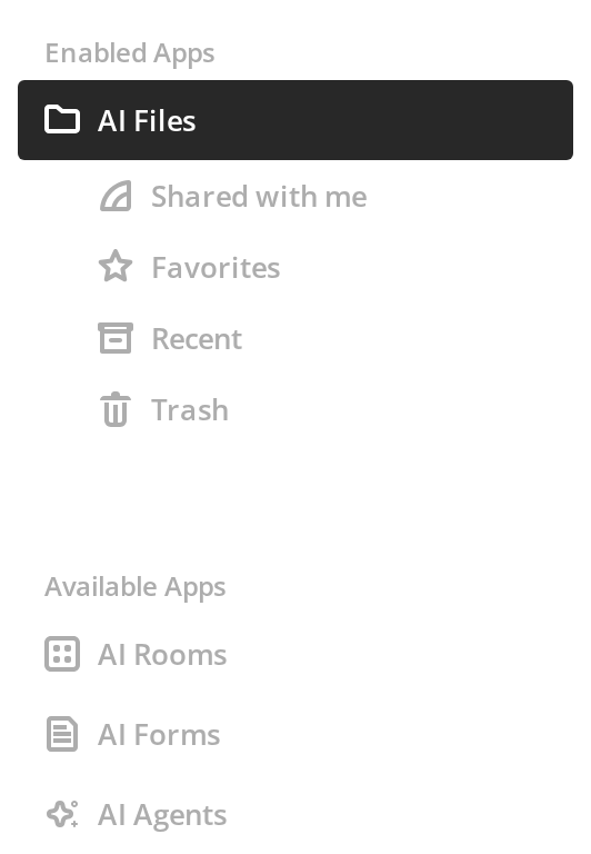
How a host wires selection: every entry's onClick stores its id, and the stored id goes back as activeItemId. Click the entries — the highlight follows, and clicking a section without a sub-menu shuts the open one.
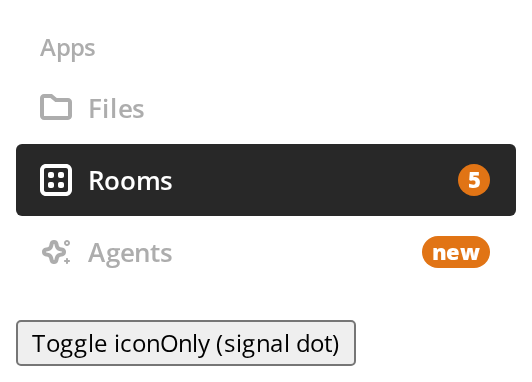
Dark Theme
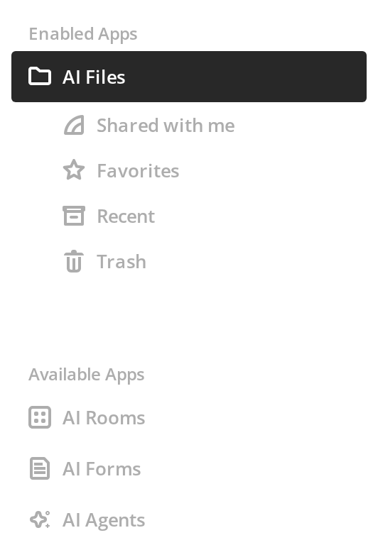
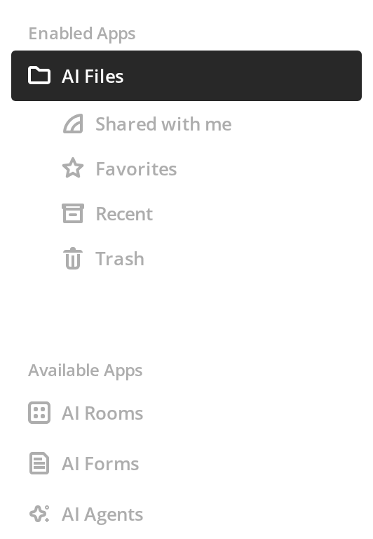
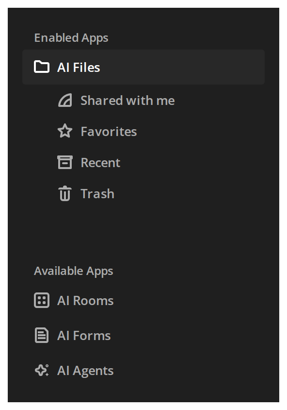
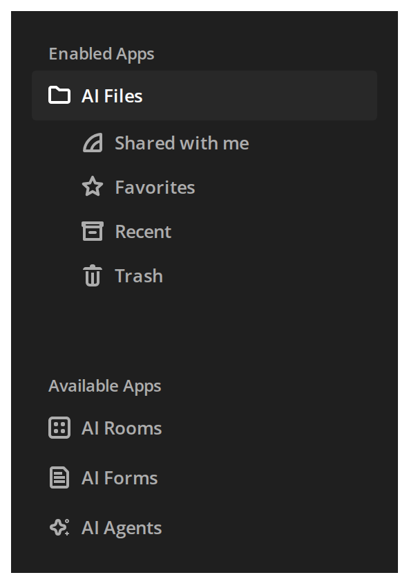
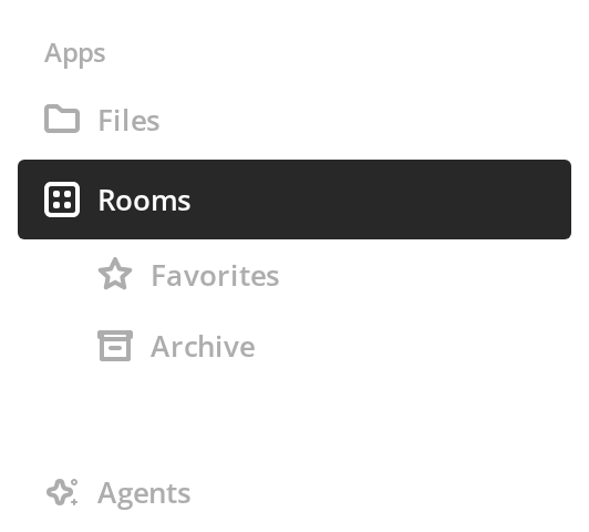
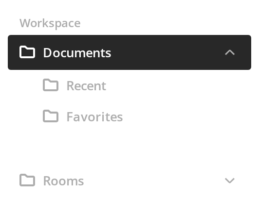
The same menu on a dark surface: inside an element with the dark class the captions, labels, icons and highlights switch to the dark palette.
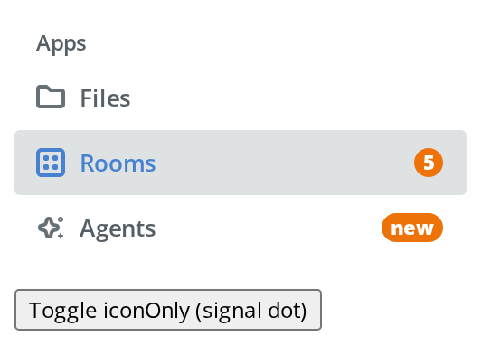
With Badge
To draw attention to an entry with new content:
- Rooms — the kit's counter badge with the number 5 (
showBadge,labelBadge) - Agents — a badge of the host's own in place of the counter (
badgeComponent)
Press the button below the menu to collapse it to a rail: the badges give way to a dot on each icon.
With Animation
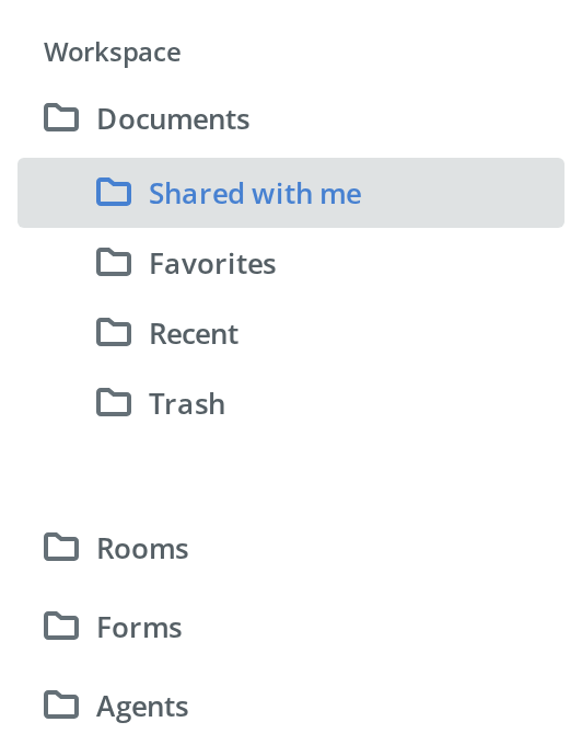
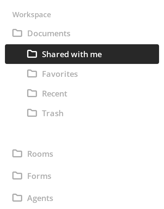
To give a click visible feedback while the next page loads: click any entry and its highlight fills from the start of the row to the end (withAnimation). Opening another section also shuts the one that was open.
With Link Data
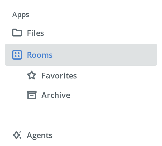
For an application with a client-side router: Files, Agents and the two Rooms sub-items render as the router's links to their paths (LinkRouter, linkData), while Rooms itself stays a button because it opens a sub-menu. Click a link — the path it leads to appears below the menu.
Full Sidebar
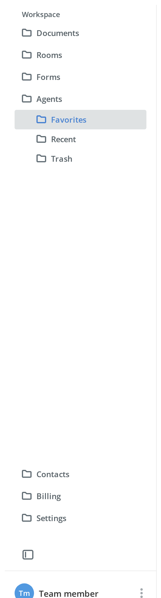
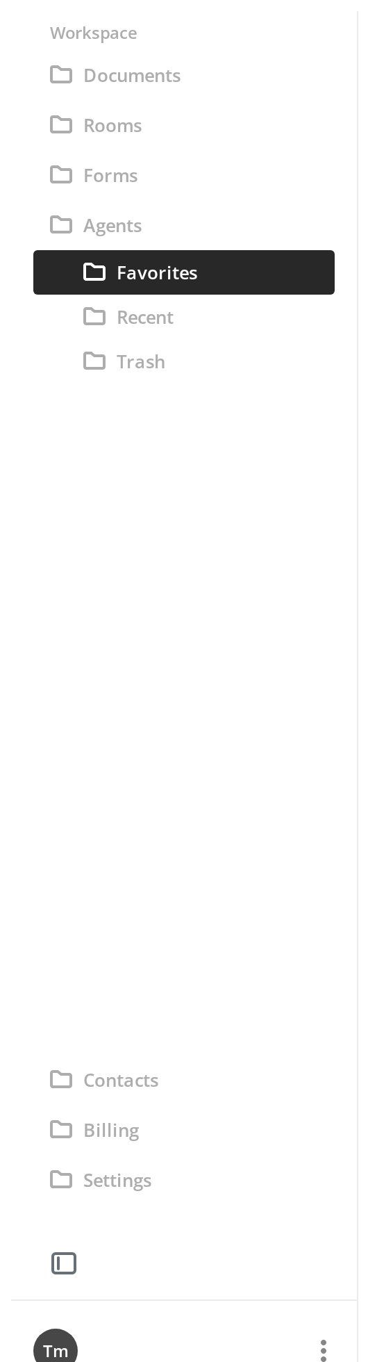
Two menus assembled into a whole sidebar: the sections at the top scroll, a second menu of settings entries sits at the bottom, followed by a collapse button and the signed-in user. Press the collapse button — both menus switch to the rail together (iconOnly), and hovering an icon shows its label.
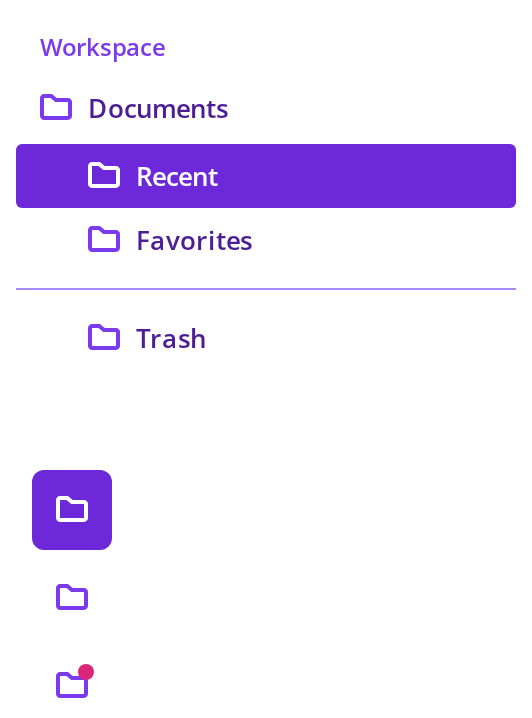
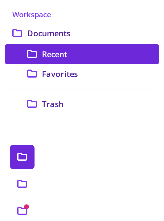
Collapsed Rail
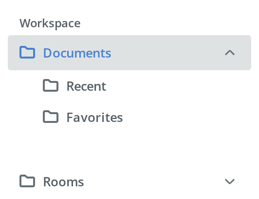
For a sidebar the user has collapsed to save room (iconOnly):
- Recent and Favorites — the sub-items of Documents, the active section, listed as entries of their own under it, with a gap after the last one
- Rooms — a shut section with a badge, shown as a dot on its icon
- Hover any icon to read its label; the tooltip is the kit's shared one, so the app mounts
RootTooltiponce, as this story does


With Expand Control
For a touch layout where a section is itself a page: each section gets a chevron at its end (withExpandControl). Press the chevron of Rooms — Rooms opens and Documents stays open next to it; press it again to shut Rooms. Clicking a label selects the entry and never shuts a section.
Section Badges
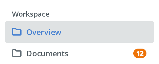
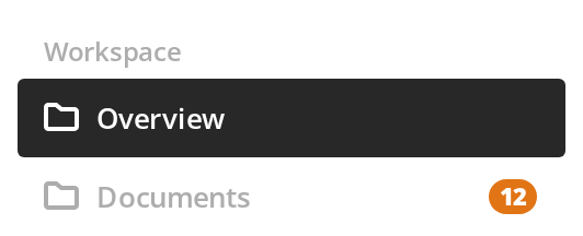
For counts that live on sub-items:
- Documents — while the section is shut it shows the total, 12, in a badge of its own (
collapsedBadgeComponent); click it to open the section and the total gives way to the counts inside - Recent and Shared — a counter on each sub-item (
showBadge,labelBadge); click a counter and the sub-item it belongs to is reported below the menu, without selecting it (onClickBadge)
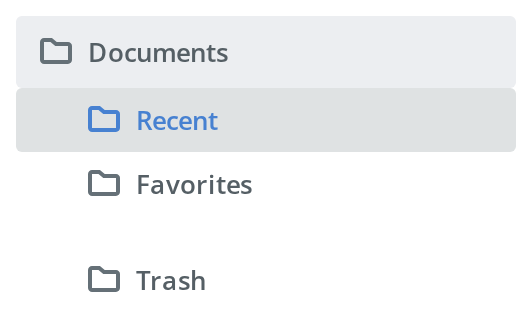
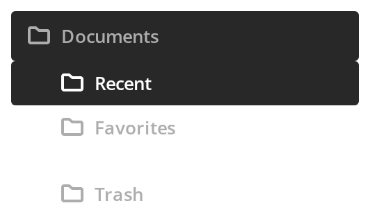
With Separator
To set one sub-item apart from the rest without a second section: Trash sits below a gap (withTopSeparator). A line is drawn in that gap only once --nav-menu-separator-color gives it a colour — the theme sets none, as the CSS Customization story shows.
Click Without Expanding
For a section whose click opens a dialog rather than a page: click Invite people — its sub-menu stays shut, because its onClick returns false, and the message below the menu stands in for the dialog.


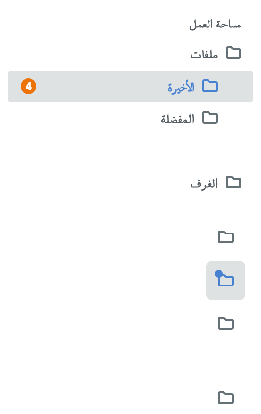
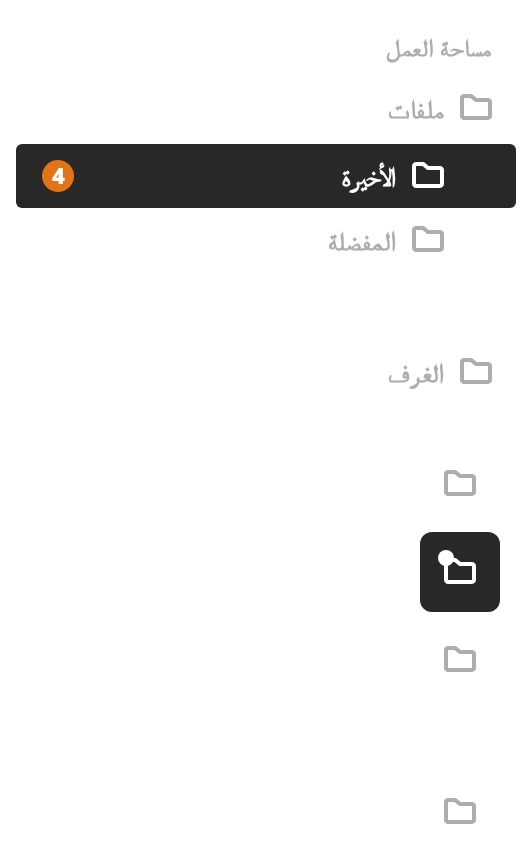
Right To Left
The menu in a right-to-left interface: icons and captions start at the right edge, sub-items are indented from the right, and the counter sits at the left end of its row. Below it, the collapsed rail keeps its highlight tile centred on the active icon.
Css Customization
Every overridable variable set through className -- the variables, and why a wrapper cannot set them, are listed under CSS variables on this page.
- The open menu — every variable but the dot: the caption, the labels, the icons, the active highlight and the line above Trash; hover an entry for the hover colour, and press Tab for the focus outline
- The rail — the dot on the Rooms icon (
--nav-menu-signal-dot-color), which only the collapsed form shows
Minimal example
import { useState } from "react";

import { NavMenu } from "@onlyoffice/apps-ui-kit/components/nav-menu";

const groups = [
  {
    id: "main",
    label: "Workspace",
    items: [
      { id: "overview", label: "Overview" },
      {
        id: "documents",
        label: "Documents",
        children: [
          { id: "recent", label: "Recent" },
          { id: "favourites", label: "Favourites" },
          { id: "trash", label: "Trash", withTopSeparator: true },
        ],
      },
    ],
  },
];

export function Sidebar() {
  const [active, setActive] = useState("overview");

  return (
    <NavMenu
      groups={groups.map((group) => ({
        ...group,
        items: group.items.map((item) => ({
          ...item,
          onClick: () => setActive(item.id),
          children: item.children?.map((sub) => ({
            ...sub,
            onClick: () => setActive(sub.id),
          })),
        })),
      }))}
      activeItemId={active}
    />
  );
}
Props
Added by the wrapper the folder exports
The index module exports a wrapped component, so these are accepted on top of the props above.
Recipes
With a router
LinkRouter is your router's link component. Only leaf items use it: an item with children stays
a button, because clicking it expands its sub-menu.
import { NavMenu } from "@onlyoffice/apps-ui-kit/components/nav-menu";
import type { LinkRouterProps } from "@onlyoffice/apps-ui-kit/types";

const groups = [
  {
    id: "main",
    items: [
      { id: "overview", label: "Overview", linkData: { path: "/" } },
      {
        id: "documents",
        label: "Documents",
        children: [
          { id: "recent", label: "Recent", linkData: { path: "/recent" } },
          { id: "trash", label: "Trash", linkData: { path: "/trash" } },
        ],
      },
    ],
  },
];

function RouterLink({ to, children, ...rest }: LinkRouterProps) {
  return (
    <a href={String(to)} {...rest}>
      {children}
    </a>
  );
}

export function RoutedSidebar({ path }: { path: string }) {
  return (
    <NavMenu
      groups={groups}
      LinkRouter={RouterLink}
      activeItemId={path === "/" ? "overview" : path.slice(1)}
    />
  );
}
The collapsed rail
iconOnly hides the labels and the sub-menus. The active section's children are flattened into
the top-level list instead, so the current branch stays reachable.
import { useState } from "react";

import { NavMenu } from "@onlyoffice/apps-ui-kit/components/nav-menu";
import { Button } from "@onlyoffice/apps-ui-kit/components/button";
import { RootTooltip } from "@onlyoffice/apps-ui-kit/components/tooltip";

const groups = [
  {
    id: "main",
    items: [
      { id: "overview", label: "Overview", icon: "/icons/home.svg" },
      {
        id: "documents",
        label: "Documents",
        icon: "/icons/docs.svg",
        children: [
          { id: "recent", label: "Recent" },
          { id: "trash", label: "Trash" },
        ],
      },
    ],
  },
];

export function CollapsibleSidebar() {
  const [collapsed, setCollapsed] = useState(false);

  return (
    <>
      <RootTooltip />
      <Button
        label={collapsed ? "Expand" : "Collapse"}
        onClick={() => setCollapsed((value) => !value)}
      />
      <NavMenu groups={groups} iconOnly={collapsed} activeItemId="recent" />
    </>
  );
}
Badges
showBadge puts a dot on the icon and the kit's badge beside the label. badgeComponent replaces
that badge, and collapsedBadgeComponent is what a section shows while its sub-menu is shut —
the place for an aggregated count.
import { NavMenu } from "@onlyoffice/apps-ui-kit/components/nav-menu";
import { Badge } from "@onlyoffice/apps-ui-kit/components/badge";

const groups = [
  {
    id: "main",
    items: [
      {
        id: "documents",
        label: "Documents",
        collapsedBadgeComponent: <Badge label={12} />,
        children: [
          { id: "recent", label: "Recent", showBadge: true, labelBadge: 9 },
          { id: "shared", label: "Shared", showBadge: true, labelBadge: 3 },
        ],
      },
    ],
  },
];

export function BadgedSidebar() {
  return <NavMenu groups={groups} activeItemId="recent" />;
}
A click that opens a dialog
An onClick that returns exactly false tells the menu the interaction was handled, so the
section does not expand behind whatever you opened. Any other return value, a promise included,
keeps the default.
import { useState } from "react";

import { NavMenu } from "@onlyoffice/apps-ui-kit/components/nav-menu";
import { ModalDialog } from "@onlyoffice/apps-ui-kit/components/modal-dialog";

export function SidebarWithDialog() {
  const [open, setOpen] = useState(false);

  const groups = [
    {
      id: "main",
      items: [
        { id: "overview", label: "Overview" },
        {
          id: "invite",
          label: "Invite people",
          children: [{ id: "invite-link", label: "Copy link" }],
          onClick: () => {
            setOpen(true);
            return false as const;
          },
        },
      ],
    },
  ];

  return (
    <>
      <NavMenu groups={groups} activeItemId="overview" />
      <ModalDialog visible={open} onClose={() => setOpen(false)}>
        <ModalDialog.Header>Invite people</ModalDialog.Header>
        <ModalDialog.Body>Share the link with your team.</ModalDialog.Body>
      </ModalDialog>
    </>
  );
}
Behaviour the types don't state
- Expansion is the component's own state, and
activeItemIddrives it. An effect finds the section the active id belongs to and opens it — so navigating from outside the menu opens the right branch by itself. An id that matches nothing leaves the state untouched. - Desktop and mobile expand differently. By default only one section is open at a time and the
active one cannot be collapsed by clicking it again; with
withExpandControleach section gets its own chevron, the item body no longer toggles anything, and several sections may be open at once. - A childless active item collapses everything on the default behaviour — that is how an "Overview" entry shuts the open section.
- A sub-menu opens with a height and opacity transition, which
prefers-reduced-motion: reduceturns off. iconOnlyhides the group captions as well as the labels; groups are then set apart by their spacing alone.iconOnlydrops the sub-menus entirely and rebuilds the active section's children as top-level entries, each with a staggered reveal animation. A sub-item'sonClickis rewrapped in the process, andwithTopSeparatoris lost.endOfActiveSection,isFlattenedChildandflattenIndexare internal. The component sets them while flattening; passing them yourself does nothing outside that mode.- Only a leaf can be a link. The link branch requires the item to have no children, so a
section header is always a
<button>even when it carrieslinkData. linkDatawithoutLinkRouteris ignored, silently.- In the collapsed rail the label is a tooltip, delivered through the kit's shared tooltip —
which renders nothing unless
<RootTooltip />is mounted somewhere in the application. iconis fetched over the network as an SVG when the menu renders;iconNodeis rendered as given and wins over it.- Clicks on a badge do not reach the item. The badge wrapper stops both click and key events, so
onClickBadgeis the only handler that fires there. - The folder re-exports two icons into the root barrel —
ArticleHideMenuIconandCatalogSettingsPaymentIcon— which is how they end up in the package's public surface.
CSS variables
Every variable but the last is declared on the menu's own nav element, under the theme
class (.light .root, .dark .root), so a value set on a wrapper never arrives. Set them in a
rule that outranks that one and pass its class through className — .light nav.my-nav does.
--nav-menu-separator-color is declared nowhere: the line falls back to --quick-buttons-color,
which the kit does not define either, so without one of the two set there is no line at all.
The sliding highlight is driven by --end-width and --flatten-index, which the component sets
itself on each animated element.
Accessibility
- The root is a
<nav>, each group is a<ul>and each entry a<li>, so the structure is announced. - Entries are real
<button>s, or yourLinkRouterelement, and are reachable and operable from the keyboard. - A section that expands on its own body click carries
aria-expanded; withwithExpandControlthe flag moves to the chevron, which is labelled with the section's name. - Keyboard focus is drawn as a 2px outline inside the entry, in
--nav-menu-item-icon-active-color; the pointer never shows it. - The
<nav>has noaria-label. Give it one through a wrapper when the page has more than one navigation landmark. - In the collapsed rail the accessible name is the tooltip title. It is set on the button, so it is announced even without the tooltip being mounted — but sighted users see nothing.
- Group labels are
<span>s, not headings, and are not tied to their list witharia-labelledby.
Test ids
The component sets none. Every entry carries data-item-id with the item's own id; select on that,
or on the nav element.