ContextMenu
Menu opened at the pointer through a ref, with submenus, a mobile sheet form and working
keyboard navigation. It has no visibility prop: you keep a ref and call show(event).
Use this when / not when
- Use for a right-click menu, or for the actions of a row, a card or a file — anywhere the menu belongs to the thing the user pointed at.
- Use it when the menu has to be reachable from the keyboard. It is the only menu in the kit with arrow keys, Enter and Escape that work.
- Not for a menu anchored to a button you control:
DropDownis simpler, andContextMenuButtonwires the two together. - Not for choosing a value —
ComboBox. - Not as a dialog. The backdrop only appears in the mobile form or with
ignoreChangeView, and nothing traps focus.
Import
import { ContextMenu } from "@onlyoffice/apps-ui-kit/components/context-menu";
Also exported from the root barrel @onlyoffice/apps-ui-kit.
Needs ThemeProvider from @onlyoffice/apps-ui-kit/providers/theme, and
TranslationProvider from @onlyoffice/apps-ui-kit/providers/translation for the labels the
menu supplies itself on the mobile sheet.
Stories
Default
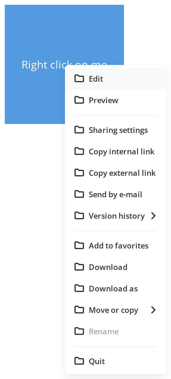
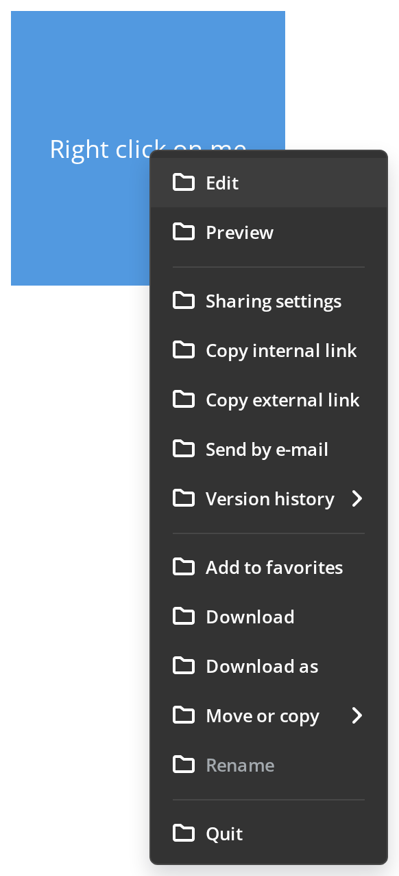
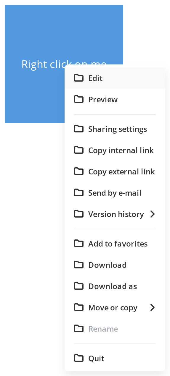
Full-featured context menu with icons, separators, nested submenus and a disabled item. Disabled items are dropped from the list by default; showDisabledItems keeps them greyed out. Right-click the colored area to open.
Simple Menu
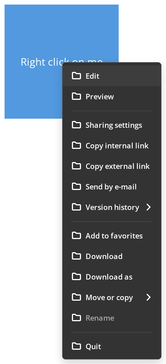
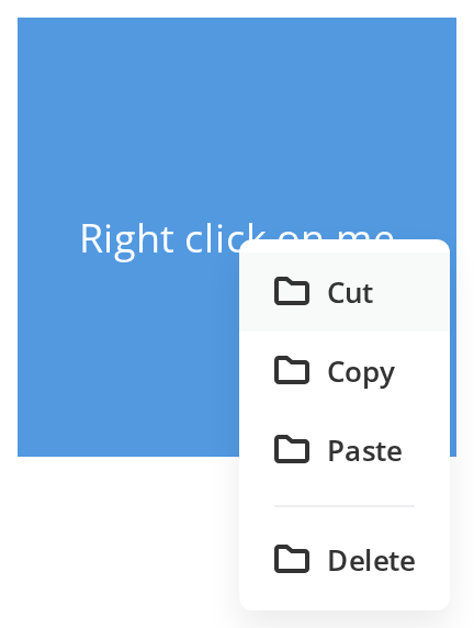
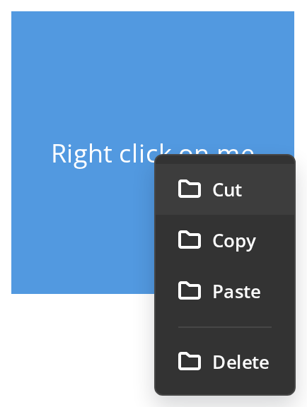
A flat list of actions with one separator and no submenus — the shape most row and card menus need, with nothing but ref and model set. Right-click the colored area to open.
With Backdrop
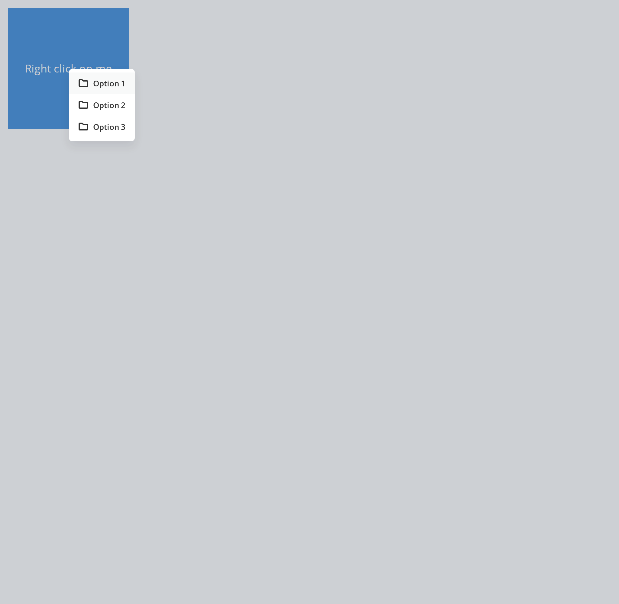
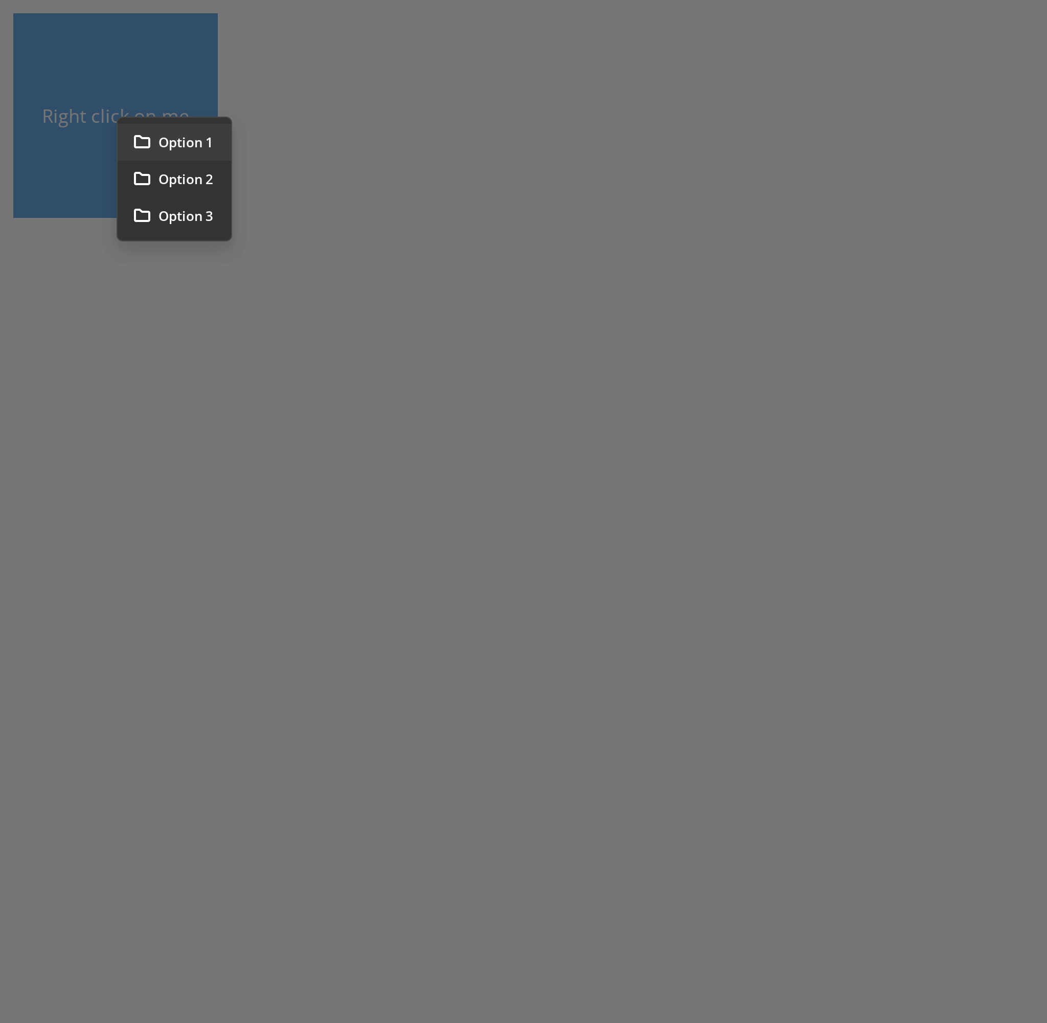
Context menu with a backdrop overlay. withBackdrop shows the backdrop only while the menu is a bottom sheet (viewports up to 600px), so on a desktop viewport it also needs ignoreChangeView, which this story passes. The mobile stories below set both props too, so the sheet and its backdrop appear however short the menu is.
With Item Descriptions
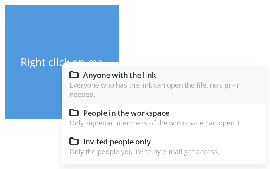
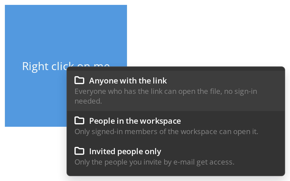
Items carrying description are laid out as two lines: the label row and an always-visible description under it. The menu grows to the width of its longest description.
Item Variants
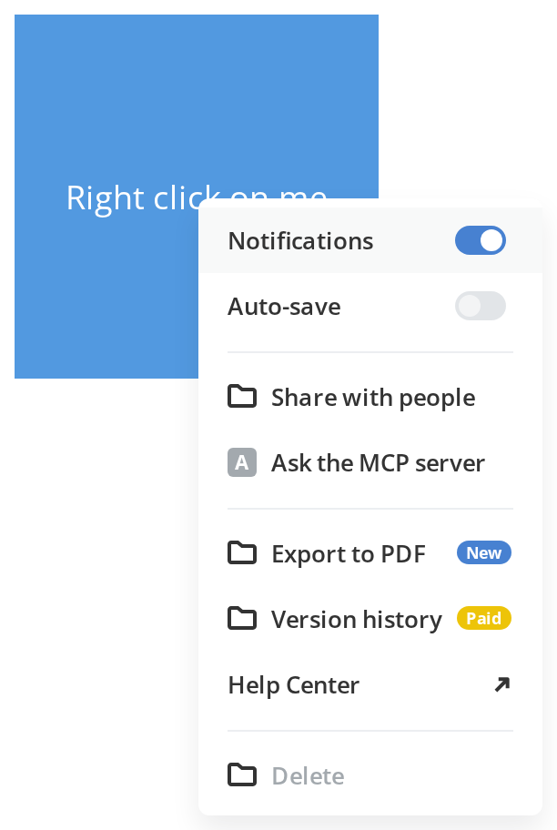
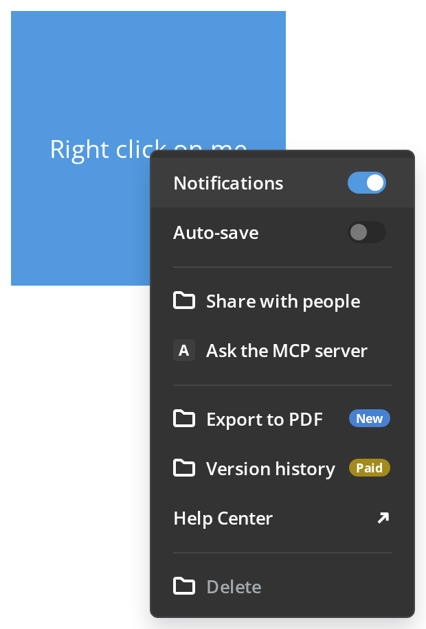
Every kind of item the model supports, in one menu. From top to bottom:
- Notifications — a switch inside the item (
withToggle,checked). Clicking it flips the switch and keeps the menu open. - Auto-save — the same switch, disabled. The label keeps its color and only the switch is greyed (
disabledStylesType: "toggle"); hover the switch to read why it is off (getTooltipContentanchored withtooltipTarget: "toggle"). - Share with people — the icon is a React element (
iconNode) instead of an image URL. - Ask the MCP server — the MCP server icon (
withMCPIcon): the server logo wheniconis given, the first letter of the label otherwise. - Export to PDF — a text badge after the label (
badgeLabel). - Version history — the same badge in the paid-feature color (
badgeLabel+isPaidBadge). - Help Center — an external link that opens in a new tab (
url,target);isOutsideLinkadds the arrow. - Delete — a disabled item. It stays in the list only because of
showDisabledItems; hover it to read the reason (getTooltipContent).
Dynamic Model
getContextModel replaces a static model: the getter runs each time the menu opens, so the first item shows the time of that open and the favorite item reads the state changed by its own click. Leading and trailing separators in the result are trimmed.
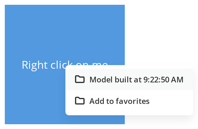
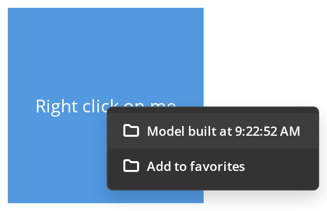
Attached To Document
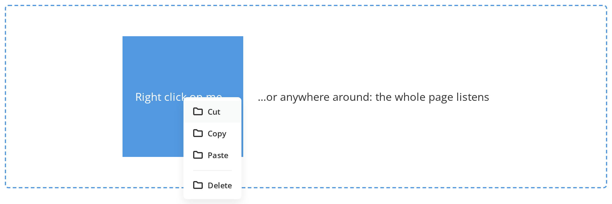
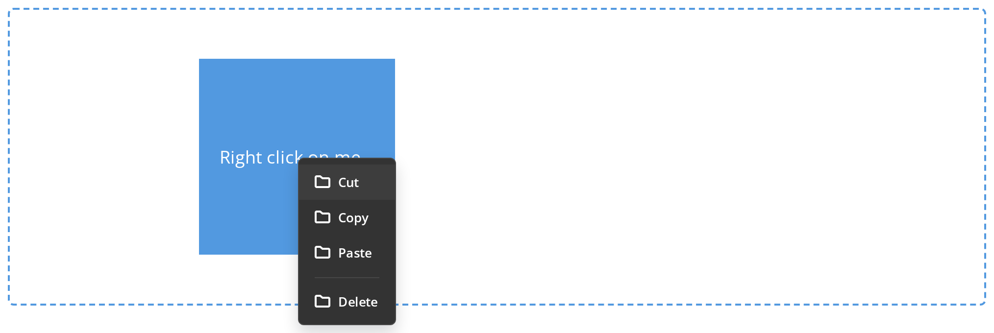
The blue square has no handler of its own and nothing calls show: with global the menu attaches itself to the whole document, so a right-click on the square and one on the empty space around it open the same menu. Use it for a page-level menu that is not tied to one element.
Max Height
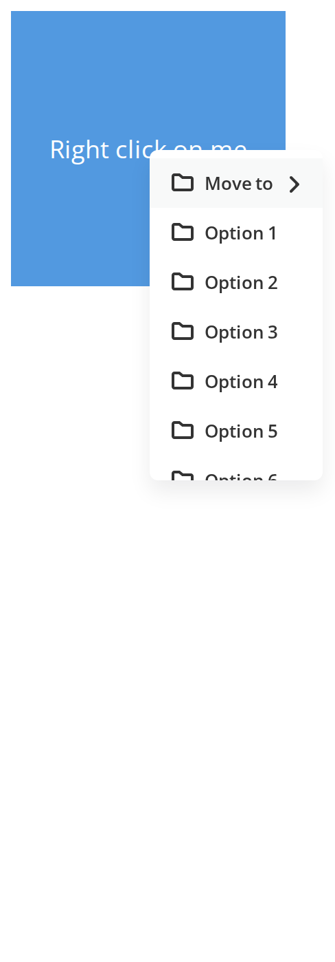
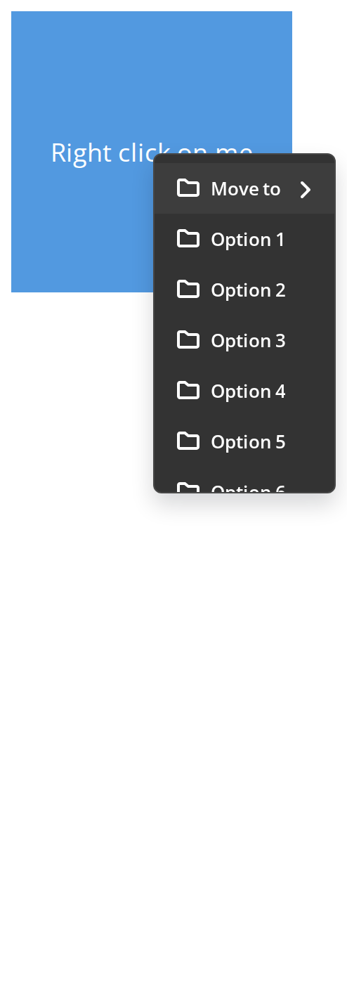
The model has sixteen items, but the menu is only 240px tall — about six and a half rows — and the rest scrolls inside it (maxHeight). Hover Move to: its submenu has twelve folders and is limited the same way, to 160px (maxHeightLowerSubmenu).
Mobile With Header
Shown at 320px, where the menu is a bottom sheet with the header on top: the title and, in the 32px block that isRoom gives it, the title's initials on the header color (the block renders only when icon is set; color then replaces the icon). Tap Move or copy: the submenu replaces the list in place and the header turns into a back button. ignoreChangeView forces the sheet layout regardless of the menu height.

Mobile With Avatar Header
The same bottom sheet with a person as the subject: header.avatar renders an avatar instead of the initials block.
Anchored To Element
Click Actions: the menu opens under the button, at its left edge, wherever the pointer was (containerRef). Use it for a menu that belongs to a toolbar button or a row's action button rather than to a right-click. leftOffset and rightOffset move it left from that edge; change them live in the Controls panel below.

Right To Left
The menu in a right-to-left interface: it opens to the left of the pointer, the icons sit on the right of the labels, and the third item's submenu opens to the left with its arrow pointing left. The menu renders into the right-to-left container (appendTo), because on its own it goes to the end of the page body, outside any dir wrapper.

Css Customization
Every variable a desktop menu can show, passed through the menu's own style prop, since the menu is portalled out of any wrapper -- the variables are listed under CSS variables on this page. Hover Delete for the hover background, hover Rename for the disabled one, and press Arrow Down for the keyboard highlight. The mobile header rows only apply to the bottom sheet.

Minimal example
The menu is opened by handing an event to show, which is where its position comes from.
import { useRef } from "react";
import {
  ContextMenu,
  type ContextMenuRefType,
} from "@onlyoffice/apps-ui-kit/components/context-menu";

export function FileCard({
  name,
  onRename,
}: {
  name: string;
  onRename: () => void;
}) {
  const menu = useRef<ContextMenuRefType>(null);

  return (
    <div onContextMenu={(event) => menu.current?.show(event)}>
      {name}
      <ContextMenu
        ref={menu}
        model={[{ key: "rename", label: "Rename", onClick: onRename }]}
      />
    </div>
  );
}
Props
An item
model and getContextModel return a list of these, or of separators.
Recipes
Items that depend on the selection
getContextModel is called each time the menu opens, so it sees the current state; model is
only the fallback.
import { useRef, useState } from "react";
import {
  ContextMenu,
  type ContextMenuRefType,
} from "@onlyoffice/apps-ui-kit/components/context-menu";

export function SelectableCard({ name }: { name: string }) {
  const menu = useRef<ContextMenuRefType>(null);
  const [pinned, setPinned] = useState(false);

  return (
    <div onContextMenu={(event) => menu.current?.show(event)}>
      {name}
      <ContextMenu
        ref={menu}
        model={[]}
        getContextModel={() => [
          {
            key: "pin",
            label: pinned ? "Unpin" : "Pin",
            onClick: () => setPinned(!pinned),
          },
          { key: "sep", isSeparator: true },
          { key: "delete", label: "Delete", disabled: pinned },
        ]}
        onHide={() => {}}
      />
    </div>
  );
}
A submenu, anchored to a button rather than the pointer
import { useRef } from "react";
import {
  ContextMenu,
  type ContextMenuRefType,
} from "@onlyoffice/apps-ui-kit/components/context-menu";

export function ShareMenu({ onCopy }: { onCopy: () => void }) {
  const menu = useRef<ContextMenuRefType>(null);
  const anchor = useRef<HTMLDivElement>(null);

  return (
    <div ref={anchor}>
      <button type="button" onClick={(event) => menu.current?.toggle(event)}>
        Share
      </button>
      <ContextMenu
        ref={menu}
        containerRef={anchor}
        scaled
        model={[
          { key: "copy", label: "Copy the link", onClick: onCopy },
          {
            key: "access",
            label: "Access",
            items: [
              { key: "view", label: "Can view" },
              { key: "edit", label: "Can edit" },
            ],
          },
        ]}
      />
    </div>
  );
}
Behaviour the types don't state
- It is opened imperatively, and the event is not optional.
show(event)readspageXandpageYoff it to place the menu, callspreventDefaultandstopPropagation, and then flips the menu when it would run past the viewport. WithcontainerRefthe menu goes to that element's corner instead, and the offsets are subtracted from it. getContextModelreplacesmodelon every open, which is why a menu built from a selection must use it —modelis read when the component renders, not when the menu opens.- A leading or trailing separator is dropped, so a list built by filtering does not end up with a rule against the edge.
- On a phone the menu becomes a sheet at the bottom — a viewport 600px wide or narrower,
and only when the menu is taller than 210px or
ignoreChangeViewis set. In that form it is portalled into#root, found by that literal id, and the backdrop finally appears. On a desktopwithBackdropshows nothing unlessignoreChangeViewis set too, which brings the backdrop behind the ordinary menu. - On the sheet a submenu replaces the list in place, with a back button in the header, rather than opening to the side.
- Disabled items are dropped from the list unless
showDisabledItemsis set; then they are shown greyed out, and an item'sgetTooltipContentexplains on hover why it is disabled. - Escape, the arrow keys and Enter work while the menu is open, through a
keyuplistener on the window.withHotkeys={false}turns them off. Nothing else in the kit's menus does this. - Opening the menu again while it is open re-shows it at the new position rather than toggling
it;
toggle(event)is the one that closes. - An item with
itemsopens a submenu to the side on hover, to any depth, and one withonLoadfetches them the first time it is opened. globalandautoZIndexare declared and never read.
CSS variables
The menu is portalled out of its parent, so a variable set on a wrapper element never reaches
it: pass them through the menu's own style prop (or render it inside the wrapper with
appendTo). Every default not given below comes from the theme.
Otherwise the menu's width is the widest item, and its height is capped by maxHeight for the
list and maxHeightLowerSubmenu for a second-level submenu.
Accessibility
- Each item is a link with
role="menuitem"and each divider hasrole="separator", but the menu container has nomenurole. - The keyboard handling is real: Arrow Up and Down move the highlight, Arrow Right opens the highlighted item's submenu and Arrow Left returns to the parent list, Enter chooses the item or opens its submenu, and Escape closes.
- Focus is not moved into the menu and not trapped: the highlight is only drawn on the item, so
a screen reader does not announce which item is highlighted. The element that opened the menu
is not linked to it by
aria-controlsoraria-expanded— add those on your own control. - A right-click is the usual way in, which no keyboard user has. Give the same actions a button
as well, as
Rowdoes.
Test ids
Related
ContextMenuButton— the icon that opens one of these.DropDown— a menu anchored to a control instead of the pointer.Row— renders one per row, opened by right-click.