DropDown
Menu anchored to a control, rendered in a portal and positioned against the element you point
it at. Its visibility prop is open, and the anchor is forwardedRef.
Use this when / not when
- Use for a menu you open from a control of your own: an actions menu, a list of options, a
picker built out of
DropDownItems. - Not for a right-click menu — that is
ContextMenu, which positions itself at the pointer. - Not for choosing one value from a list:
ComboBoxis this component plus the button, the selection and the matching. - Not for a hint:
Tooltip. - Not as a dialog. There is no focus trap and no Escape handling; the backdrop is all that catches the next click.
Import
import { DropDown } from "@onlyoffice/apps-ui-kit/components/drop-down";
Also exported from the root barrel @onlyoffice/apps-ui-kit.
DropDownProps is not exported — type a wrapper's props yourself, or import the type from
its file path.
Needs ThemeProvider from @onlyoffice/apps-ui-kit/providers/theme above it in the tree for
the background, the border and the shadow.
Stories
Default
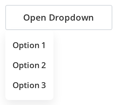
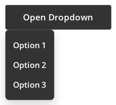
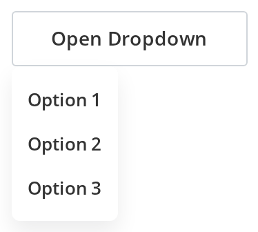
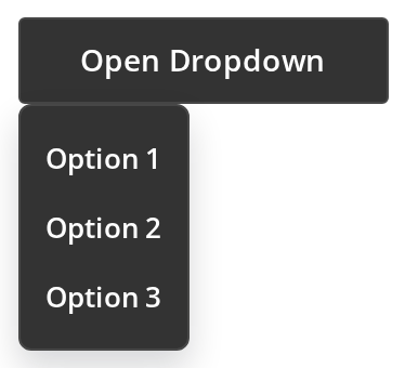
The everyday case: a short menu opened from a button and closed by the next click anywhere else. Press Open Dropdown, then change any other prop live in the Controls panel below and open it again.
With Headers And Separators
Dropdowns can include headers and separators to organize items into logical groups.


With Disabled Items
Use showDisabledItems to display disabled items. By default, disabled items are hidden.


Scrollable List
For a list longer than the screen can hold: the menu stays 200px tall and scrolls (maxHeight). Open it and press the Down and Up arrows to move the highlight, then Enter to pick the highlighted option.


Direction Variants
To open the menu where there is room for it: each button opens its menu to the side and edge its label names (directionX, directionY). A menu that would run past the side of the window opens towards the other side instead.


Custom Width
Use manualWidth to set a custom width for the dropdown.


With Separators
To group a short menu without titles: thin lines split the editing commands into three groups (isSeparator on a DropDownItem).


Right To Left
The menu in a right-to-left interface, open from the start: the button sits at the right, the menu lines up with the button's right edge and extends towards the left, and the labels are aligned to the right. The menu renders into the right-to-left container (appendTo), because on its own it goes to the end of the page body, outside any dir wrapper.
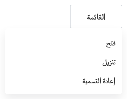
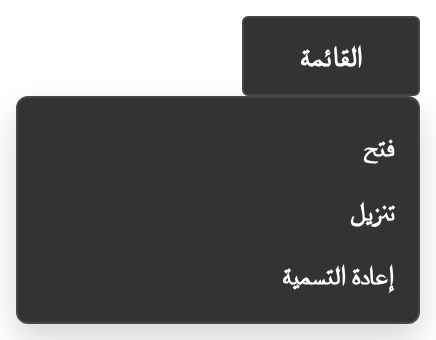
Css Customization
The variables are listed under CSS variables on this page. Press Dropdown trigger to open the menu. It renders inline here (isDefaultMode={false}), inside the wrapper that sets the variables; in the default portal mode the menu is on the page body, outside any wrapper, so set them through the DropDown's own style prop instead.


Minimal example
forwardedRef is what the menu is positioned against; without it, the menu in its default
portal mode has nothing to measure.
import { useRef, useState } from "react";
import { Button } from "@onlyoffice/apps-ui-kit/components/button";
import { DropDown } from "@onlyoffice/apps-ui-kit/components/drop-down";
import { DropDownItem } from "@onlyoffice/apps-ui-kit/components/drop-down-item";

export function ActionsMenu({ onRename }: { onRename: () => void }) {
  const [open, setOpen] = useState(false);
  const anchor = useRef<HTMLDivElement>(null);

  return (
    <div ref={anchor} style={{ position: "relative", width: "fit-content" }}>
      <Button label="Actions" onClick={() => setOpen(!open)} />
      <DropDown
        open={open}
        forwardedRef={anchor}
        clickOutsideAction={() => setOpen(false)}
        manualWidth="200px"
      >
        <DropDownItem
          label="Rename"
          onClick={() => {
            setOpen(false);
            onRename();
          }}
        />
      </DropDown>
    </div>
  );
}
Props
Recipes
Open and close, controlled
clickOutsideAction is the close handler: the backdrop calls it, and so does any event type
you list in eventTypes. Its second argument is the state being asked for.
import { useRef, useState } from "react";
import { DropDown } from "@onlyoffice/apps-ui-kit/components/drop-down";
import { DropDownItem } from "@onlyoffice/apps-ui-kit/components/drop-down-item";
import { IconButton } from "@onlyoffice/apps-ui-kit/components/icon-button";

export function RowMenu({ onDelete }: { onDelete: () => void }) {
  const [open, setOpen] = useState(false);
  const anchor = useRef<HTMLDivElement>(null);

  return (
    <div ref={anchor} style={{ position: "relative" }}>
      <IconButton
        size={16}
        title="More"
        onClick={() => setOpen(true)}
        iconNode={
          <svg viewBox="0 0 16 16" aria-hidden="true">
            <circle cx="3" cy="8" r="1.5" />
            <circle cx="8" cy="8" r="1.5" />
            <circle cx="13" cy="8" r="1.5" />
          </svg>
        }
      />
      <DropDown
        open={open}
        forwardedRef={anchor}
        directionX="left"
        clickOutsideAction={(_event, next) => setOpen(next)}
      >
        <DropDownItem label="Delete" onClick={onDelete} />
      </DropDown>
    </div>
  );
}
A long list that scrolls
maxHeight is what turns on the scrollbar — and with it the virtualised list, which reads each
item's height from its height prop rather than measuring it.
import { useRef, useState } from "react";
import { DropDown } from "@onlyoffice/apps-ui-kit/components/drop-down";
import { DropDownItem } from "@onlyoffice/apps-ui-kit/components/drop-down-item";

export function TimezoneMenu({ zones }: { zones: string[] }) {
  const [open, setOpen] = useState(false);
  const anchor = useRef<HTMLDivElement>(null);

  return (
    <div ref={anchor} style={{ position: "relative" }}>
      <button type="button" onClick={() => setOpen(!open)}>
        Time zone
      </button>
      <DropDown
        open={open}
        forwardedRef={anchor}
        maxHeight={320}
        manualWidth="280px"
        clickOutsideAction={() => setOpen(false)}
      >
        {zones.map((zone) => (
          <DropDownItem
            key={zone}
            label={zone}
            onClick={() => setOpen(false)}
          />
        ))}
      </DropDown>
    </div>
  );
}
Behaviour the types don't state
- It renders into
document.bodyby default and positions itself by measuring the element behindforwardedRefon open, on resize and on scroll. Without that ref it cannot find the anchor and lands wherever the stylesheet leaves it;appendTomoves the portal, andisDefaultMode={false}renders it in place instead, absolutely positioned against the nearest positioned ancestor. maxHeightchanges how the children are rendered, not just how tall the menu is. Without it every child is rendered as given, with no scrollbar and no keyboard navigation. With it the list is virtualised byreact-window, which takes each child's height from itsheightprop (32px, or 36 on a tablet, and 12 for an item markedisSeparator) — a child that is actually taller overlaps its neighbour.isNoFixedHeightOptionsswaps the virtual list for a plain scrollbar and measures nothing.- While an open menu has keyboard navigation on, every key press in the document has its
default prevented. The handler is attached to
windowand callspreventDefault()before it looks at the key, so a text field elsewhere on the page stops accepting characters. PassenableKeyboardEvents={false}for a menu that opens next to an input. - Disabled children are removed from the list by default.
showDisabledItemskeeps them; a separator that would end up first or last is dropped either way. Keyboard navigation still counts the original children, so the highlight and the removed items disagree. directionXanddirectionYare preferences. The component measures the room around the anchor and flips the menu to whichever side fits, ending up at the viewport edge when neither does.fixedDirectionturns that off. In a right-to-left interface the alignment mirrors: the menu lines up with the anchor's right edge instead of its left.- Nothing closes the menu by itself.
openis yours, andclickOutsideActionis called by the backdrop and by the DOM events you list ineventTypes— there is no Escape handling and no default event list. On a mobile device the component registers a single event type spelled"click, touchend", which no browser ever fires. - The element is always in the DOM and
display: noneuntilopen. Its width comes frommanualWidth, not from the anchor. - The stylesheet's own
max-heightrule is attached to a class the component never sets, so the height you get is the one computed from the items and the scrollbar of the list. id,columnCount,withBluranddisableOnClickOutsideare declared and never read.
CSS variables
--dropdown-text-size and --dropdown-text-weight are set on the menu, and a DropDownItem
sets its own font size and weight, so they reach only children that do not.
In the default portal mode the menu is rendered on document.body, outside any wrapper of
yours, so a variable set on a wrapper never reaches it: set it through the DropDown's own
style prop, or render in place with isDefaultMode={false}.
--z-index, --max-height, --manual-width, --manual-x and --manual-y are written by the
component from the matching props.
Accessibility
- The menu is a
<div role="listbox">. ADropDownIteminside it is arole="option", or arole="separator"when markedisSeparator; children of your own get no role. - Nothing links the anchor to the menu: no
aria-expanded, noaria-controls, noaria-activedescendanton the anchor. Add them on your own control. - Focus is neither moved into the menu nor trapped, and Escape does not close it. The arrow keys
work only with
maxHeight, and they move a highlight rather than focus, wrapping from the last item to the first and back. - Enter activates the highlighted child by calling its
onClickdirectly, which does nothing for a child that has none.
Test ids
Related
DropDownItem— what goes inside, and whereheightcomes from.ContextMenu— the menu that opens at the pointer.Backdrop— the layer this renders for you unless you say otherwise.