RowContainer
Scrolling list the rows go in, virtualised and paged in as the user reaches the end. Its virtualisation is built for the DocSpace portal and needs the portal's own scroll element.
Use this when / not when
- Use around
Rows, which is the only thing it is laid out for. - Not outside the portal with virtualisation on: the list looks for the portal's scroll
container and measures its width through a literal element id. Pass
useReactWindow={false}and the container becomes a plain<div>that renders every child. - Not for a list with columns —
Table— and not for a handful of items, which need no container at all.
Import
import { RowContainer } from "@onlyoffice/apps-ui-kit/components/rows/row-container";
components/index.ts does not list this folder, but it lists rows, and export *
is transitive — so the name arrives from @onlyoffice/apps-ui-kit/components/rows and from
the root barrel @onlyoffice/apps-ui-kit as well.
RowContainerProps is not exported — type a wrapper's props yourself, or import the type
from its file path.
Needs ThemeProvider from @onlyoffice/apps-ui-kit/providers/theme for the rows inside it.
Stories
Default
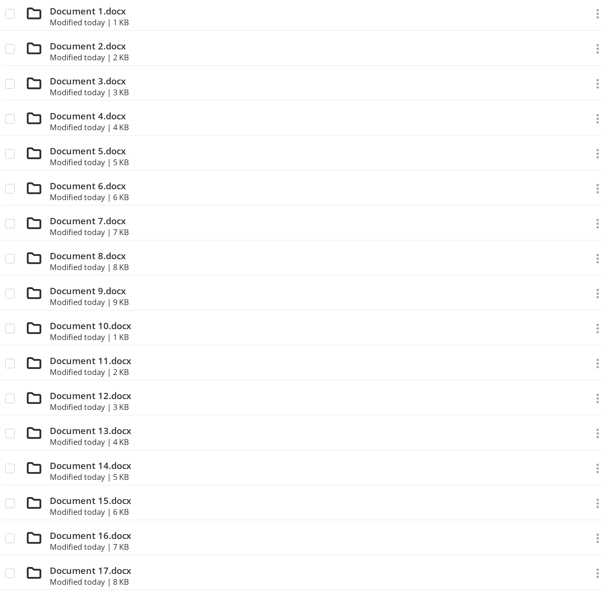
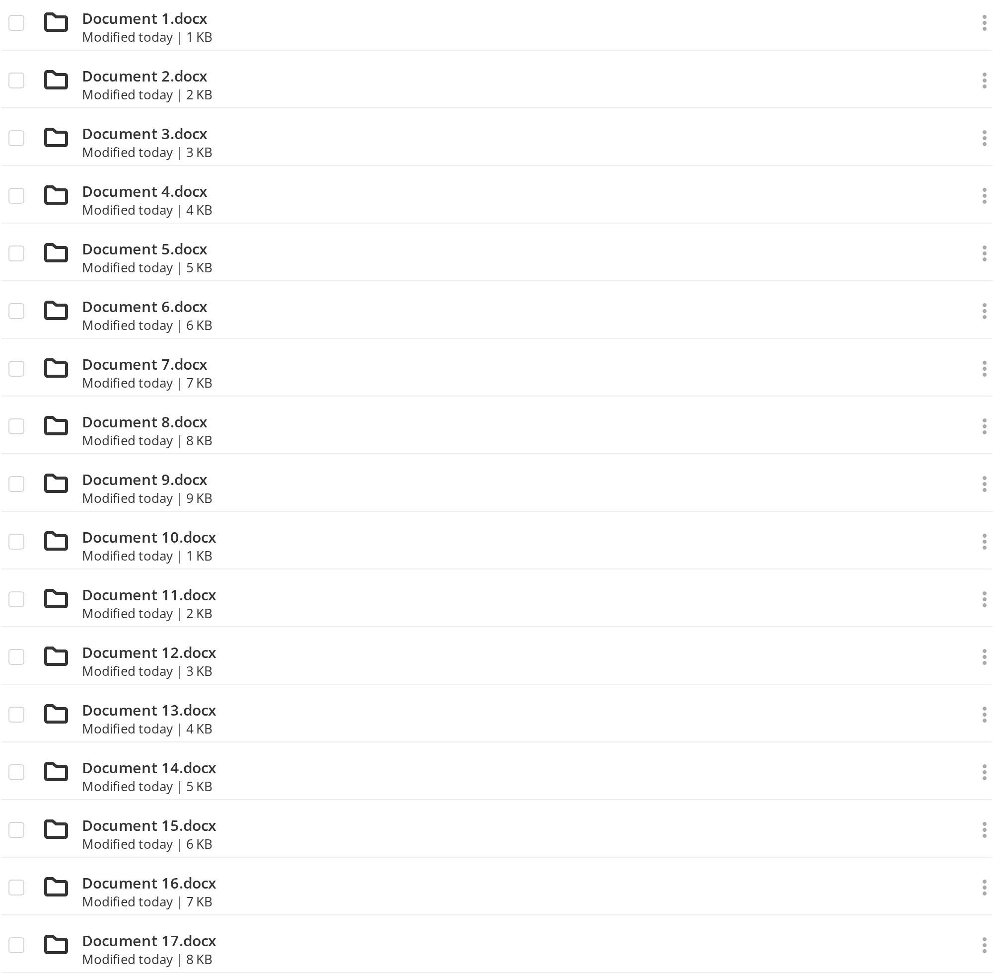
A short list of twenty files rendered as it is, with virtualisation off (useReactWindow), which is how the list works on a page that has no portal section around it. Select the text of a row to see that selection is allowed; change any other prop live in the Controls panel below.
No Text Selection
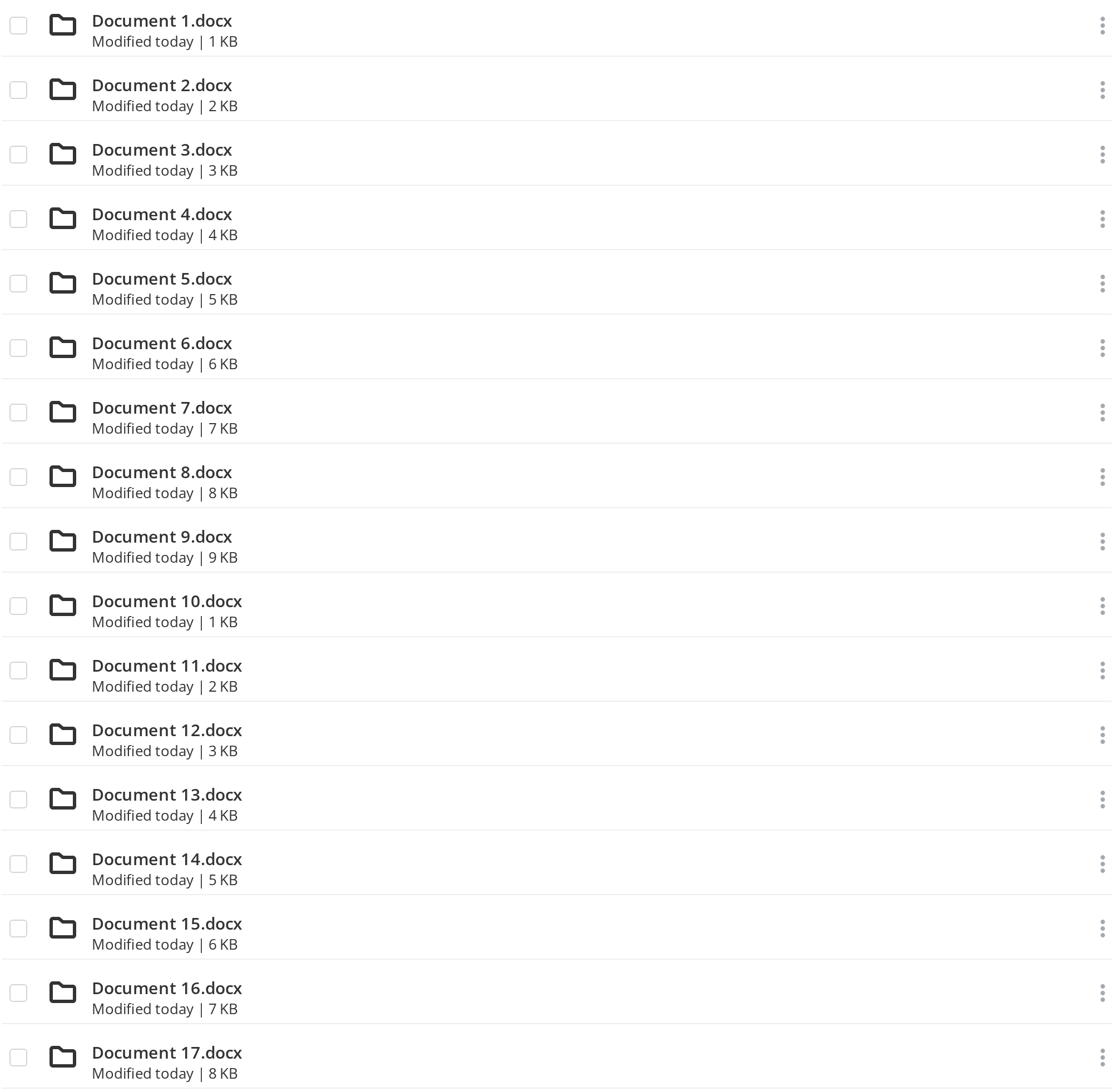
A list whose rows are picked with clicks and drags rather than read and copied: dragging across a title selects no text (noSelect).
Virtualised
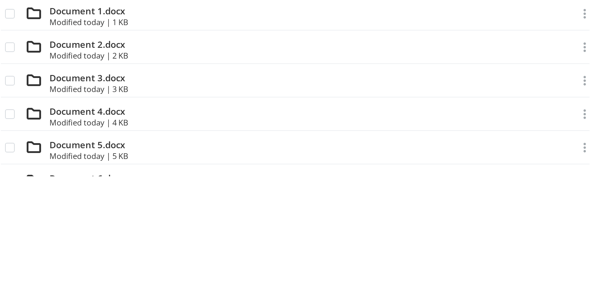
A list of a hundred files of which twenty are loaded: scroll the box and only the rows in view are mounted, each 56px high (itemHeight). Near the end of the loaded rows the list asks for the next range (fetchMoreFiles, logged in the Actions panel) and shows skeleton rows until it arrives half a second later.
Minimal example
Without virtualisation the container is a plain <div> as tall as its rows. It sets no
height and no scrollbar of its own, and manualHeight is not read in this mode; a list that
has to scroll gets both from a wrapper of yours.
import { RowContainer } from "@onlyoffice/apps-ui-kit/components/rows/row-container";
import { Row } from "@onlyoffice/apps-ui-kit/components/rows/row";
import { RowContent } from "@onlyoffice/apps-ui-kit/components/rows/row-content";
import { Text } from "@onlyoffice/apps-ui-kit/components/text";

export function FileList({ names }: { names: string[] }) {
  return (
    <RowContainer useReactWindow={false}>
      {names.map((name) => (
        <Row key={name} contextOptions={[]}>
          <RowContent>
            <Text fontWeight={600}>{name}</Text>
            <span />
          </RowContent>
        </Row>
      ))}
    </RowContainer>
  );
}
Props
Recipes
Paging in more rows
The four …Files props are the whole of the infinite loader's contract: how many rows are
loaded, how many there are, whether to ask for more, and what to call.
import { RowContainer } from "@onlyoffice/apps-ui-kit/components/rows/row-container";
import { Row } from "@onlyoffice/apps-ui-kit/components/rows/row";
import { RowContent } from "@onlyoffice/apps-ui-kit/components/rows/row-content";
import { Text } from "@onlyoffice/apps-ui-kit/components/text";

export function PagedList({
  names,
  total,
  loadMore,
}: {
  names: string[];
  total: number;
  loadMore: () => Promise<void>;
}) {
  return (
    <RowContainer
      itemHeight={50}
      filesLength={names.length}
      itemCount={total}
      hasMoreFiles={names.length < total}
      fetchMoreFiles={() => loadMore()}
    >
      {names.map((name) => (
        <Row key={name} contextOptions={[]}>
          <RowContent>
            <Text fontWeight={600}>{name}</Text>
            <span />
          </RowContent>
        </Row>
      ))}
    </RowContainer>
  );
}
Behaviour the types don't state
- The virtual list measures its width through
document.getElementById("rowContainer"). That is this component's defaultid. Change it, or render two containers on a page, and the rows are laid out at a width of zero. - It scrolls the portal's scroll element, not itself. The loader looks for
#sectionScroll .scroll-wrapper > .scroller, or#customScrollBar's on a phone, and falls back to the window when neither is there. Outside the portal that fallback is what you get, so a container with its own scrollbar wantsuseReactWindow={false}. - Every row is
itemHeighttall, 50px by default, whatever the row actually renders — a taller row is cut off. One height for the whole list. - With virtualisation on, the container is
height: 100%and needs a parent with a height, ormanualHeight. With it off the container isheight: auto, grows with its rows and ignoresmanualHeight. - Text inside the container is selectable on purpose, including inside the rows;
noSelectturns that off. onScrollis handed to the virtual list, so it is not called at all when virtualisation is off.
Accessibility
- The container is a plain
<div>with no list role, and virtualisation means only the rows near the viewport exist in the DOM — a screen reader is given no count and no position. - There is no keyboard navigation between rows, and nothing here is focusable.
- A list users must work through from the keyboard needs
Tableor markup of your own.
Test ids
It cannot be overridden by a prop.
Related
Row— what goes inside.Rows— the three parts together.InfiniteLoader— the virtualisation this delegates to.