InfiniteLoader
Virtualised list or grid that asks for the next page as the user scrolls towards the end. It is built for the DocSpace portal's layout and looks for the portal's own elements by id.
Use this when / not when
- Use for thousands of rows or tiles, where rendering them all would be too slow —
RowContainerandTableuse it for exactly that. - Not in an application that is not the portal, unless you reproduce the portal's scroll
element: this component looks for
#sectionScrolland falls back to the window. - Not for a list of a few dozen items. Virtualisation costs a fixed row height, a measured container and a scroll container; a plain list costs none of that.
- Not to show that something is loading —
LoaderorRectangleSkeletonis that.
Import
import { InfiniteLoaderComponent } from "@onlyoffice/apps-ui-kit/components/infinite-loader";
Also exported from the root barrel @onlyoffice/apps-ui-kit.
The export is named InfiniteLoaderComponent, not InfiniteLoader, and InfiniteLoaderProps
is not exported — import the type from its file path if you need it.
Needs ThemeProvider from @onlyoffice/apps-ui-kit/providers/theme for the skeletons it shows
between pages.
Stories
Default
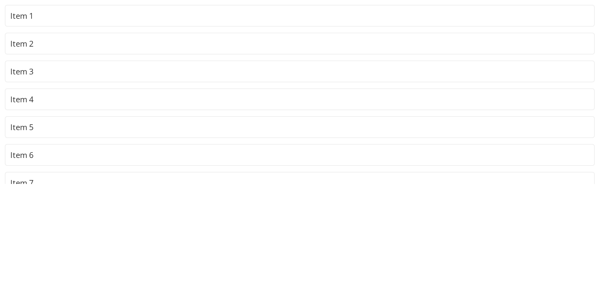
Scroll the box: when the end of the loaded items comes near, the loader asks for the next range, and the new items arrive half a second later (loadMoreItems, logged in the Actions panel). In the tile layout each child is one row of the grid; here a plain box stands in for a row of tiles. Change any other prop live in the Controls panel below.
Row Layout
A list of rows of one height (viewAs="row", itemSize). Scroll to the end: the rows after the last loaded item are skeleton rows until the next page arrives, and a jump of more than 800px, such as dragging the scrollbar, turns every row in view into a skeleton while the scrolling lasts.
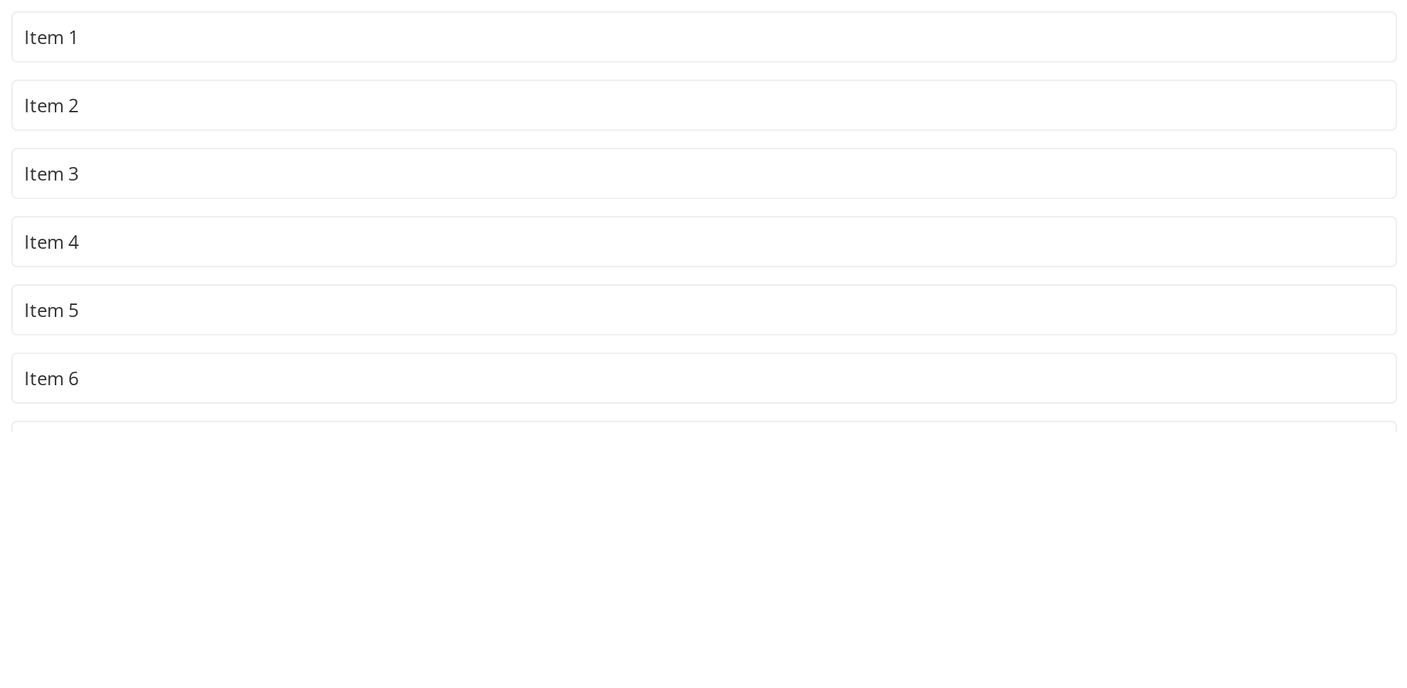
Table Layout
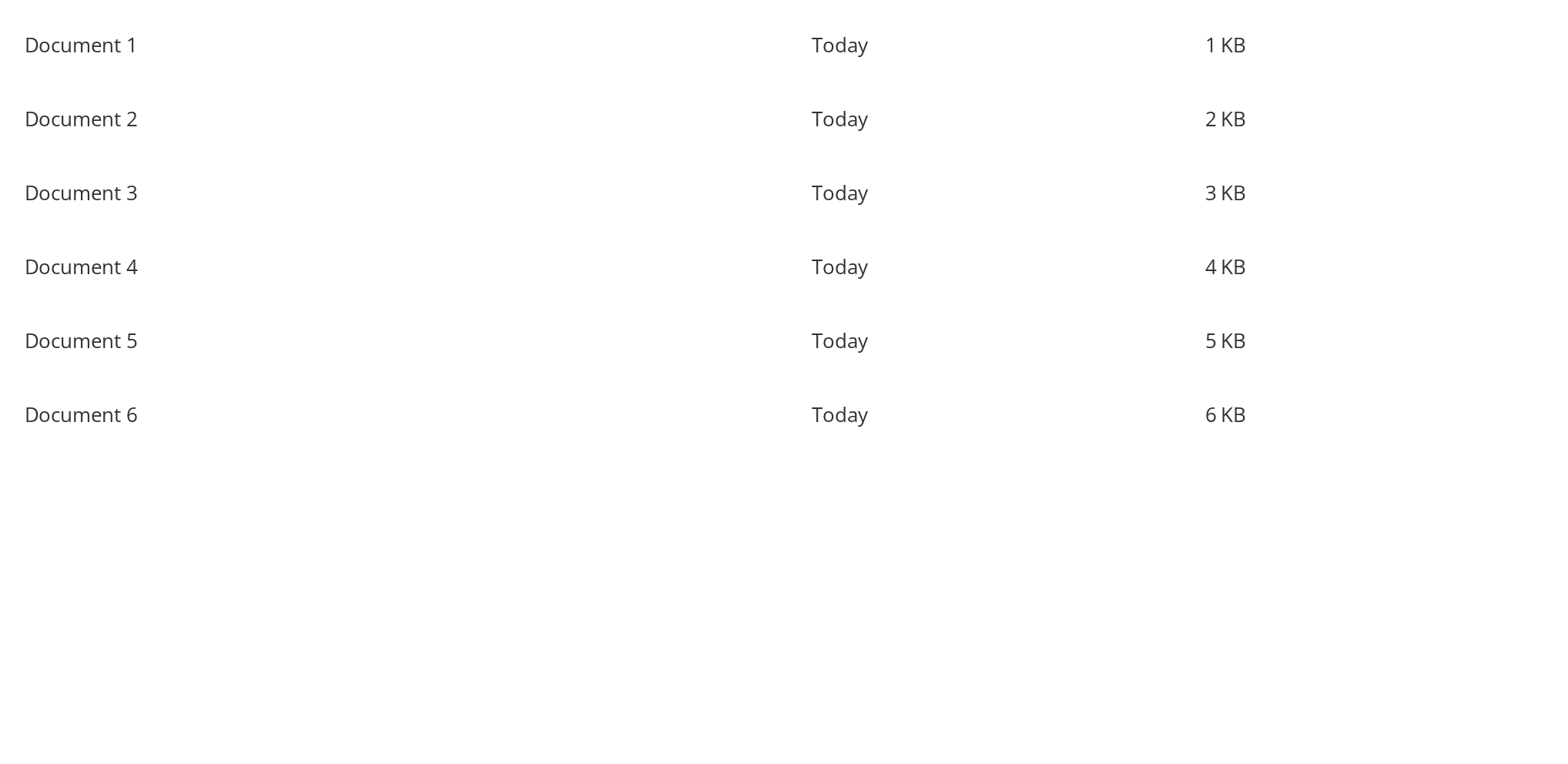
A table whose rows share one column layout (viewAs="table"). The layout is not passed as a prop: the loader reads it from localStorage under the key it is given (columnStorageName, or columnInfoPanelStorageName while infoPanelVisible is set), which lets the table header that saves the widths and the rows below stay in step. The rows not loaded yet show the table skeleton.
Right To Left
The row layout in a right-to-left interface: the text of each row starts at the right edge of the row instead of the left.
Css Customization
The three tile variables set on one wrapper -- the variables are listed under CSS variables on this page. They size only the skeleton tiles, which appear for a moment when the box is scrolled by more than 800px at once — drag the scrollbar quickly to see them.
Minimal example
itemSize is the height of every row alike, and loadMoreItems is called with the range to
fetch.
import { InfiniteLoaderComponent } from "@onlyoffice/apps-ui-kit/components/infinite-loader";

export function NameList({
  names,
  total,
  loadMore,
}: {
  names: string[];
  total: number;
  loadMore: () => Promise<void>;
}) {
  return (
    <div id="rowContainer" style={{ height: 400 }}>
      <InfiniteLoaderComponent
        viewAs="row"
        itemSize={50}
        filesLength={names.length}
        itemCount={total}
        hasMoreFiles={names.length < total}
        loadMoreItems={() => loadMore()}
      >
        {names.map((name) => (
          <div key={name}>{name}</div>
        ))}
      </InfiniteLoaderComponent>
    </div>
  );
}
Props
Recipes
Loading
isLoading renders nothing at all — not a skeleton, not an empty list — so show your own
placeholder beside it.
import { InfiniteLoaderComponent } from "@onlyoffice/apps-ui-kit/components/infinite-loader";
import { RectangleSkeleton } from "@onlyoffice/apps-ui-kit/components/rectangle";

export function LoadableList({
  names,
  isLoading,
  loadMore,
}: {
  names: string[];
  isLoading: boolean;
  loadMore: () => Promise<void>;
}) {
  if (isLoading)
    return <RectangleSkeleton width="100%" height="200px" title="Loading" />;

  return (
    <div id="rowContainer" style={{ height: 400 }}>
      <InfiniteLoaderComponent
        viewAs="row"
        itemSize={50}
        filesLength={names.length}
        itemCount={names.length}
        hasMoreFiles={false}
        loadMoreItems={() => loadMore()}
      >
        {names.map((name) => (
          <div key={name}>{name}</div>
        ))}
      </InfiniteLoaderComponent>
    </div>
  );
}
Behaviour the types don't state
- It scrolls the portal's element, not itself. The component looks for
#sectionScroll .scroll-wrapper > .scroller, or#customScrollBar's on a viewport of 600px or less — the inner elements of aScrollbar— and falls back to the window when neither exists. Nothing here creates a scrolling region of its own. - The width comes from an element found by a literal id:
#table-containerfor thetablelayout,#tileContainerfortileand#rowContainerfor every other. Without the right one in the document the items are laid out at a width of zero, which is why the examples above put the id on the wrapper. - Every row and table row is
itemSizetall, and a taller one is clipped. Thetilelayout ignoresitemSize: it sizes each grid row by the class name of the child in it —isRoom,isFolder,isFile,isTemplate, or a section header otherwise — so tiles of one kind share a row height. - The
tablelayout takes its columns fromlocalStorage. Each row is a CSS grid whosegrid-template-columnsis the value saved undercolumnStorageName, or undercolumnInfoPanelStorageNamewhileinfoPanelVisibleis set. Both keys are required there: rendering a table row without either throws. - Rows not loaded yet are skeletons. In the
rowandtablelayouts every position pastfilesLengthshows aRowsSkeletonorTableSkeletonrow until its page arrives; thetilelayout shows no placeholder for them. - A long jump in the scroll position shows skeletons for 200ms. The component watches the
scroll and, when it moves more than 800px in one event, swaps the rows still scrolling for
skeletons briefly —
TileSkeletons in thetilelayout,RowsSkeletonorTableSkeletoninrowandtable, and nothing for any otherviewAs. isLoadingreturnsnull, so the region collapses rather than holding its height.childrenhas to be an array; the loader indexes it and asks for two more entries than there are whenhasMoreFilesis set, to leave room for the loading rows.
CSS variables
Set these on an ancestor. Everything else the stylesheet defines is private to it.
The three tile variables size only the skeletons shown for a moment after a jump of more than
800px; the real tiles are whatever the children render. --infinite-loader-table-width is not
one to set: the list writes the measured width into it on its own element, overwriting a value
from outside, so use --infinite-loader-list-width instead.
Accessibility
- The list is a stack of
<div>s with no list or grid roles, and only the items near the viewport exist in the DOM — assistive technology is given no total and no position. - Nothing here is focusable, and the scrolling element belongs to whatever wraps the component.
- A list a keyboard user has to work through is better built without virtualisation.
Test ids
Neither can be overridden by a prop.
Related
RowContainer— the row list built on this.Table— the table body built on this.Scrollbar— the scrolling region this looks for.