Loader
Spinner in one of four animations, for work whose duration is unknown. Pick the animation explicitly — the component has no default worth having.


Use this when / not when
- Use while waiting for something whose progress cannot be measured: a request, a save, a panel that has not loaded yet.
- Not when the shape of what is coming is known — a skeleton reads better and does not move
the layout when the content arrives. That is
RectangleSkeleton. - Not when progress can be measured:
ProgressBar. - Not inside a button that is saving —
ButtonhasisLoading, which places and sizes its own loader.
Import
import { Loader, LoaderTypes } from "@onlyoffice/apps-ui-kit/components/loader";
Also exported from the root barrel @onlyoffice/apps-ui-kit.
Needs ThemeProvider from @onlyoffice/apps-ui-kit/providers/theme above it in the tree for
the track colours; without it the animation falls back to the pale default stroke.
Stories
Default
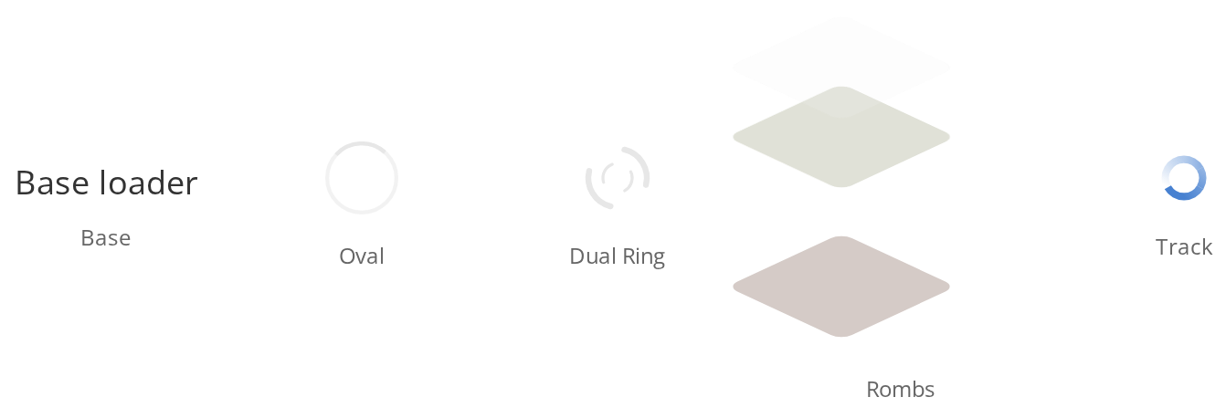
A line of plain text instead of an animation, for a place where a moving spinner would distract: this is what you get with type set to base or left out, so pick an animation explicitly when you want one. Change any other prop live in the Controls panel below.
Oval
Oval spinner animation, commonly used for inline loading states.


Dual Ring
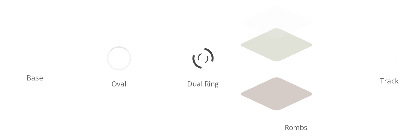
Dual ring animation with two concentric spinning rings.


Rombs
Rombs (diamond) animation, used as the main application loader.


Track
Track animation for compact loading indicators.


All Types
Side-by-side comparison of the text fallback (Base) and the four animations (Oval, DualRing, Rombs and Track), to choose the one that fits the space it waits in.
Custom Colors
DualRing loaders with different custom colors applied via the color prop.


Different Sizes
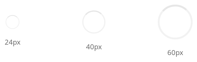
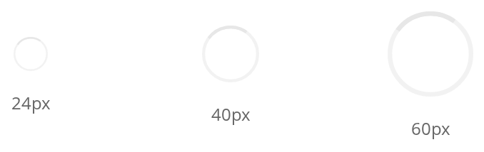
Oval loaders at three different sizes to demonstrate scalability.
On Primary Button
A white track on the accent background of a primary button, where the default accent-coloured track would disappear (primary).


Disabled State
The track dimmed beside a normal one, for a loader inside a control that is currently unavailable (isDisabled, read by the track only).


Css Customization
Every overridable variable set on one wrapper -- the variables are listed under CSS variables on this page.
The example shows, from left to right: an oval for --loader-stroke and --loader-size, which every instance picks up; a track for --loader-track-base; a track with primary for --loader-track-primary; and a track with isDisabled for --loader-opacity-disabled.


Minimal example
type is what makes it spin. Without it you get a line of text.
import { Loader, LoaderTypes } from "@onlyoffice/apps-ui-kit/components/loader";

export function PanelLoader() {
  return (
    <div style={{ display: "flex", justifyContent: "center", padding: 24 }}>
      <Loader type={LoaderTypes.oval} size="32px" label="Loading rooms" />
    </div>
  );
}
Props
Enums
Recipes
Disabled
isDisabled dims the animation. Only the track type reads it, and it is meant for a loader
drawn on a control that is itself disabled.
import { Loader, LoaderTypes } from "@onlyoffice/apps-ui-kit/components/loader";

export function DisabledTrack() {
  return <Loader type={LoaderTypes.track} size="20px" isDisabled />;
}
Centred in a panel that has not loaded
import type { ReactNode } from "react";
import { Loader, LoaderTypes } from "@onlyoffice/apps-ui-kit/components/loader";

export function PanelBody({
  isLoading,
  children,
}: {
  isLoading: boolean;
  children: ReactNode;
}) {
  if (!isLoading) return <>{children}</>;

  return (
    <div
      style={{
        display: "flex",
        alignItems: "center",
        justifyContent: "center",
        minHeight: 160,
      }}
    >
      <Loader type={LoaderTypes.dualRing} size="40px" label="Loading" />
    </div>
  );
}
Behaviour the types don't state
LoaderTypes.baseis not a spinner. It is the branch the switch falls through to, and it renderslabelas plain text with no animation at all. An absenttypedoes the same thing, so a<Loader />on its own renders nothing visible. Always passoval,dualRing,rombsortrack.Loader.defaultis decoration. The component carries a static object naming a type, a size and a label, and nothing reads it — the props have no defaults. The sizes quoted in the table come from the stylesheet's own fallbacks.- The wrapper is a plain
<div>with no width, height or centring of its own. Place it yourself; the examples above do. - The four animations differ in shape:
ovalis a ring with one spinning arc,dualRingtwo concentric rings turning in opposite directions,rombsthree diamonds that bounce in turn, andtracka ring of six segments spinning together. colorreaches theovalanddualRingstrokes and thebasetext only. Thetracktakes its colour from the theme (orprimary), and therombsdiamonds keep their own blue, green and red.rombsneeds a positioned container. The diamonds are absolutely positioned<div>s that move betweentop: 0andtop: 120px, so they sit against the nearest positioned ancestor and need aboutsizeplus 120px of height below it.- Give every
trackits ownid. The track builds its gradient ids fromid(spinner-color-<id>-1and on); two tracks with the same or noidshare one set of gradients, and the second draws in the first one's colour. refreaches thetracktype's<svg>alone; the other types ignore it.primaryandisDisabledare read by thetracktype alone; the other three ignore them.
CSS variables
A size prop sets --loader-size on the animation itself and so beats a value set on a
wrapper. --loader-color cannot be set from outside at all: the stylesheet defines it on the
animation, so pass color instead.
Accessibility
- The wrapper carries
aria-busy="true", which tells assistive technology that the region is updating. It sets norole="status", so the change is not announced on its own. labelbecomes thearia-labelof theoval,dualRingandtrackanimations. Without it the dual ring falls back to its built-in title, "dual ring"; the oval's and the track's titles are not direct children of the<svg>, so those two are unnamed graphics.rombsignoreslabelentirely: give its container an accessible name yourself.- The
basetype is read as its plain text. - Nothing here manages focus. A loader that replaces a focused control leaves focus on the document.
Test ids
| Element | data-testid |
|---|---|
| The wrapper | loader |
oval animation | oval-loader |
dualRing animation | dual-ring-loader |
rombs animation | rombs-loader |
track animation | track-loader |
None of these can be overridden by a prop.
Related
RectangleSkeleton— for content whose shape is known.ProgressBar— for work with measurable progress.Button—isLoadingfor a button that is saving.