TableHeaderCell
TableHeaderCell is the title of one column in a TableHeader, with its sort arrow and the handle that resizes it.
The Table README describes it in full.


Props
Stories
Default
The title of a column the table is not sorted by; hover it to see the arrow that sorts by this column, and change any other prop live in the Controls panel below.


Resizable
The short bar at the end of the cell is the handle a user drags to widen the column (resizable); here it only reports the press, since TableHeader does the resizing.
Sorted By This Column
The column the table is sorted by keeps its arrow on screen without a hover, so the user sees what the list is ordered by (sortBy matches the column's sortBy).
Without Sorting
A column that cannot sort: no arrow on hover and clicks on the title do nothing, for a list whose order is fixed (sortingVisible off).


With Unchecked Checkbox
A column with a select-all checkbox that nothing is ticked in yet shows only its title; the checkbox appears once a row is selected.


With Checked Checkbox
The select-all checkbox before the title once every row is selected (checkbox.value); a click on it calls checkbox.onChange.


With Indeterminate Checkbox
The same checkbox partly ticked, for a selection that covers some rows but not all (checkbox.isIndeterminate).


Short Column
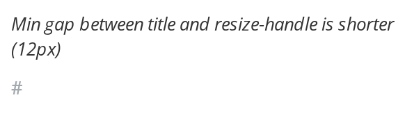
A narrow column, such as a row number, keeps 12 pixels before its handle instead of 22, so the title is not cut off (isShort).