FolderTile
Tile for a folder, as a single name row or, with one flag, a tall card with a picture on top. The
short form is what a folder normally looks like in a tile listing; isBigFolder is the form the
portal uses for a room's own subfolders.


Use this when / not when
- Use for a folder in a tile listing.
- Not for a document —
FileTilehas the thumbnail chain and the badge strip. - Not for a room or a template —
RoomTileandTemplateTile. - Not for a card of your own —
BaseTileis the shell without the folder-specific click handling. - A plain click selects the folder; it does not open it. Put the opening on the name, with the
class
item-file-nameso that the click is not taken as a selection.
Import
import FolderTile from "@onlyoffice/apps-ui-kit/components/tiles/folder-tile";
components/index.ts does not list this folder, but it lists tiles, and export *
is transitive — so the name arrives from @onlyoffice/apps-ui-kit/components/tiles and from
the root barrel @onlyoffice/apps-ui-kit as well.
Needs ThemeProvider for its colours and TranslationProvider for the three-dot button's
tooltip, which it asks the kit's own translation hook for under the key TitleShowActions.
Stories
Default
A folder as a single row: the icon, the name, and a badge beside the menu. Click the tile to select it, Ctrl- or Shift-click it to see the other callbacks in the Actions panel, and change any other prop live in the Controls panel below.


Big
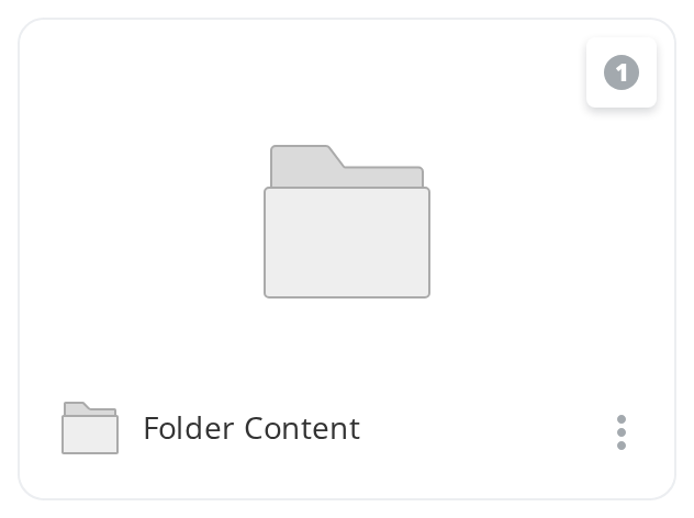
The tall layout, for a grid where folders should stand out as much as files: a picture on top with the badge in its corner, and the name row below it (isBigFolder, temporaryIcon).

Checked
A selected folder, as it looks among others the reader has picked: the checkbox stays ticked in place of the icon and the whole tile is tinted (checked).


In Progress
A folder that is busy, being copied or moved: a small loader stands where the icon and the checkbox were (inProgress).


With Hotkey Border
The tile the keyboard is on while the reader moves through the grid with the arrow keys: its border turns the accent colour (showHotkeyBorder). The tile does not handle the keys itself.


Renaming State
A folder whose name is being edited: the icon and the checkbox go, so the name row can hold a text field, and hovering no longer tints the tile (isEdit).


Right To Left
The same row in a right-to-left layout: the icon moves to the right-hand end, the name is aligned right after it, and the badge and the three-dot button move to the left edge. The wrapper carries dir="rtl" for the layout; the side the three-dot menu opens on comes from the theme's interfaceDirection (the Direction toolbar).


Css Customization
The variables are listed under CSS variables on this page.
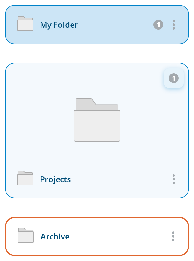
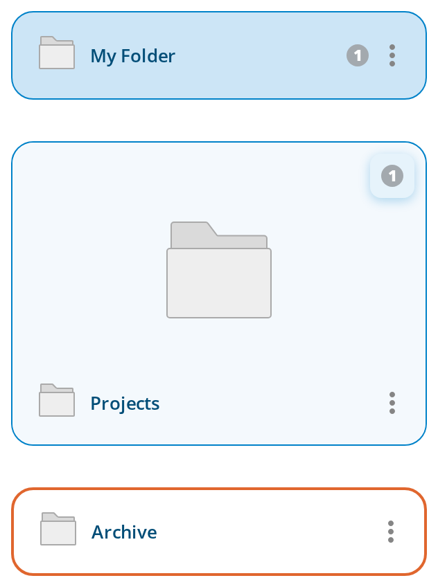
Three instances:
- My Folder — the single row, for the border, radius and name variables; hover it for
--tile-hover-bg,--tile-hover-text-decorationand--tile-bgbehind the icon. - Projects — the tall layout (
isBigFolder), for--tile-bgand the badge variables. - Archive —
showHotkeyBorder, for--tile-hotkey-color, in a wrapper of its own that sets--folder-tile-border-styleto a thicker border.
Minimal example
import { Link } from "@onlyoffice/apps-ui-kit/components/link";
import FolderTile from "@onlyoffice/apps-ui-kit/components/tiles/folder-tile";
import { TileContent } from "@onlyoffice/apps-ui-kit/components/tiles/tile-content";

const folder = {
  id: "f1",
  title: "Contracts",
  isFolder: true,
  contextOptions: [],
};

export function SimpleFolderTile() {
  return (
    <FolderTile item={folder} contextOptions={[]}>
      <TileContent>
        <Link className="item-file-name">{folder.title}</Link>
      </TileContent>
    </FolderTile>
  );
}
Props
Recipes
The tall layout
isBigFolder puts a picture above the name row and moves the badges over it. Without the flag
there is no picture at all and temporaryIcon is not rendered.
import { Link } from "@onlyoffice/apps-ui-kit/components/link";
import FolderTile from "@onlyoffice/apps-ui-kit/components/tiles/folder-tile";
import { TileContent } from "@onlyoffice/apps-ui-kit/components/tiles/tile-content";

const folder = {
  id: "f1",
  title: "Contracts",
  isFolder: true,
  contextOptions: [],
};

export function BigFolderTile() {
  return (
    <FolderTile
      isBigFolder
      item={folder}
      contextOptions={[]}
      temporaryIcon="/icons/folder.svg"
    >
      <TileContent>
        <Link className="item-file-name">{folder.title}</Link>
      </TileContent>
    </FolderTile>
  );
}
Selection
The checkbox appears beside element and reports through onSelect; so does a plain click on the
tile, and a tap on the icon below 600px. Hold checked yourself.
import { useState } from "react";

import { Link } from "@onlyoffice/apps-ui-kit/components/link";
import FolderTile from "@onlyoffice/apps-ui-kit/components/tiles/folder-tile";
import { TileContent } from "@onlyoffice/apps-ui-kit/components/tiles/tile-content";

const folder = {
  id: "f1",
  title: "Contracts",
  isFolder: true,
  contextOptions: [],
};

export function SelectableFolderTile() {
  const [checked, setChecked] = useState(false);

  return (
    <FolderTile
      item={folder}
      checked={checked}
      contextOptions={[]}
      element={<span aria-hidden="true">📁</span>}
      onSelect={(next) => setChecked(next)}
    >
      <TileContent>
        <Link className="item-file-name">{folder.title}</Link>
      </TileContent>
    </FolderTile>
  );
}
Behaviour the types don't state
- Three props are dead.
thumbnailClick,draggingandcontextMenuHeaderare declared and never read, and because the component forwards no unknown props they do not even reach the DOM. UseisDraggingfor the drag state; the menu's header is built from the first child'sitem. temporaryIconis only drawn in the tall layout. In the short form the picture block is not rendered at all, so the prop is silently ignored.- The badges move with the layout: over the picture when
isBigFolderis set, after the name inside the content row otherwise. - A plain click selects, with exceptions by class name. The handler walks up from the click
target looking for
.badges,.item-file-name,.expandButton,.p-contextmenuand the internal checkbox class. Note that.tagand.not-selectable— which the file tile also honours — are not in this list. setSelection([])runs first, clearing the rest of the selection, unless the click landed on animg, aninputor an SVG shape.- A double click selects once: the handler requires
e.detail === 1. - Ctrl or Cmd and Shift are diverted to
withCtrlSelectandwithShiftSelectand never select on their own; without those props such a click does nothing. - The three-dot button needs the flag on the item as well as the prop — the component tests
hasOwnProperty(item, "contextOptions")before it checks the prop — and the right-click menu needsgetContextModel. Without them you get an emptydiv.expandButtonand a swallowed browser menu. - The menu opens on the reading side. Its horizontal direction is taken from the interface direction context: right in a left-to-right layout, left in a right-to-left one.
- Only the first child is rendered; the rest of
childrenis dropped. - The picture is wrapped in a link with no
href, so it is an<a>that is not focusable.
CSS variables
The three badge variables apply only in the tall layout: in the single row the badges sit in the
name row, outside the element that reads them. --folder-tile-border-style and the file tile's
--file-tile-border-style let the two kinds of tile differ while --tile-border-style stays the
fallback for both.
Accessibility
- The tile is a plain
<div>with click and context-menu handlers: no role, notabindex, no key handling. Only the checkbox and the content are focusable. - The checkbox carries no label of its own; the folder's name is a sibling, not a label, so give the set of tiles a structure of your own if the count and the names matter.
- Ctrl-click and Shift-click have no keyboard equivalent.
- The right-click menu is pointer-only; the three-dot button is the keyboard path to the same actions, so keep it available.
- Make the name a real link. The tile's own click handler selects rather than opens, and it is not reachable from the keyboard.
Test ids
| Element | data-testid |
|---|---|
| Outer element | tile, overridden by dataTestId |
| Picture | file-thumbnail, in the tall layout only |
Related
Tiles— the family this belongs to.FileTile— the same idea for a document.TileContent— what goes inchildren.